In the dynamic world of eCommerce, conversions are king. A high conversion rate means more sales, more revenue, and more growth for your business. But how do you create a high converting website?
The answer lies in your eCommerce website. A well-planned and executed website is a powerful magnet that attracts visitors, engages them, and persuades them to take action.
In this blog post, we’ll explore the key elements of how to create a high converting website. We’ll take cues from the best e-commerce sites in the world and show you how you can create a website that converts like crazy.
So buckle up, because we’re about to uncover the secrets of the pros.
Let’s get started!
How To Create High Converting Website: Essential Tips
In the realm of online retail, success lies in the mastery of crucial pillars that captivate and persuade.
Clean and Clear Layout:
Apple’s website is the biggest example of a high converting website with minimalistic looks. It showcases a pristine and well-organized layout, placing vital elements at the forefront for easy navigation. The product pages boast a clutter-free design, making information easily scannable and accessible.
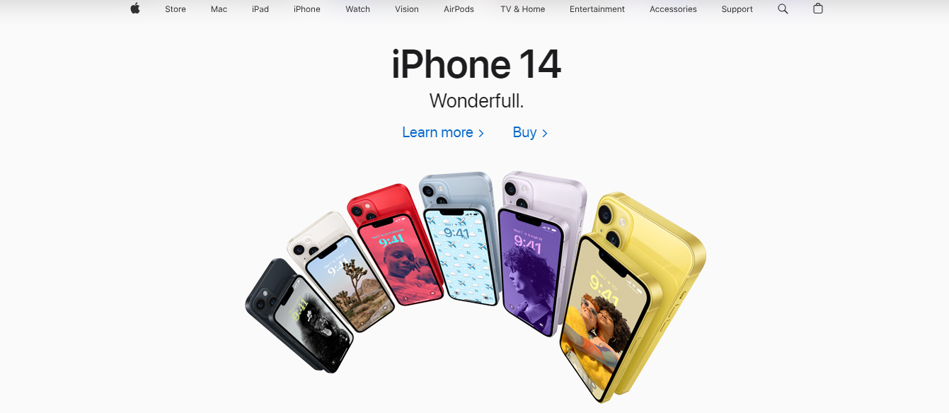
The homepage embraces simplicity and elegance, drawing attention to their collections. Abundant white space and a minimalist header facilitate the smooth exploration of products, empowering visitors to make informed choices.
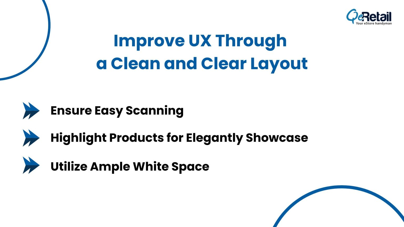
- Prioritize Clean and Clear Layout: Focus on creating product pages with a clean and uncluttered design, making it easy for users to find essential information.
- Ensure Easy Scanning: Organize content in a way that allows users to quickly scan and absorb information without feeling overwhelmed.
- Highlight Products: Design the homepage with a simple and elegant layout, allowing your products or collections to take center stage and capture visitors’ attention.
- Utilize Ample White Space: Incorporate generous white space around elements to provide visual breathing room, enhancing the user experience and facilitating navigation.
- Enable Informed Decisions: Aim to empower visitors to make informed choices by presenting product details clearly and intuitively, thereby increasing the likelihood of conversions.
Consistent Branding:
MVMT, a watch and accessories brand, exemplifies consistent branding throughout its website. The use of their signature logo, consistent color palette, and cohesive brand voice reinforces the brand identity and resonates with their target audience. This consistency creates a sense of trust, leading to higher brand loyalty and making it a high converting website.
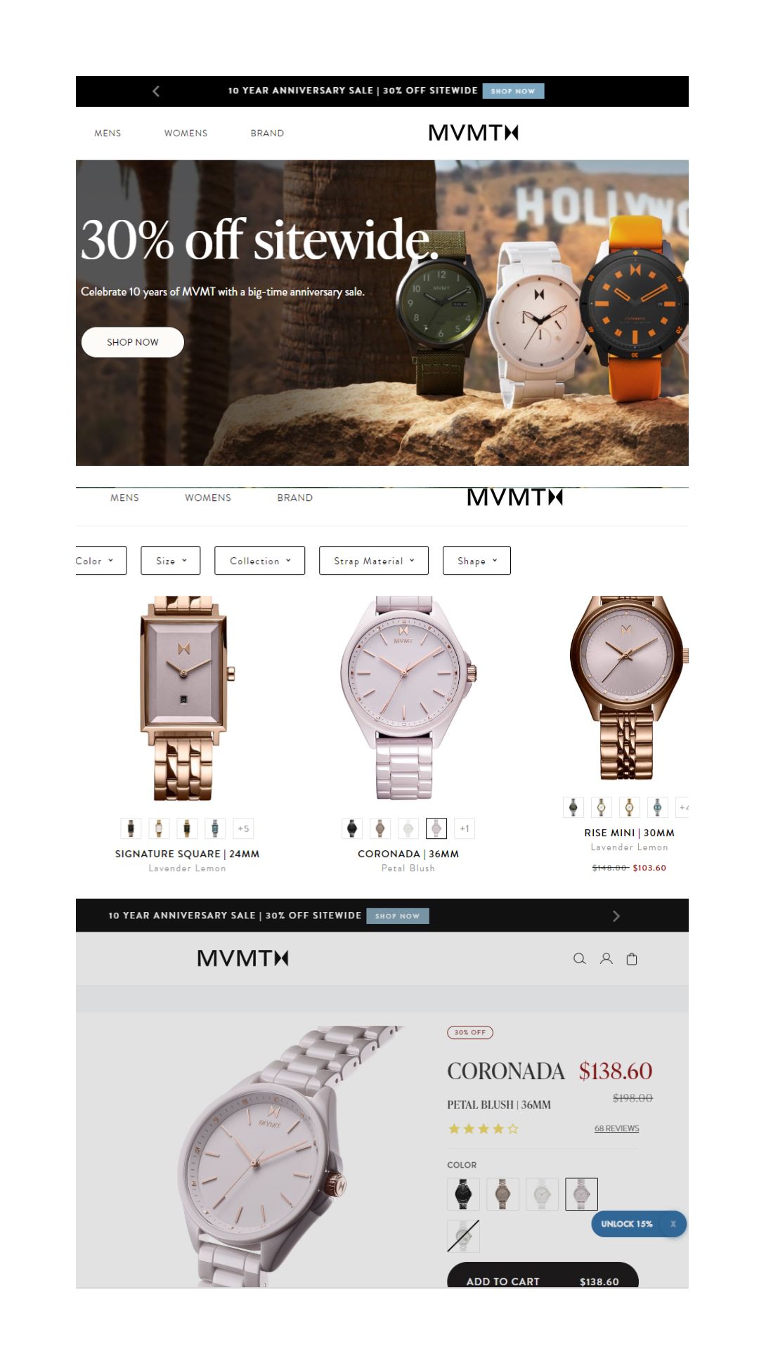
- Unified Identity: Maintain a consistent look and feel across your website, incorporating the logo, colors, typography, and brand voice to establish a unified identity.
- Trust and Familiarity: A strong and recognizable brand cultivates trust and familiarity with visitors, making them more inclined to explore and interact with your site.
- Enhanced Engagement: Consistent branding encourages visitors to engage deeper with your website, potentially leading to higher levels of interaction and making it a high converting website.
- Professional Image: Presenting a cohesive brand image demonstrates professionalism, leaving a positive impression on users and building credibility.
- Lasting Impression: Investing in consistent branding leaves a lasting impression on your audience, making it easier for them to remember and return to your site.
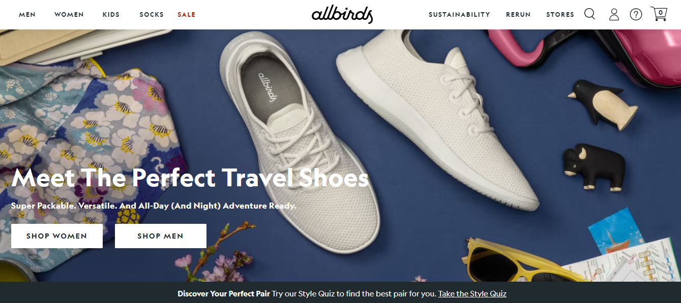
Visual Hierarchy:
A sustainable footwear brand, Allbirds, effectively implements a visual hierarchy on its website. It strategically places large, eye-catching visuals of eco-friendly shoes to draw visitors’ attention to their best-selling products. This high converting website prominently displays clear CTAs, guiding users toward the purchasing process, and ensuring a seamless experience.
- Guide Attention: Visual hierarchy organizes website elements strategically to guide visitors’ attention, ensuring they notice essential elements before others.
- Convey Brand Message: By prioritizing key elements, visual hierarchy helps effectively communicate the brand’s message and values to the audience.
- Direct the Users: Implementing visual hierarchy assists in directing users toward specific calls-to-action (CTAs), increasing the likelihood of desired actions and conversions.
- Enhance User Experience: A well-structured visual hierarchy contributes to a more enjoyable and intuitive user experience, making it easier for visitors to navigate the site and find relevant information.
- Optimize Engagement: Prioritizing critical elements through visual hierarchy optimizes user engagement, leading to higher interaction rates and improved overall website performance. Customer engagement is the ultimate cheat code for a high converting website.
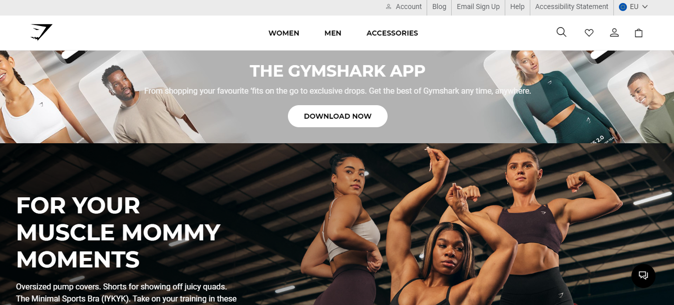
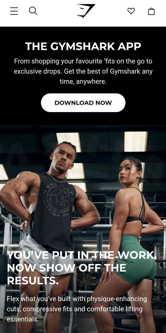
Mobile Responsiveness:
Recognizing the importance of mobile responsiveness, Gymshark, a renowned fitness apparel brand, has crafted a high converting website that delivers a seamless and user-friendly experience on smartphones and tablets. This thoughtful design allows potential customers to effortlessly explore products and make purchases from their mobile devices, fostering convenience and accessibility in their fitness journey.
Desktop View:
Mobile View:
- Prioritize Mobile-Responsiveness: Recognize the growing importance of mobile devices in online shopping and make mobile-responsive design a top priority for your eCommerce website.
- Optimize User Experience: Ensure that your website seamlessly adapts to different screen sizes, providing a user-friendly experience for mobile shoppers.
- Mobile Testing: Regularly test your website on various mobile devices to identify and resolve any issues that may hinder the optimal user experience.
- Streamline Checkout Process: Simplify the checkout process for mobile users, eliminating any unnecessary steps and ensuring a smooth and hassle-free transaction.
- Stay Competitive: Embrace mobile-responsive design as a crucial factor in maintaining a competitive edge and meeting the evolving needs of mobile-savvy consumers.
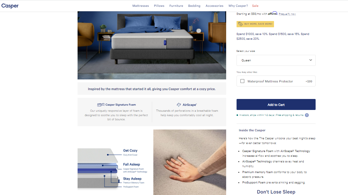
High-Quality Product Imagery:
Casper, the mattress company, places a strong emphasis on high-quality product imagery throughout its website. By showcasing multiple high-resolution images on their product pages, customers are empowered to thoroughly examine every aspect of the mattress. This attention to detail instills confidence and significantly enhances the chances of conversions.
- Emphasize Quality Imagery: Give priority to high-quality product images to grab visitors’ attention and create a positive impression of your products.
- Showcase Products Clearly: Use clear and detailed images to effectively showcase your products, allowing potential customers to make informed decisions.
- Enhance Visual Appeal: Invest in visually appealing imagery that enhances the overall aesthetics of your website, enticing visitors to explore further. The secret to a high converting website is to leave a lasting impression of your brand and your products on your visitors.
- Improve Conversions: Utilize compelling product imagery as a strategic tool to drive conversions, ultimately contributing to the overall success of your e-commerce business.
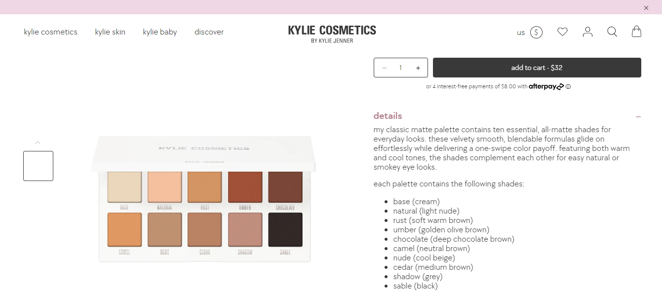
Persuasive Product Descriptions:
Kylie Cosmetics, a renowned skincare and makeup brand, showcases exceptional skill in crafting persuasive product descriptions. On their product pages, they present concise yet powerful descriptions that highlight the unique benefits of each product. This masterful persuasion deeply resonates with the target audience, inspiring them to add the products to their carts with confidence.
- Compelling Narratives: Craft product descriptions as compelling narratives that effectively showcase features, benefits, and unique selling points to entice potential customers.
- Evoke Emotions: Use language that evokes emotions and connects with customers on a personal level, making them feel engaged and invested in the product.
- Address Customer Pain Points: Identify and address customer pain points in your product descriptions, showing how the product can offer solutions to their needs or problems.
- Drive Purchase Decisions: Utilize persuasive language and storytelling to influence purchase decisions, encouraging customers to feel confident in making the buy.
Intuitive Navigation:
ColourPop, the cosmetics brand, excels in providing an intuitive navigation system that streamlines the browsing experience. With a clear and efficient menu categorizing products, users can effortlessly find specific makeup items. This user-friendly approach not only reduces bounce rates but also significantly enhances overall conversions making it a high converting website.
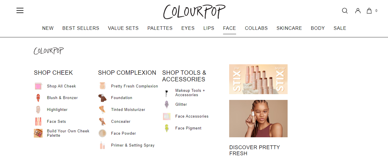
Intuitive navigation ensures that visitors can easily find what they are looking for without confusion. A well-structured menu and logical categorization of products contribute to a positive user experience.
- Intuitive Navigation: Ensure a user-friendly and straightforward navigation system that allows visitors to find what they need effortlessly.
- Clear Menu Structure: Create a well-structured menu with logical categorization of products to facilitate easy browsing and quick access to different sections.
- Simplify Product Organization: Arrange products in a way that makes sense to your target audience, making it easier for them to locate specific items and explore related options.
- User-Centric Approach: Put yourself in the shoes of your customers and think about their preferences and needs when designing the website’s navigation and categorization.
- Continuous Improvement: Regularly analyze user behavior and feedback to identify pain points and optimize the navigation and categorization for a constantly improving user experience.
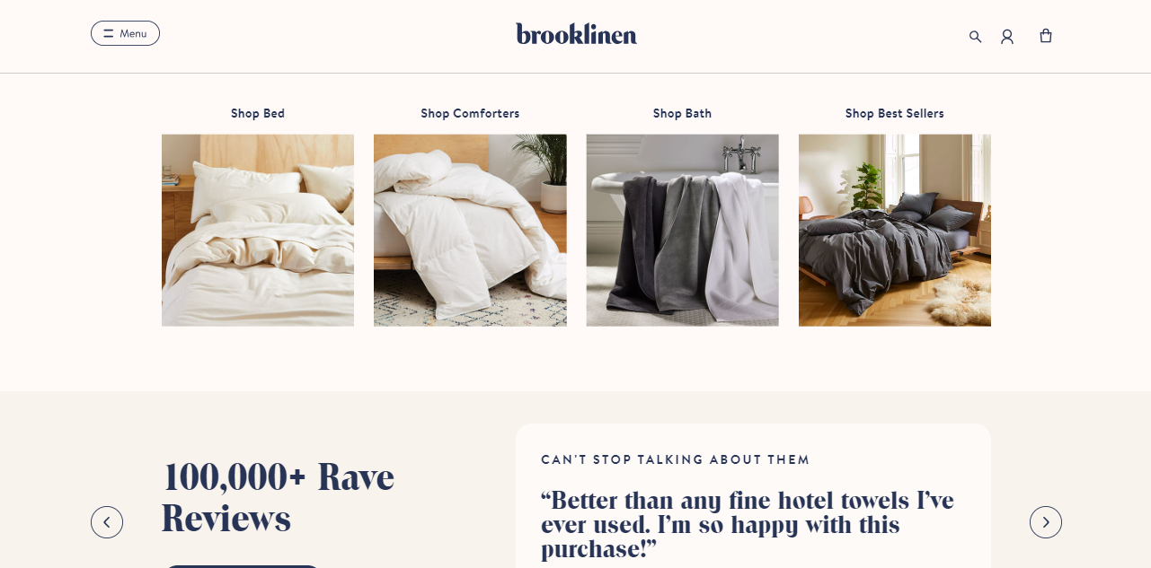
Readability and Typography:
Brooklinen, a bedding and home essentials brand, focuses on readability and typography. Their high converting website features a clean and easily readable font, ensuring that product information and website content are effortlessly understood by visitors. This attention to typography enhances user engagement and encourages prolonged browsing.
- Choose Suitable Fonts: Select fonts that are clear, legible, and align with your brand’s identity to improve the overall reading experience for website visitors.
- Optimize Font Size: Ensure the font size is neither too small nor too large, striking a balance that allows users to comfortably read the content without straining their eyes.
- Consider Line Spacing: Properly adjust the line spacing to provide enough breathing room between lines, making the text more accessible and easier to follow.
- Test for Accessibility: Verify that the chosen fonts and typography meet accessibility standards, enabling all users, including those with visual impairments, to navigate and comprehend the content seamlessly.
- Maintain Consistency: Establish a consistent typography style across the website to create a cohesive and polished appearance, enhancing brand recognition and trust among users.
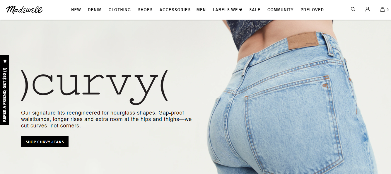
Prominent CTAs:
Madewell sets a new standard in website design, elevating the typical eCommerce experience. Their compelling use of CTAs on the homepage, featuring contrasting buttons with persuasive texts like “Check it Now,” entices visitors to take action and make purchases. This effective strategy not only drives conversions but also enhances the overall user experience, making it a truly high converting website.
- Strategic Placement: Carefully position CTAs throughout your website, especially on product pages and the checkout process, to prompt visitors to take desired actions.
- Clear and Compelling Text: Use persuasive and action-oriented language on the CTAs, such as “Add to Cart,” “Sign Up,” or “Buy Now,” to create a sense of urgency and encourage conversions.
- Eye-catching Design: Make CTAs stand out visually with contrasting colors or buttons, ensuring they catch the visitor’s attention and guide them towards taking action.
- Mobile Responsiveness: Ensure CTAs are mobile-friendly and easily clickable on various devices, as a significant portion of e-commerce traffic comes from mobile users.
- A/B Testing: Continuously test and optimize CTAs’ placement, design, and text to identify the most effective variations that work best for the website conversion rate optimization and improve the user experience. Take expert conversion rate optimization services if you are working on lean resources to redesign your website professionally.
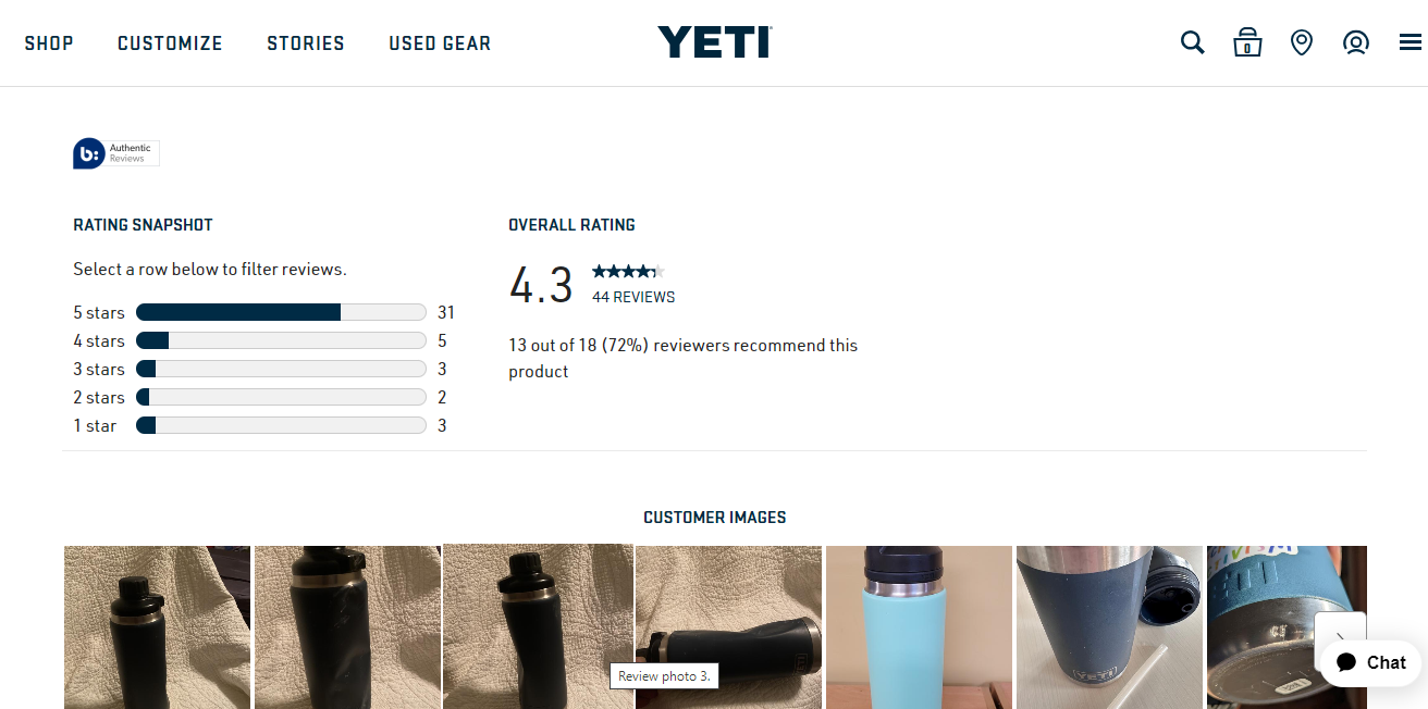
Trust Signals:
Leveraging trust signals, Yeti, a premium cooler, and outdoor gear brand, reinforces credibility with customers. Their product pages prominently display customer reviews and ratings, instilling trust in the quality and reliability of their products. This transparency positively impacts conversion rates, making Yeti a top choice among outdoor enthusiasts.
- Incorporate Security Badges: Display recognized security badges to assure visitors of a safe and secure online shopping experience, boosting their confidence in making a purchase.
- Showcase Customer Reviews: Feature genuine customer reviews and ratings on product pages to provide social proof and build trust in the quality and reliability of your products.
- Seek Endorsements from Trusted Organizations: Obtain endorsements from reputable organizations or influencers to further enhance your brand’s credibility and instill confidence in potential customers.
- Consistency is Key: Maintain a consistent presence of trust signals across your website, ensuring they are visible and accessible to visitors at crucial stages of their shopping journey.
Attention-Grabbing Banners:
Utilizing attention-grabbing banners, Away, the travel and luggage brand, entices website visitors effectively.
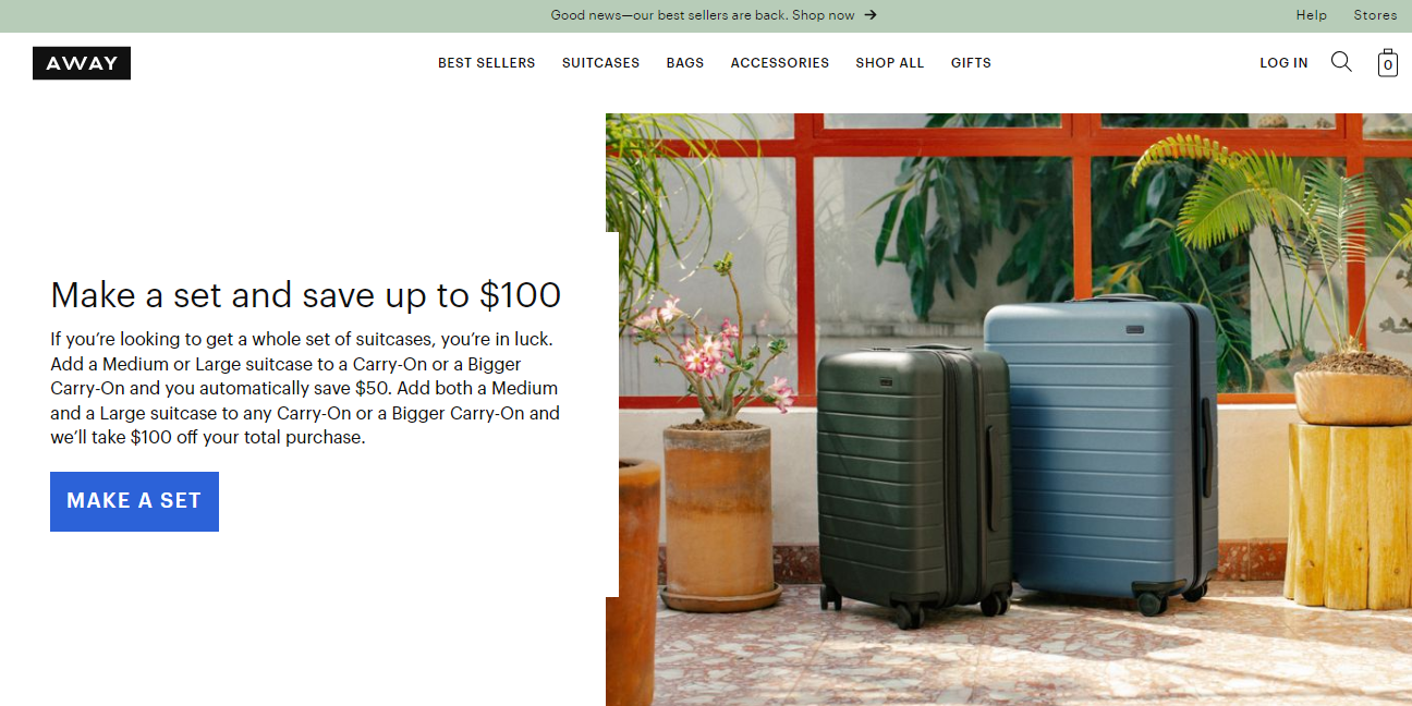
These vibrant banners feature enticing texts such as “Limited Time Offer,” “Refer a friend, get $20,” and “Make a set and save up to $100,” creating a sense of urgency that drives conversions and captures visitors’ interest.
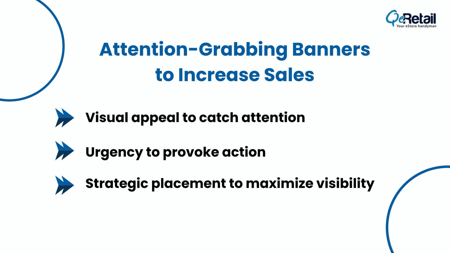
- Visual Appeal: Create visually captivating banners that stand out and draw attention to promotions, discounts, and special offers.
- Urgency and Action: Craft persuasive texts on banners to create a sense of urgency, motivating visitors to take immediate action.
- Strategic Placement: Position attention-grabbing banners prominently on the website to ensure maximum visibility and impact.
- Limited Time Offers: Utilize banners to highlight time-sensitive deals and offers, prompting customers to act quickly before the opportunity expires.
Seamless Checkout:
A subscription-based razor and grooming products brand, Dollar Shave Club, enhances user experience by streamlining its checkout process.
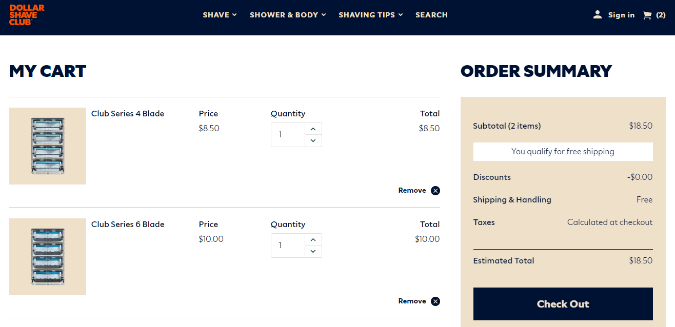
The high converting website features a one-page checkout that ensures a hassle-free experience for customers, reducing cart abandonment and working wonders for conversion rate optimization.
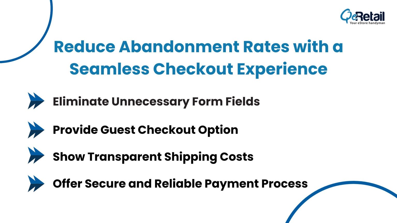
- Simplify Checkout Flow: Optimize the checkout process with a streamlined flow, minimizing steps and distractions to create a seamless and efficient experience for customers.
- Eliminate Unnecessary Forms: Request only essential information from customers during checkout, avoiding unnecessary form fields that may deter them from completing the purchase.
- Provide Guest Checkout Option: Offer a guest checkout option to eliminate the need for customers to create an account, making the process quicker and more convenient.
- Transparent Shipping Costs: Clearly display shipping costs and any additional fees upfront to avoid surprises at checkout, which can lead to cart abandonment.
- Secure Payment Process: Ensure a secure and reliable payment gateway to build trust with customers, assuring them that their sensitive information is protected during the checkout process.
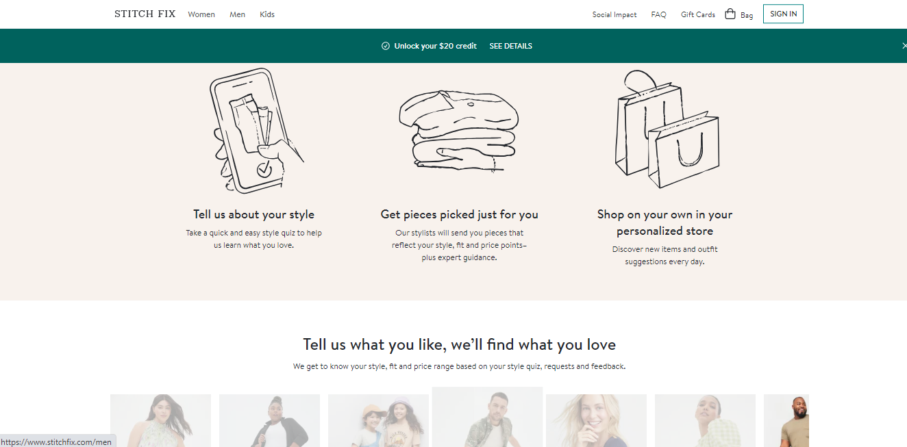
Personalization:
An online personal styling service, Stitch Fix, stands out with its exceptional personalization. Using data-driven algorithms, they curate personalized clothing recommendations tailored to customers’ style preferences and feedback. This individualized approach fosters a strong connection with customers, resulting in higher conversion rates.
- Understand User Preferences: Gather data on individual preferences and behaviors to gain insights into customers’ interests and shopping habits.
- Implement Customized Recommendations: Utilize data-driven algorithms to offer personalized product recommendations, enhancing user engagement and encouraging conversions.
- Tailor Content: Create personalized content based on user interests and past interactions to provide a more relevant and engaging website experience.
- Utilize Behavioral Triggers: Implement behavioral triggers to prompt personalized offers and incentives, increasing the likelihood of conversion.
- Constantly Improve: Continuously analyze user data and feedback to refine personalization strategies and deliver an ever-improving user experience.
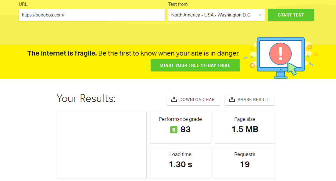
Fast Load Times:
Bonobos, a men’s clothing brand, prioritizes fast load times on its website. Their streamlined design and optimized loading speed ensure that visitors can quickly access product pages and checkout, reducing the risk of abandonment and improving conversions.
- Prioritize Speed: Focus on optimizing load times to retain visitors and reduce bounce rates caused by slow-loading pages.
- Optimize Website Performance: Implement strategies such as image compression, browser caching, and efficient coding to ensure faster load times.
- Mobile Responsiveness: Ensure your website is mobile-friendly and loads quickly on various devices, as mobile users make up a significant portion of online traffic.
- Impact on Conversions: Fast load times positively impact conversion rates, increasing the likelihood of visitors making a purchase or engaging with your website.
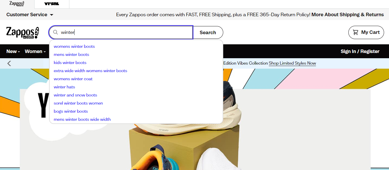
User-Friendly Search Functionality:
Zappos, an online shoe and clothing retailer, incorporates a user-friendly search functionality. Their website’s search bar offers real-time suggestions as users type, making it easier for customers to find specific products quickly. This enhances customer satisfaction and increases the likelihood of conversions.
- Prioritize User-Friendly Search: Implement an efficient and user-friendly search function to simplify product discovery for visitors.
- Intuitive Search Bar: Design an intuitive search bar with relevant suggestions that enhance the user experience and aid in finding desired products.
- Autocomplete and Suggestions: Provide autocomplete and relevant search suggestions to assist users in finding products more quickly.
- Search Result Accuracy: Ensure search results are accurate and relevant, helping visitors find what they are looking for easily and efficiently.
Interactive Product Filters:
An online furniture and home decor retailer, Wayfair, elevates the user experience by offering interactive product filters on its website. With the ability to easily narrow down search results by selecting preferences like style, material, or room type, visitors find the perfect products effortlessly. This intuitive feature enhances user engagement and contributes to conversion rate optimization.
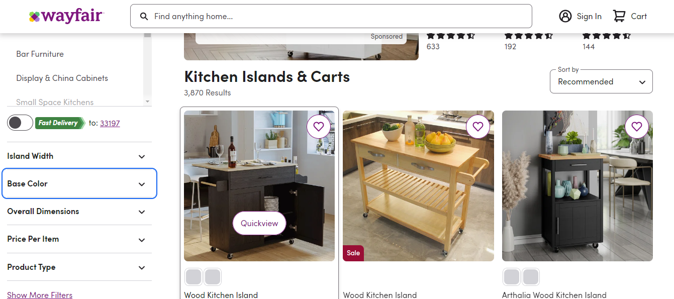
- Enable Interactive Filters: Implement interactive product filters on your website, allowing visitors to refine search results based on specific criteria like size, color, or price range.
- User-Friendly Design: Ensure the filters are easy to use and navigate, providing a seamless experience for users searching for products.
- Relevant Filtering Options: Offer a diverse range of relevant filtering options that align with your products and customers’ preferences, improving the search process.
- Efficient Search Results: Ensure the filters provide accurate and tailored search results, helping users find products that match their preferences more effectively.
Sticky Header for Easy Navigation:
Huckberry, a men’s lifestyle and outdoor gear brand, employs a sticky header on its high converting website. The header remains visible at all times, allowing users to navigate the site effortlessly, even when exploring lengthy product pages. This seamless navigation positively impacts conversion.
- Implement Sticky Headers: Incorporate sticky headers on your website, ensuring essential navigation elements remain visible and accessible as visitors scroll down.
- Enhance User Convenience: Sticky headers provide easy access to navigation, improving user convenience and overall browsing experience.
- Reduce Friction: With fixed navigation at the top, users can quickly move through the website without having to scroll back up, reducing friction and frustration.
- Keep it Clean and Clear: Design the sticky header to be clean and unobtrusive, ensuring it complements the overall aesthetics of the website without being distracting.
Clear Shipping and Return Information:
Warby Parker provides clear shipping and return information on its website.
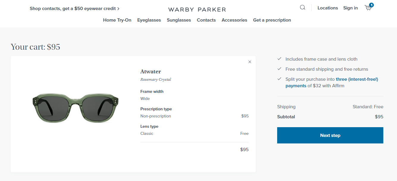
A dedicated section outlines their shipping options, delivery times, and return policies, ensuring transparency for customers. This clarity builds confidence and encourages conversions.
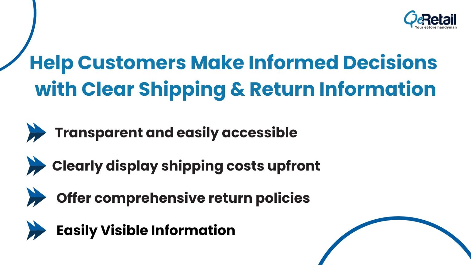
- Transparency is Key: Provide transparent and easily accessible shipping and return information on your website to instill trust in potential buyers.
- Clear Shipping Costs: Clearly display shipping costs upfront, ensuring visitors have a clear understanding of additional expenses before making a purchase.
- Comprehensive Return Policies: Offer comprehensive and customer-friendly return policies, assuring buyers that they can easily return products if needed.
- Visible Information: Place shipping and return details prominently on the website, making it easy for visitors to find and understand, thereby increasing the likelihood of conversions.
Engaging Video Demonstrations:
Purple, a mattress and sleep product brand, utilizes engaging video demonstrations on its website. These videos showcase the unique properties of their mattresses, such as pressure relief and motion isolation. Engaging videos increase customer engagement and contribute to the conversion rates of a high converting website.
- Engaging Visuals: Incorporate video demonstrations to showcase products in action, capturing customers’ attention and increasing engagement.
- Enhance Product Understanding: Videos effectively convey product features and benefits, helping customers visualize potential purchases more effectively than static images.
- Boost Sales: Engaging videos can lead to higher conversion rates and making your eStore a high converting website as customers gain a better understanding of the product and its value.
- Showcase Real-Life Usage: Use video demonstrations to showcase real-life usage scenarios, building trust and confidence among potential buyers.
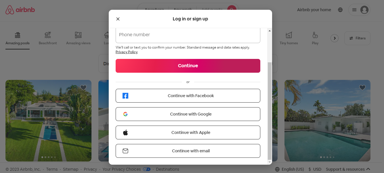
Seamless Social Media Integration:
Airbnb operates an online marketplace for short-term homestays and experiences. They use a variety of platforms to connect with their audience. They display user-generated content from their loyal customers, showcasing stunning photos of their properties, as well as photos of guests enjoying their stays This integration enhances brand credibility and encourages conversions.
- Integrate Social Media Platforms: Implement social media integration to allow visitors to engage with the brand across various platforms seamlessly.
- Leverage User-Generated Content: Encourage user-generated content to build trust and authenticity, showcasing real customer experiences and testimonials.
- Harness Social Proof: Display social proof, such as customer reviews and ratings, to instill confidence in potential customers and foster a sense of community.
- Create a Connected Experience: Use social media integration to create a cohesive and connected brand experience, enhancing customer engagement and loyalty.
Make Your eStore a High Converting Website:
You’ve discovered the secrets of high converting eCommerce websites inspired by top brands like Warby Parker and MVMT. Clean layout, consistent branding, mobile responsiveness, persuasive content, and intuitive navigation are the keys to success.
But there’s more! Unlock your e-store’s potential with a personalized conversion diagnosis from QeRetail. Our experts will analyze your audience and provide tailored solutions for higher conversions.
Don’t miss out on customers! Click the CTA now to connect with us and revolutionize your e-commerce success. Unleash your e-store’s potential today!