eCommerce websites earn their bread and butter from a well-established online presence! And building a credible online store is a no joke. There are at least a hundred aspects that need to be taken care of. From eCommerce website design to optimizing them for search engines, it is an effort taking task. When crafting your eCommerce website for conversions, some factors are more important than others, and then comes the factors which are unmissable! Today’s episode will highlight those eCommerce mistakes in website designing that can cost you dollars in terms of lost sales if ignored.
Mastering varied customer preferences and serving them the way they like is almost impossible! Getting into each and every customer’s shoes and creating a seamless online shopping experience for them is what all eCommerce stores are struggling for. Not only website visitors but now there are intuitive and smart search engines that we need to cope with. Let’s get started with top eCommerce website design mistakes that might turn your sales down if not handled with care!
eCommerce Mistakes in Website Designing
1. No Favicon
Creating an identity that stands out is vital when you’re competing in this digital age! Shoppers are smart enough to compare on various eCommerce platforms before making a purchase decision.
When there are multiple tabs open in a browser (mostly in desktop), Favicons make it easy to shift between the desired tabs. Unique identity can be differentiated with a Favicon that represents either your logo or a specified element of your eCommerce store. It would be a mistake if your eStore doesn’t have a Favicon or a shortcut icon that people can relate to. There are higher chances you might get lost between the tabs because shoppers aren’t going to waste time if you’re not remarkable! This small-sized, square sized graphical representation is essential since Google has added website icons in SERPs. Take a look at the following examples of Favicons from Google, QeRetail, Macy’s, and Walmart in a single browser.

2. Using Website Carousels
Carousel ads are making a mark on social platforms. Facebook, Instagram, even LinkedIn offers this marketing functionality to users. But the catch here is that they are ‘Ads’. When placed on an eCommerce store’s home page, carousels are not appreciated, especially the auto changing carousel banners.
It is essential for online stores to highlight different collections, offers, and products on their home page, but using carousels for the same might go wrong! The short attention span of shoppers gets distracted with changing banners and they might lose focus from one particular thing. The use of carousel banners has reduced drastically due to mobile responsiveness errors and usability pitfalls. However, there are still significant numbers of eCommerce stores, 28% of the top US and European eCommerce desktop sites to be specific, that still use carousel banners on their home page. Banner placement should be such that it catches users’ eyes and not annoy them. If used strategically, per se with proper autorotating time span, paused over cursor hovering, and implementing manual carousels for mobile sites, homepage carousels can still work!
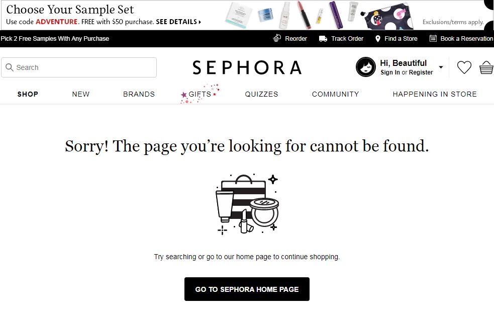
3. No Custom 404s
eCommerce sites are always updating, and with every new product addition, offer applied, content altered or product removed, there are chances of your online store generating 404 pages. Search engines will display a standard 404 message whenever a user will click onto such URLs, but have you thought of the amount of difference that a custom 404 page could make rather than just a dull, boring ‘Page Not Found’ message?
It is one of the website optimization best practices to design custom 404s for better user experience and conversions.
Online stores can divert the visitors to their home page or specific category pages as per the search query they enter. This buys you some more time from the visitor who might otherwise close the tab abandoning your website. Take a look at Sephora’s custom 404-page example for the inspiration.
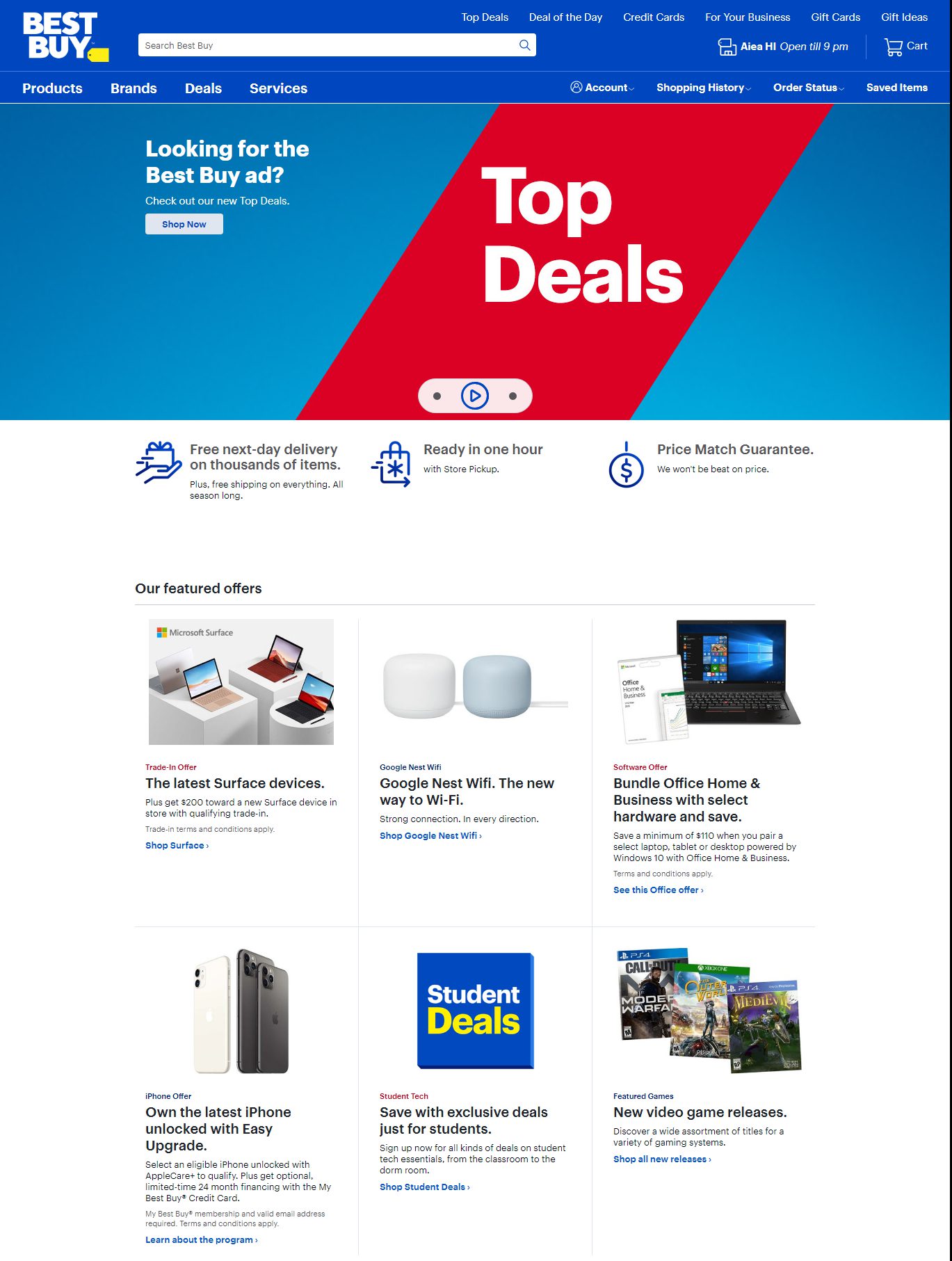
4. Improper Use of White Space
A vital aspect of eCommerce website design is the right use of white space. From white space, we mean the areas on your website pages that should be left blank. The proper use of white space improves readability and focus. Where you place CTAs on your eStore and when you highlight a discount offer, there should be a balance between those focus areas and the blank space you utilize to grab the attention.
The utilization of the white space should be strategic enough to serve your purpose of clarity. You can take a look at Best Buy’s home page. The broad banner and aligned product list portrayal leaving the blank white space on both the sides draw targeted attention to each element present.
5. Right Logo Placement
Other than providing branding benefits, the logo on your online store works as a ‘back to home’ link. Visitors tend to click on the logo more rather than pressing ‘back’ multiple times. It might seem a small factor but creates a huge impact! User experience is everything in an eCommerce business and the smallest design details make a difference. The logo on the upper left corner of the website is accepted and appreciated globally. Even if you’re trying new ways and put it in the middle of the website, users might feel it unusual and not likely to click on it. Center aligned logos are difficult to navigate as per logo placement effect studies.
It is not right for every brand, but if you’re not to mend shopper trends a lot, it is advisable to place it in the upper left corner. Wherever you put it, don’t forget to direct it to your homepage!
6. Poor Navigation
It is way too important for eCommerce businesses to provide difficulty-free website navigation. When there are categories, subcategories, and long product lists, users should be conveniently moving from one webpage to others. They should be able to browse more to shop more and this is possible only with swift navigation.
The use of website breadcrumbs, links to important pages, quick checkout process and more are unmissable navigation factors. Distracting or scrolling navigators might help you with visual cues but not in sales. Read more about effective eCommerce store features that help in conversions.
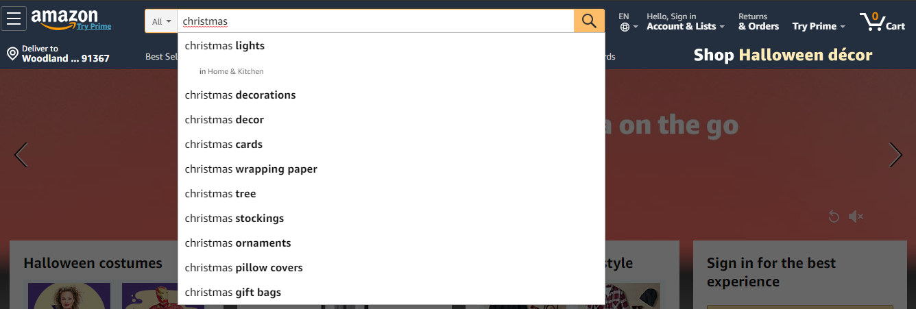
7. Poor Site Search
An unsupportive intuitive site search will hinder the product search experience for the visitors.!Being able to find the right product or at least ending up with a similar product list should always be present in a shopping site. embed an optimized site search option on your eCommerce websites for the ease of access. When users types search queries, they tend to make spelling errors by entering wrong names, categories, or types, enable a site search that still shows results with typos and half-matched queries. Provide intuitive drop-down search options for faster and easier product searches. Check out Amazon’s example below.
8. Website Responsiveness
If your online store isn’t responsive, the aforementioned seven design eCommerce mistakes are unlikely to work for you the way to desire. If users need to zoom-in zoom-out for a particular text in their mobile device, there are higher chances they might abandon your website. Regardless of the device, your eCommerce website should be able to adapt to various screen sizes and operating system functionalities. Visitors being able to open your eStore on their device is not enough, there should be impactful content readability, user interface, and feature operations too.
Google considers mobile responsiveness as one of its ranking factors as people are turning towards using their smart devices more for browsing. This update is no news and is here for almost 4 years now. Google even lets you test your webpage URLs for mobile-friendliness. Optimizing your eCommerce store for multiple devices increases your credibility online (search crawlers) and helps you provide a seamless online shopping and browsing experience for your website visitors. Responsive web design is a technique of building web pages that change how they look and respond. If you’re still not fixing this inescapable eCommerce mistake, then you should already bid adieu to website conversions. Take a look at an example below for how webpages should alter with devices.

9. Inappropriate Typography and Font
Powerful content can save the day when it comes to online shopping as shoppers can’t look and feel the product themselves. It should be your words that can convince them to make a purchase. Appropriate use of typography and font is an essential element of eCommerce. However strong your sales appeal is or how well you’ve explained the product features, if it won’t read good, it is of no use! Your typography and selection of font should be neat enough to grab the attention and hold it. Using exaggerated, too flashy or too much cursive fonts makes it difficult to read your content.
Cognitive understanding is related to how well the readers can perceive what you’ve written and process it. If that element is missing in your website typography, you should rethink and restructure it.
eCommerce fonts, again being an important aspect should be properly aligned, line-spaced, and in sync. If the lengths and widths of the font visuals create an inappropriate reading experience, then you won’t be able to please your visitors for precision. These eCommerce mistakes in font and typography kill the visual appeal of website design! Visualize, compare, and render your fonts to provide an ultimate user reading experience.
10. Lousy Product Photos
No matter how conversion-optimized your eCommerce content is, the first thing to catch attention will always be the visual representation! Product photos undeniably play a major role in online shopping. eStore entrepreneurs should never hesitate to invest on good product photography as 93% of consumers consider visual appearance to be the key deciding factor in a purchasing decision.
Most online stores chose a white background for their product photography. A consistent product photo representation adds value to the branding as well. There are two signified types of product photos,
- Plain-cut, white background product-only photos
- In-context, lifestyle photos
Choosing any one of the types or amalgamating the two to offer a more detailed product understanding experience is entirely up to you and the array of products you sell. Putting up false, misleading, or manipulated photos may cost you credibility and customer trust. The story does not end here, image optimization for better search engine ranking is yet another product photo element that shouldn’t be ignored. Optimize each and every image with alt+tags, file names, and image sitemaps. Image SEO is as important as the website SEO is!
Final Word
Affixing eCommerce mistakes in website designing is crucial for impeccable and impactful user experience. Winning the customers is not easy, but building an online store that covers major optimized website designing features is a thing that we can try! Try fixing the mentioned designing eCommerce mistakes on your website, and if you get stuck anywhere, get in touch with eStore handymen; we can sort you out!