An eCommerce store’s sales can plummet for many reasons and your eCommerce store design could be one of the biggest culprits. All your marketing efforts will amount to nothing if your eCommerce store is not ready to convert its visitors into customers.
One of the easiest ways to make things right is by regularly studying the competition and take a note of their strong points and identify which are the areas that will need improvement.
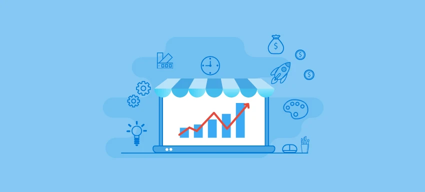
Given below are the 5 key aspects essential for any eCommerce store design to have skyrocketing sales:
#1 Use Quality Pictures
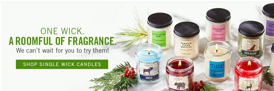
If your eCommerce design doesn’t have quality images it will leave a bad impression on your site visitors. If the images were taken in low light conditions, make sure you adjust their brightness. If your images are getting pixelated you must re-shoot the products with a good quality dslr camera. If you have some extra budget, go with a professional photographer. It may shoot up your budget but it will consolidate your impression as a professional seller. Here’s a banner which has some really nice product images.
You can read here on how to take professional quality product pictures with an iPhone
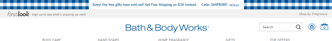
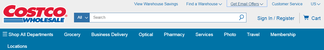
#2 Get The Color Psychology Right
You will have to choose the right color theme for your eCommerce store design. If you notice carefully, most of them are trying to maintain a consistent color scheme throughout the portal. Your brand colors will help your customers remember you even when they are not on your website. If you haven’t decided on your brand color yet, then study your competitor’s website. Most websites follow a consistent color pattern for their specific business domain. For example – Black is very popular in apparel industry. Different shades of Pink are commonly used in beauty and fashion industry. If you haven’t made up your mind for choosing one brand color, Blue and Black are safe options to begin with as they are the most commonly used theme colors in eCommerce. Please stay away from adding too much colors on your website as it tends to distract your customers and they might even get completely overwhelmed.
![]()
The ideal way to test is to do a survey among a small group of people in your network who would give you an honest feedback on your color scheme. You get what we are trying to say here, right?
#3 Infuse Website With Intuitiveness
Do a frank analysis of your own eCommerce store and ask yourself how intuitive its design is to a visitor. Is it really intuitive enough for the visitors to find their way around the website. Discuss it with your close group of friends and colleagues who would share their unbiased feedback with you. You would be surprised to know how different people experience your website.
There are tools available out there which can help you find out which are the areas in your eCommerce store design that can be improved.
Tools like Lucky Orange, Hot Jar and Crazy Egg can track the user movement on your website and give you insights about where and how people are interacting with your website’s content.
#4 Keep Up With Current Trends
We live in a world where anything that was done yesterday is no longer considered fresh. The web design you painstakingly put together along with the designer is no longer appealing. Unfortunately, you will have to go through the whole process all over again.
Your website should be in sync with the current UI/UX design trends that are being followed. Ideally an eCommerce store design should be given a facelift every 6 months. Not to mention the holiday season theme you will have to additionally keep updating every year.
You may even outsource this work to an agency which is good at eCommerce store design. In case you want to go for a quick fix you can begin with replacing the home page banners with new ones.
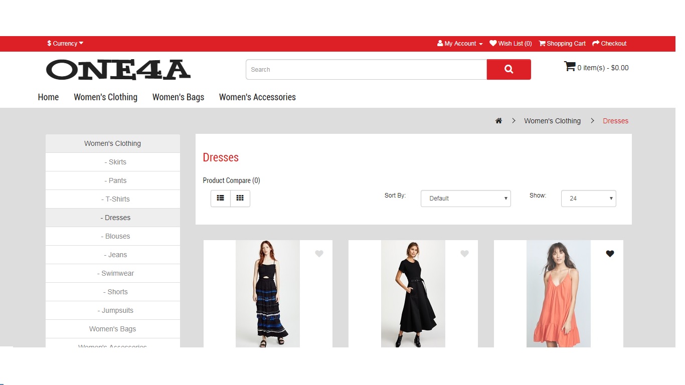
#5 Well Defined Product Categories
A website which doesn’t offer well defined product categories to its visitors will not be able to retain them for too long.
Clubbing all men related articles and accessories under one generic category ‘Men’ is a very lazy way of marketing your products.
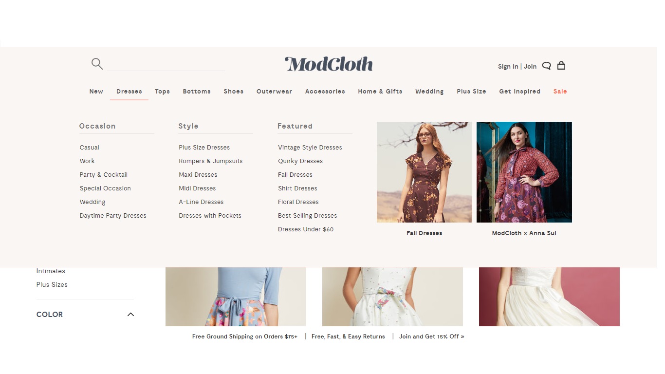
All your products should have clearly identified specific headers under which they should appear. You can take a look at the following two websites. If you were looking to buy dresses on this website you would have to keep scrolling and go through all their pages.
Whereas the second website offers you additional sub categories like ‘casual’, ‘style’, and ‘featured’. Again under each of these individual categories you have multiple categories to choose from.
Bonus: Tighten Up Your Content
Content may not be considered an eCommerce store design element but it goes hand in hand with your eCommerce store’s overall experience. You don’t want a misplaced comma or a typo to become the eyesore for your visitors. It may be a harmless mistake but at the end of the day your brand takes the beating. The worst thing that can happen is that people find the developer text – ‘Lorem Ipsum’ still residing in the website.
Follow a regular regimen of content audit for your website and make sure you religiously follow it.
Now before you leave we would like you to get some inspiration from these three awesome eCommerce store designs.
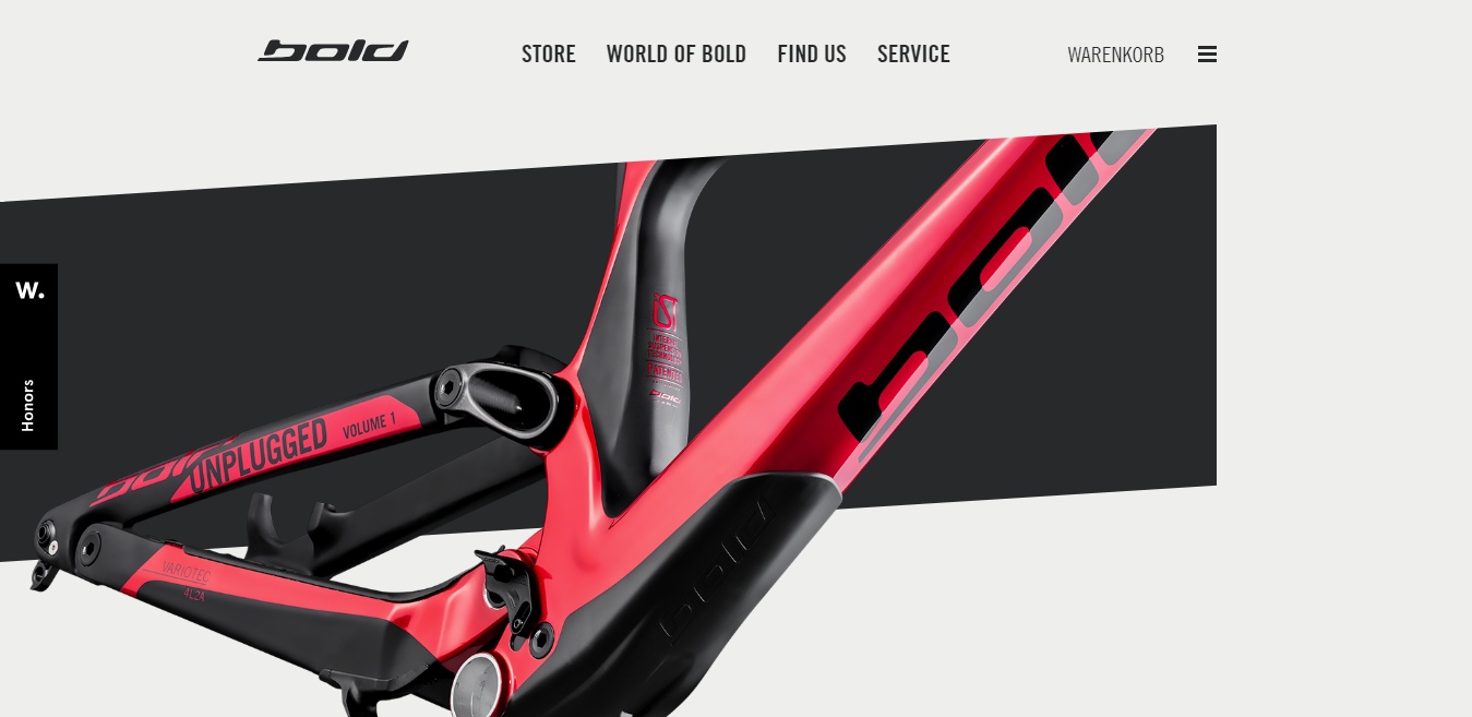
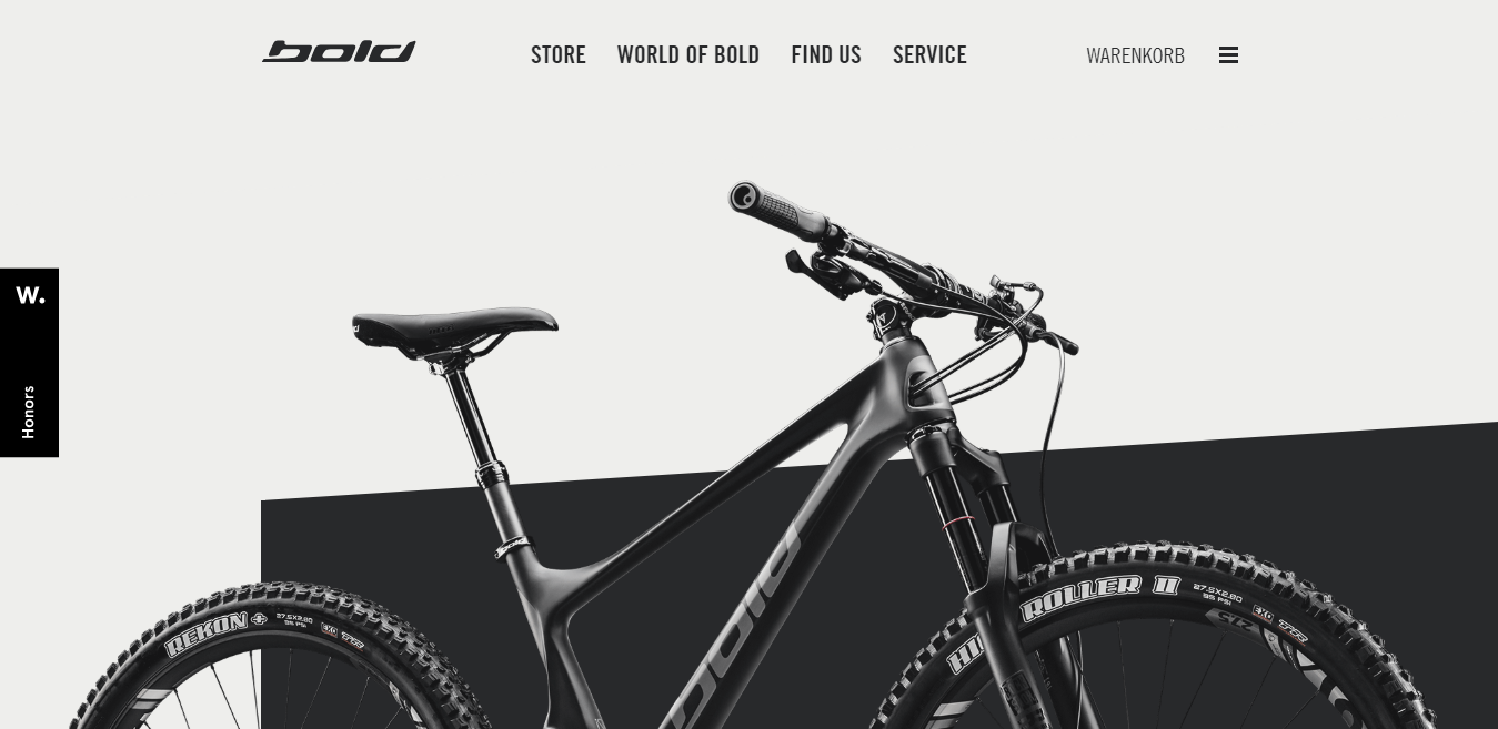
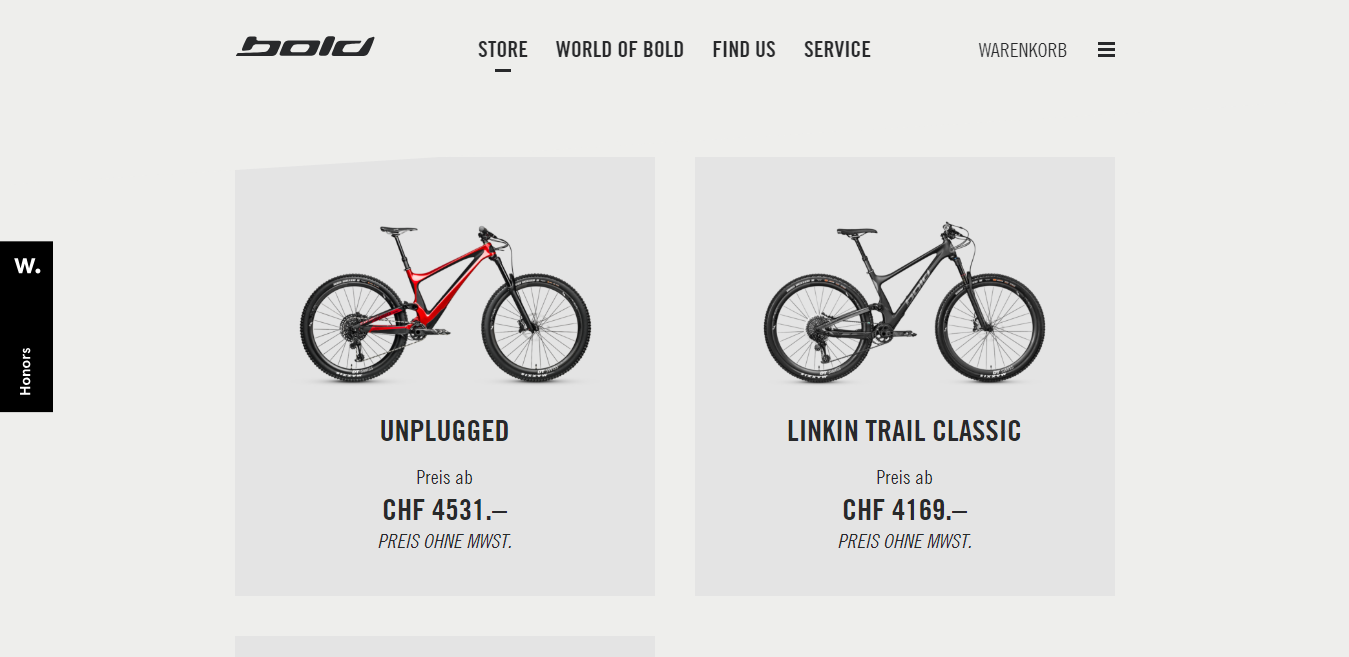
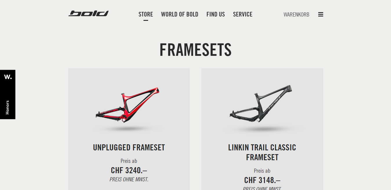
1. boldcycles.com
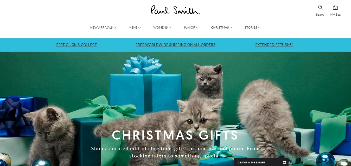
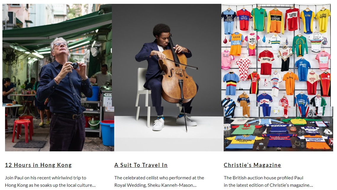
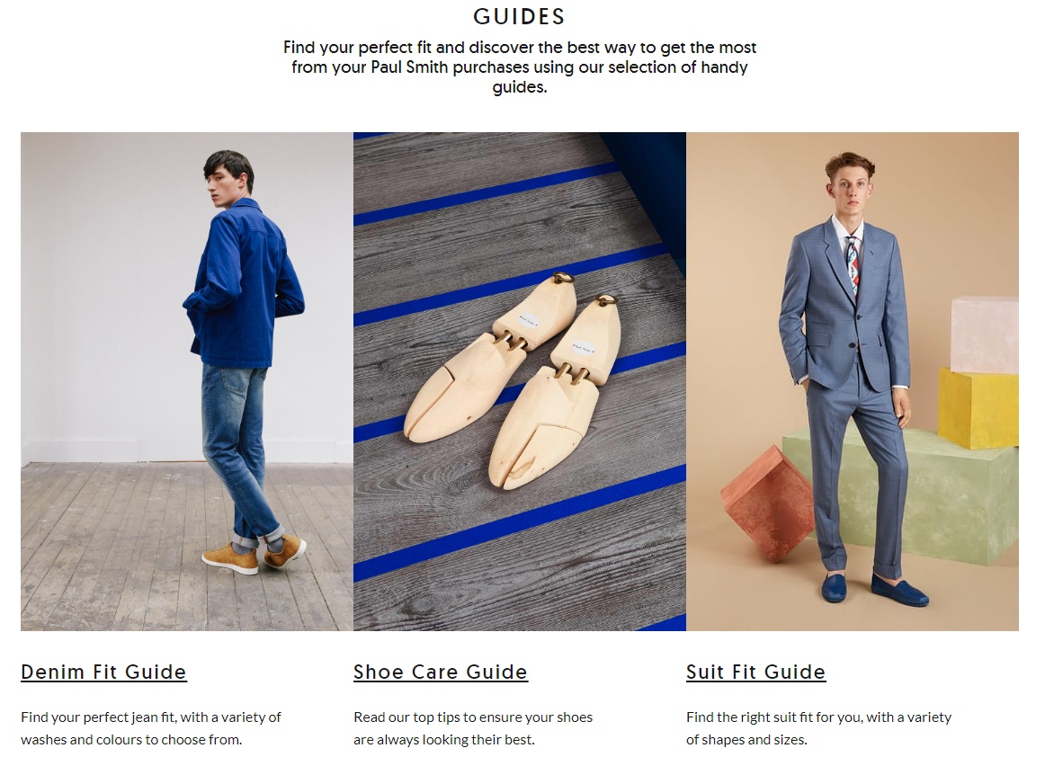
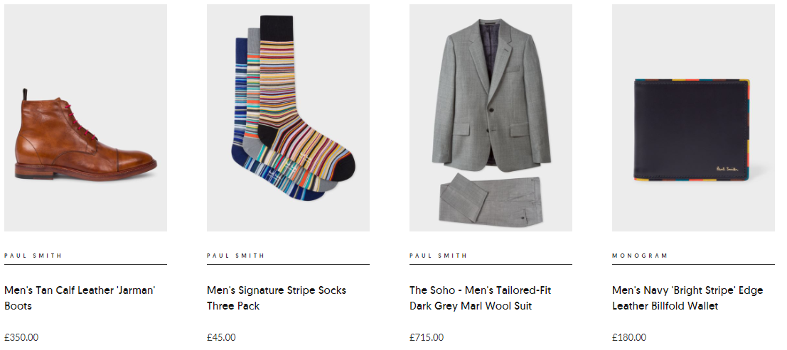
2. paulsmith.com
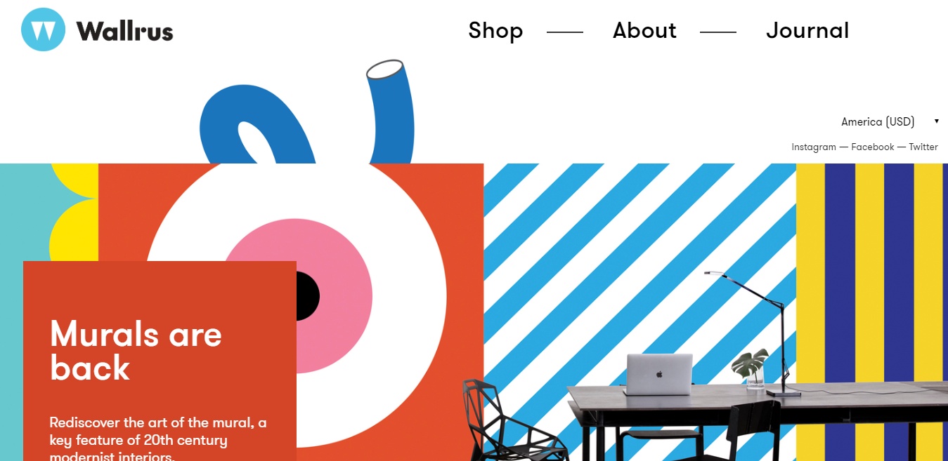
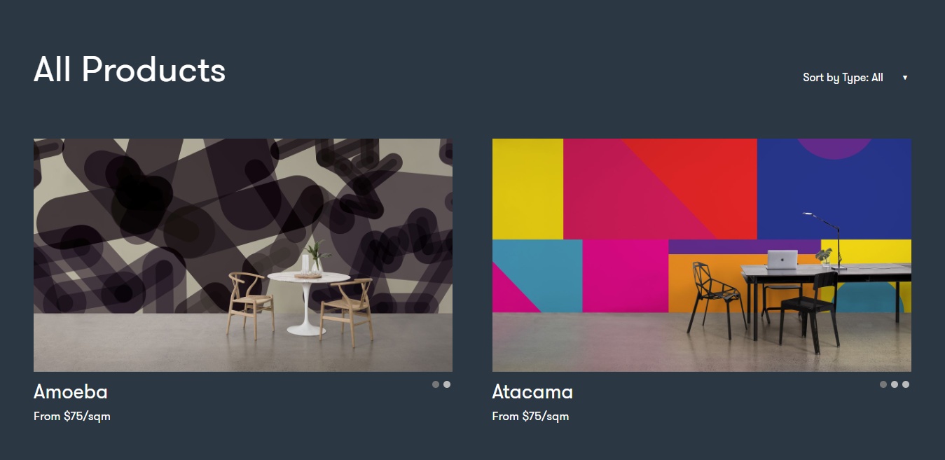
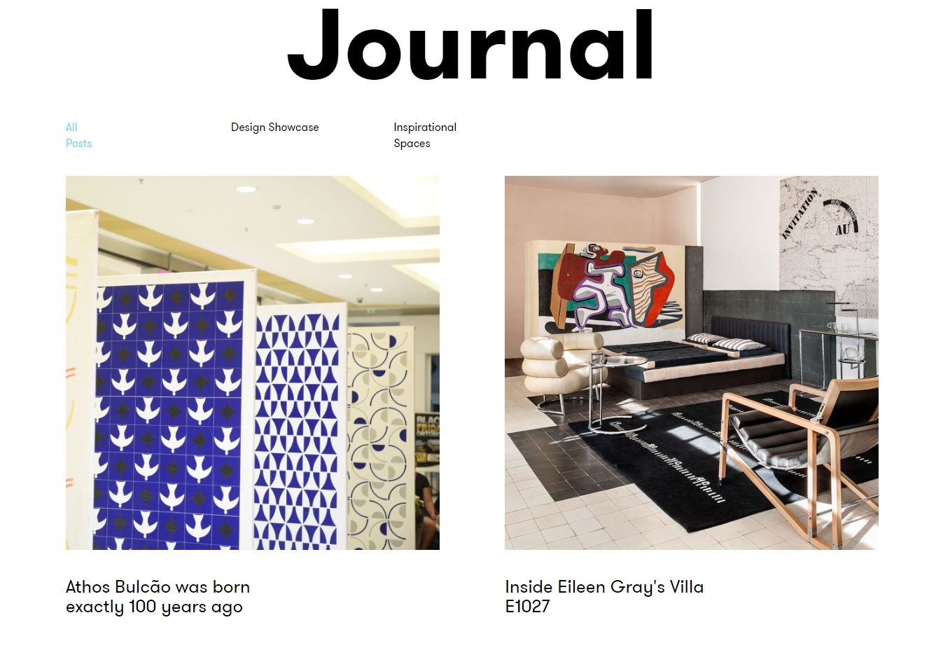
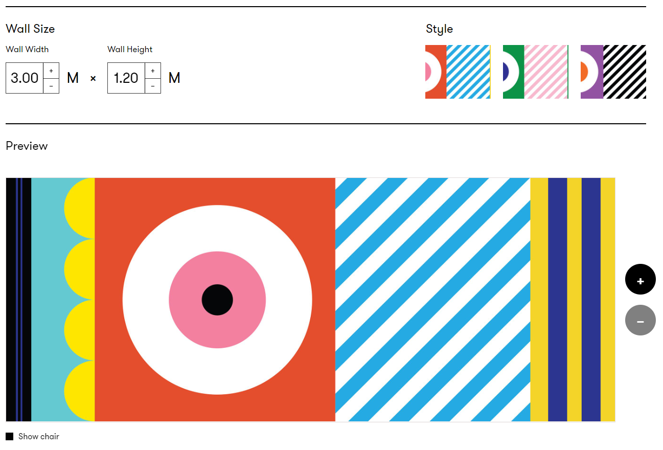
3. wallrus.net