Your Shopify store may be optimized for mobile screens, but that does not always mean it is optimized for mobile behavior.
A responsive theme can adjust layouts. Images can resize correctly. Pages can load properly. Yet customers may still struggle to complete actions because the experience is not designed around how people physically interact with smartphones.
Mobile shoppers do not navigate stores the same way desktop users do. They browse with limited screen space, rely heavily on thumb movement, and expect important actions to appear naturally where their hands can reach them.
For Shopify stores, this becomes even more important because every interaction influences buying momentum. Finding a product, selecting a variant, opening filters, adding items to cart, and moving through checkout all depend on how efficiently customers can interact with the storefront.
Thumb-zone optimization focuses on a simple question:
Can customers complete important actions comfortably without unnecessary effort?

Key Action Points Summary
Before auditing your Shopify store’s mobile thumb-zone experience, review these important areas:
- Review placement of primary purchase actions
- Test navigation using one hand
- Improve mobile search accessibility
- Simplify product selection flows
- Check button size and spacing
- Review sticky elements across mobile pages
- Test forms and checkout interactions
- Analyze mobile customer behavior patterns
- Remove unnecessary interaction steps
- Validate UX changes on real devices
Quick Wins: Do These Before Anything Else
These improvements can be tested quickly and help identify immediate mobile usability issues.
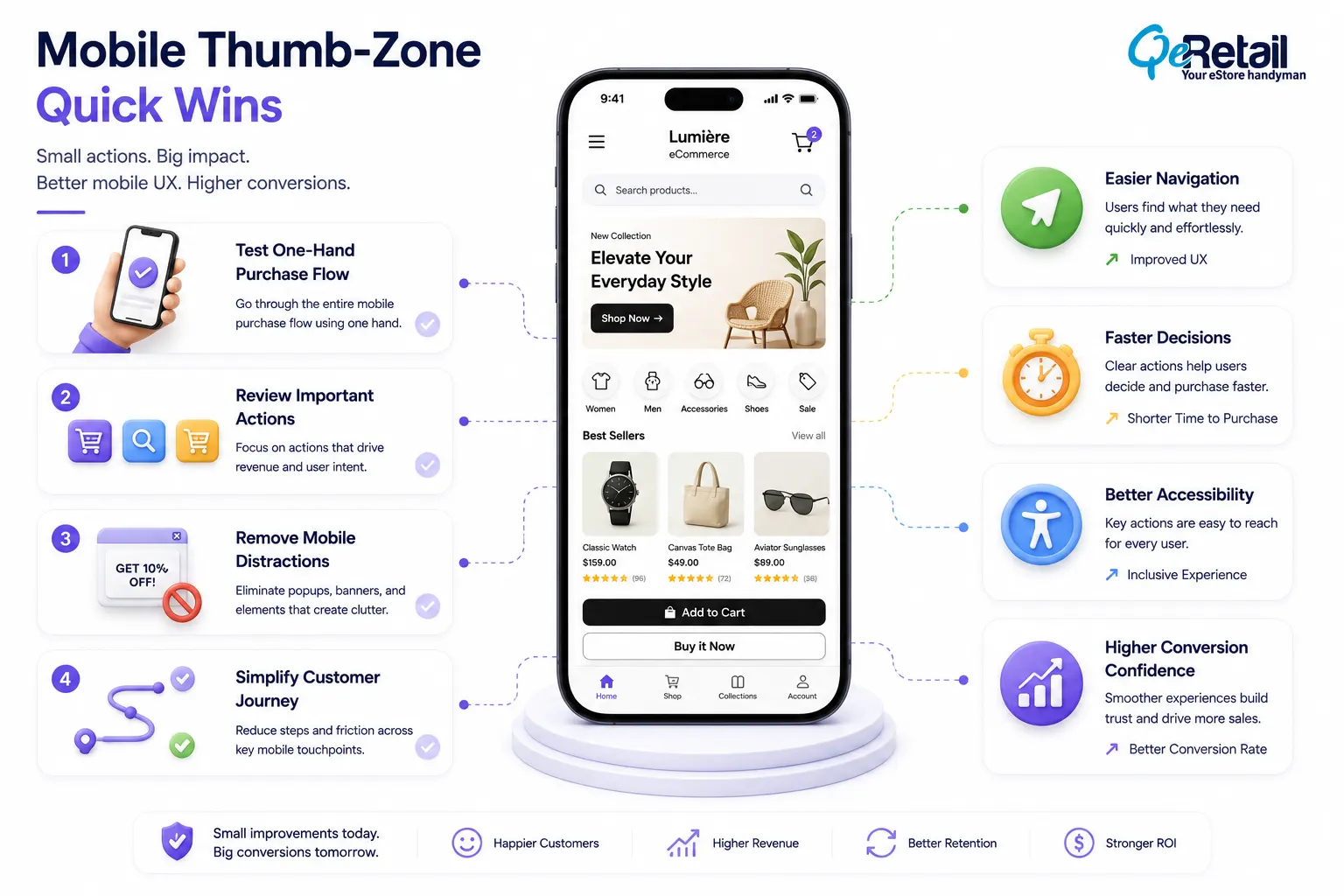
1. Complete a Full Purchase Journey Using One Hand
Open your Shopify store on a smartphone and complete the journey from homepage to checkout.
Notice where you need to adjust your grip, stretch your thumb, or search for important actions.
Result: You identify interaction barriers that standard analytics may not reveal.
2. Review Your Most Valuable Mobile Actions
Identify the actions that directly influence revenue:
- Add to cart
- Product search
- Variant selection
- Checkout initiation
Make sure these actions are easy to access without excessive scrolling or repositioning.
Result: Customers can move faster through important conversion steps.
3. Remove One Unnecessary Mobile Distraction
Review popups, floating widgets, promotional banners, and additional buttons.
If an element does not support product discovery or purchase completion, test removing it.
Result: A cleaner interface improves customer focus.
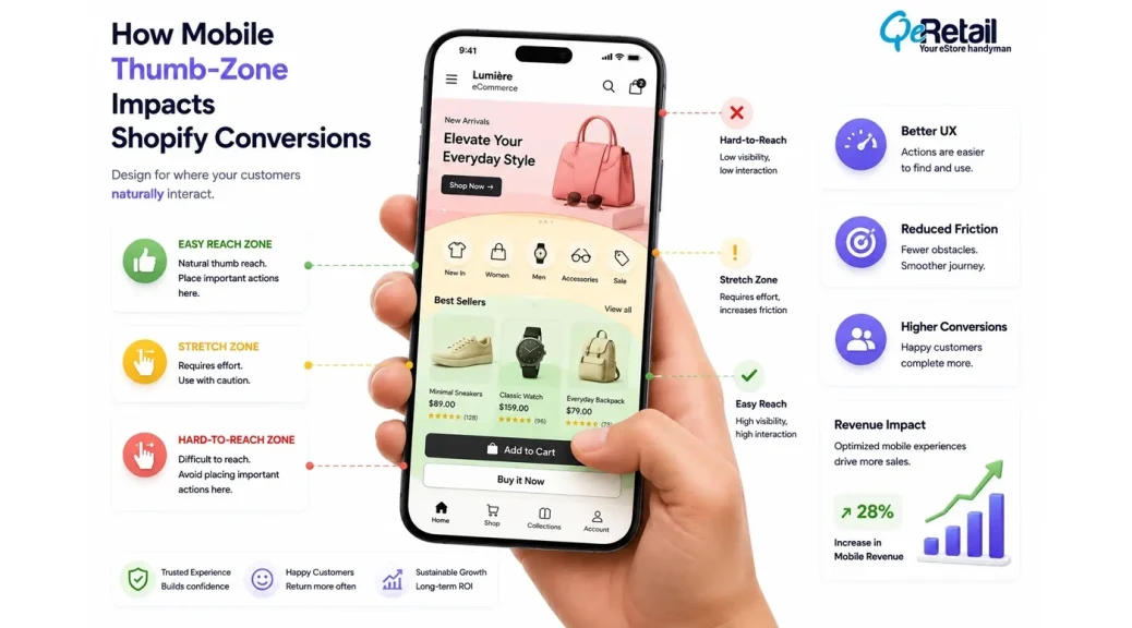
Why Thumb-Zone Optimization Matters for Shopify Stores?
When users hold a smartphone, their thumb naturally reaches certain areas more easily than others. Actions placed within these comfortable zones require less effort and feel more intuitive.
For Shopify stores, this can influence everything from product discovery to checkout completion.
A customer may like a product but struggle to find the right variant or selector. They may want to add an item to the cart but repeatedly miss a small button. They may want to filter products but abandon the collection because controls feel difficult to access.
These moments seem minor individually.
But across thousands of mobile sessions, small interaction problems can affect engagement, conversion rates, and revenue efficiency.
A thumb-zone audit helps store owners understand whether their mobile experience supports natural customer behavior or creates unnecessary interaction friction.
In our Shopify UX evaluations, we have reviewed 20+ mobile storefront experiences where the biggest usability gaps were not related to broken functionality. They were caused by small interaction decisions such as button placement, navigation depth, and crowded mobile layouts.
7 Things to Check in Your Shopify Store’s Mobile Thumb-Zone Experience
1. Are Your Primary Conversion Actions Easy to Reach?
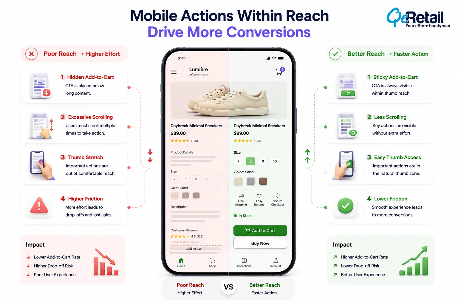
The most important actions in your Shopify store should also be the easiest to access.
Many stores design mobile pages by simply adapting desktop layouts. While the design may technically work, the placement of important actions may not match how customers naturally interact with their devices.
For example, an Add-to-Cart button positioned too far below product details forces shoppers to scroll repeatedly before taking action. A checkout button hidden behind unnecessary sections can delay purchase intent at the most important moment.
In approximately 40% of storefront assessments, important actions such as add-to-cart or product selection required more scrolling or searching than expected.
What should Shopify stores improve?
- Position high-value actions within comfortable thumb reach
- Use sticky purchase actions where relevant
- Maintain clear spacing between interactive elements
- Prioritize customer actions over decorative elements
Quick Win
Open your highest-selling product page on mobile and attempt to add the product to the cart using one hand. If the process feels uncomfortable, review the placement of your purchase actions.
2. Is Your Mobile Navigation Helping Customers Discover Products Faster?
Navigation becomes more challenging as Shopify stores expand.
A growing catalog may include multiple collections, product types, filters, and buying options. Without a mobile-first navigation structure, customers spend more time searching and less time evaluating products.
During mobile UX reviews for Shopify stores with growing catalogs, we commonly find navigation complexity increasing after brands add more collections and product lines.
Around 25-30% of navigation issues we identify come from stores that have expanded inventory without restructuring their mobile discovery flow.
What should Shopify stores improve?
- Simplify mobile menu structures
- Highlight high-performing collections
- Improve search visibility
- Reduce unnecessary navigation depth
Quick Win
Ask someone unfamiliar with your store to find a specific product category using mobile navigation. If they need multiple attempts, simplify the customer path.
3. Are Product Selection Elements Designed for Mobile Interaction?
Product selection can become complicated quickly.
Variants, bundles, subscriptions, sizes, colors, and customization options often create additional decision points.
On a desktop, multiple selections may feel manageable. On mobile, crowded option areas can create confusion and increase hesitation.
Baymard Institute’s checkout and UX research repeatedly highlights that unnecessary complexity during online shopping journeys contributes to user hesitation and abandonment.
What should Shopify stores improve?
- Organize variant selection clearly
- Reduce unnecessary options
- Improve dropdown usability
- Highlight recommended selections
Quick Win
Review your most complex product page. If customers must process too many choices before adding to the cart, simplify the selection flow.
4. Are Mobile Product Pages Structured Around Customer Decisions?
A mobile product page has limited space.
Every section competes for attention.
Many Shopify stores add more information over time: reviews, banners, descriptions, recommendations, trust badges, and promotional blocks. Eventually, important buying information becomes difficult to locate.
The challenge is maintaining a balance between educating customers and helping them make decisions.
A strong mobile product page guides customers through the buying process without overwhelming them.
What should Shopify stores improve?
- Prioritize essential product information
- Improve content hierarchy
- Place trust signals strategically
- Reduce unnecessary scrolling
Quick Win
Review your top product page and identify the three things customers need before purchasing. Make those elements easier to find.
5. Are Mobile Buttons and Interactive Elements Easy to Use?
Buttons that are too close together, small tap areas, and crowded layouts increase accidental clicks and frustration.
These issues are especially common after adding multiple Shopify apps that introduce additional widgets and interface elements.
In mobile storefront assessments, small interaction issues appear more often than merchants expect. We have seen stores with multiple conversion apps where 5–10 additional interface elements were competing for customer attention on a single mobile page.
What should Shopify stores improve?
- Increase tap target size
- Maintain proper spacing
- Review app-generated elements
- Test interactions on multiple devices
Quick Win
Use your smartphone to test every important button, filter, and dropdown. Any repeated tapping issue should be treated as a UX improvement opportunity.
6. Are Forms and Checkout Designed for Mobile Completion?
Forms require more effort than browsing.
Customers must tap fields, enter information, correct mistakes, and complete multiple steps before purchasing.
Poor mobile form experiences create unnecessary abandonment.
This is especially important for Shopify stores where checkout completion directly impacts revenue.
What should Shopify stores improve?
- Reduce unnecessary fields
- Support browser autofill
- Improve error handling
- Test checkout across devices
Quick Win
Complete a checkout on your phone and note every unnecessary interaction. Reducing even one frustrating step can improve completion flow.
7. Are Sticky Elements Improving UX or Creating More Friction?
Sticky elements can be useful when they support customer actions.
However, excessive floating banners, chat widgets, announcement bars, and promotional elements can consume valuable mobile screen space.
Instead of improving usability, they can create visual competition.
Every fixed element should justify its presence.
What should Shopify stores improve?
- Keep sticky elements purposeful
- Remove overlapping components
- Prioritize conversion actions
- Review the mobile screen balance
Quick Win
Scroll through your mobile storefront and count how many fixed elements appear at once. If multiple elements compete for attention, simplify the experience.
How QeRetail Helps Shopify Stores Improve Mobile UX Performance?
Improving mobile UX requires understanding both customer behavior and storefront architecture.
QeRetail helps Shopify brands evaluate how users interact with their stores and identify where mobile experiences create unnecessary effort.
Mobile UX Assessment
We review customer journeys across navigation, product discovery, cart interaction, and checkout behavior.
Shopify Theme Optimization
Our team evaluates theme structure, component placement, and frontend behavior affecting mobile usability.
Interaction Flow Improvements
We help simplify customer actions by improving layouts, navigation paths, and conversion-focused elements.
Mobile Experience Analysis
We identify usability gaps that affect engagement, purchase confidence, and overall storefront performance.
The objective is not simply making a Shopify store responsive.
It is creating a mobile experience that supports faster, clearer, and more natural customer decisions.

Conclusion
Mobile shoppers do not experience a Shopify store through pages alone. They experience it through every tap, swipe, scroll, and decision they make. A thumb-zone audit helps reveal whether your storefront supports natural mobile behavior or creates unnecessary effort during important purchase moments.
For growing Shopify brands, improving these small interaction details can create a stronger foundation for better customer experiences and more efficient revenue growth.
QeRetail helps Shopify businesses improve mobile storefront experiences through UX analysis, technical optimization, and conversion-focused improvements built around real customer behavior.
If you want to understand how your Shopify store performs from a mobile customer perspective, contact us.
Frequently Asked Questions
What Is Thumb-Zone Optimization in Mobile UX?
Why Does Thumb-Zone Design Matter for Shopify Stores?
How Can I Audit My Shopify Store’s Mobile UX?
Does Thumb-Zone Optimization Improve Shopify Conversions?
How Often Should Shopify Stores Review Mobile Ux?
Table of Contents


