75% of consumers admit to judging a company’s credibility based on website design alone.
Your ad is working. The click happened. A real buyer landed on your store and left in eight seconds. Not because your product is wrong. Because your store said “amateur” before your copy said anything.
Most Shopify stores at the $100K–$500K tier have a design credibility gap they cannot see from the inside. The product is right. The margins work. But something in the visual experience quietly tells buyers: this brand isn’t serious enough to trust with my card.
This post names the five signals. Fix them, and trust converts. Ignore them, and your CAC climbs while your product stays the same.
Key Action Points:
- Audit your font stack and reduce it to two typefaces maximum
- Replace all phone-shot product images with consistent, professional photography
- Add trust badges in the checkout and directly below your Add to Cart button
- Rebuild your homepage hierarchy around one primary buyer type, not all of them
- Run your store on mobile and complete a purchase yourself – time every friction point
- Enable sticky Add to Cart on mobile – most themes support it natively, but it isn’t turned on
Signal 1: Product Images That Look Like Phone Photos
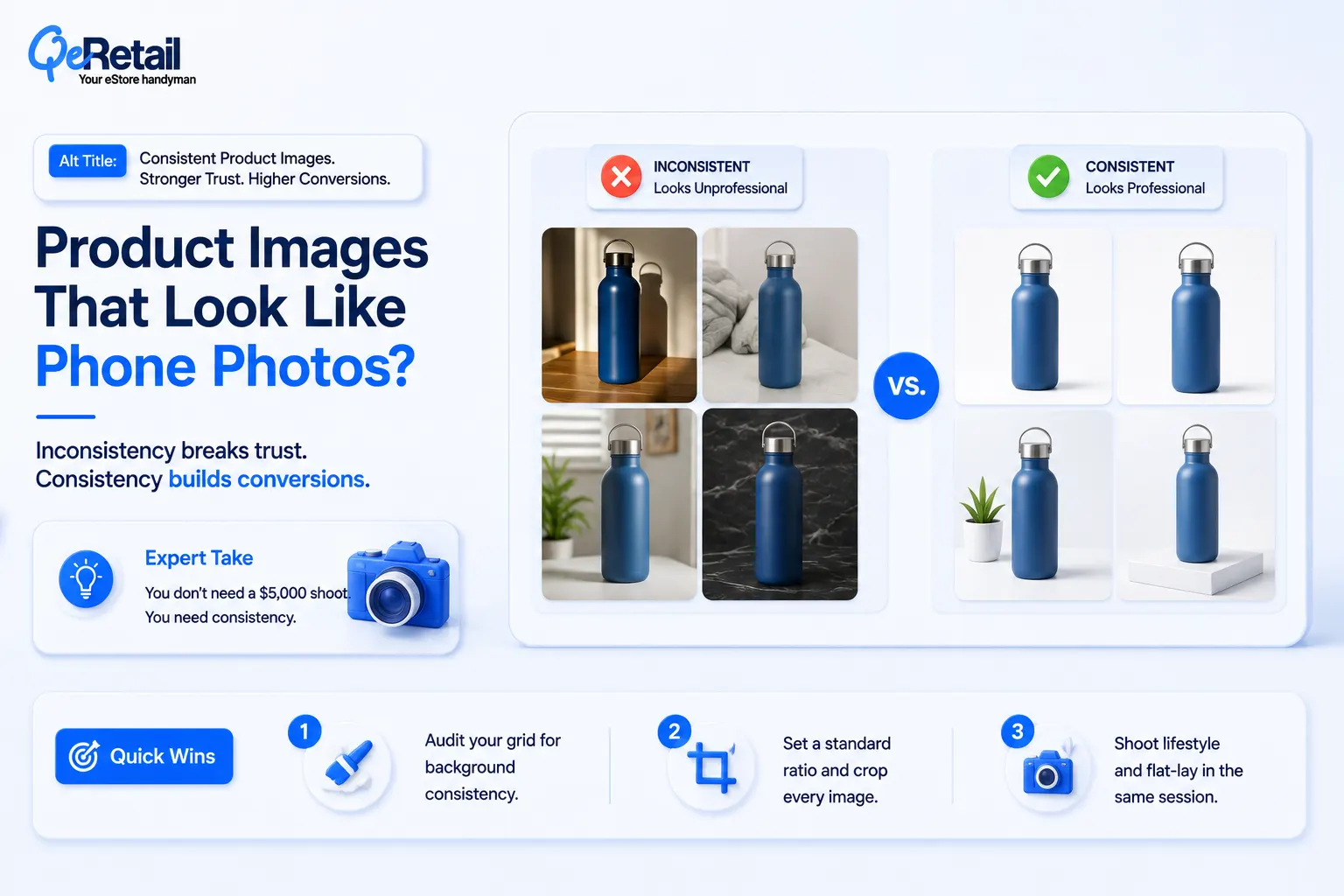
This is the single fastest trust-killer on any Shopify store. Buyers cannot touch your product. Your images are your product. The gap between phone shots and professional photography is not aesthetic preference; it is conversion architecture.
Consistency is the Real Problem
The issue isn’t just quality. It’s inconsistency. A hero banner with studio photography next to a product grid with shadow-filled phone photos tells buyers two different stories about your brand in the same scroll. That mismatch collapses trust faster than either image alone.
Expert Take:
You don’t need a $5,000 photo shoot to fix this. You need consistency. A clean white or grey flat-lay background, a $200 lightbox kit, and a fixed shoot template produce results that beat mismatched “professional” shots that differ in white balance and framing.
Quick Wins:
- Audit your product grid for background consistency – every image should share the same background color.
- Set a standard image ratio (1:1 for grid, 4:5 for mobile hero) and crop every image to it.
- Shoot lifestyle and flat-lay in the same session – alternate them per product, never mix randomly.
Signal 2: No Social Proof Above the Fold
Your buyers are not trusting your copy. They are trusting other buyers. But the majority of Shopify stores bury their reviews below the fold on product pages – or worse, in a tab the buyer has to click to find.
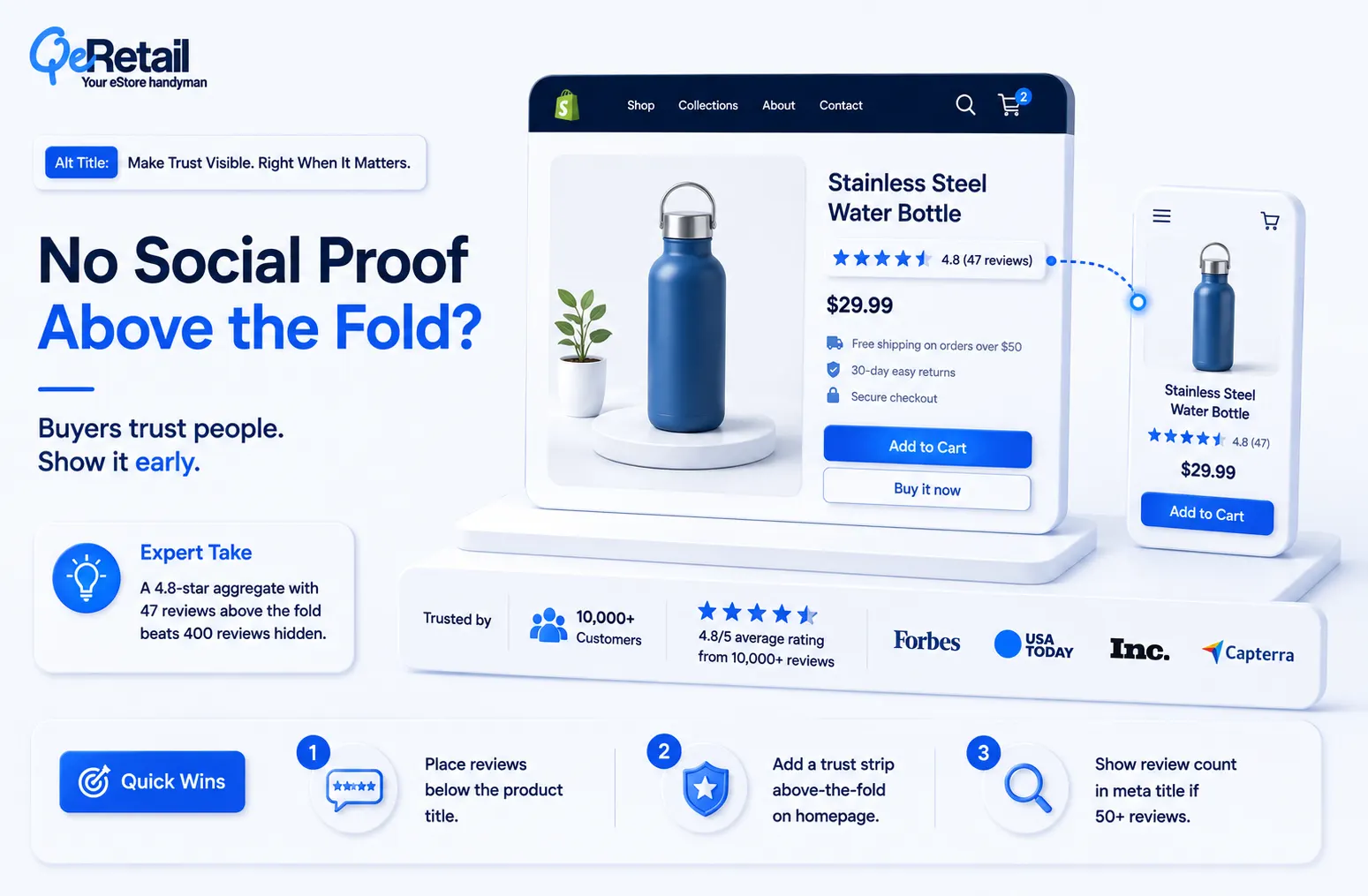
Social proof has a placement problem, not a quantity problem. Review count and star rating belong directly under the product title, not at the bottom of the page. Your homepage needs a trust strip – logo bar, review aggregate, or customer count visible within the first screen, before the first scroll.
Expert Take:
A 4.8-star aggregate with 47 reviews visible above the fold converts better than 400 reviews buried below the buy box. Buyers make a trust judgment in the first 8 seconds. If your proof isn’t in that window, it doesn’t exist for most visitors.
Quick Wins:
- Move your review widget to render directly below the product title on all product templates.
- Add a trust strip to your homepage above-the-fold section: star aggregate, review count, or notable customer logos.
- Display review count in your meta title if it exceeds 50 reviews – it shows in Google search results before the click.
Signal 3: A Generic Theme With Zero Customization
Out-of-the-box Shopify themes are starting points. But thousands of other stores bought the same theme and left it at default.
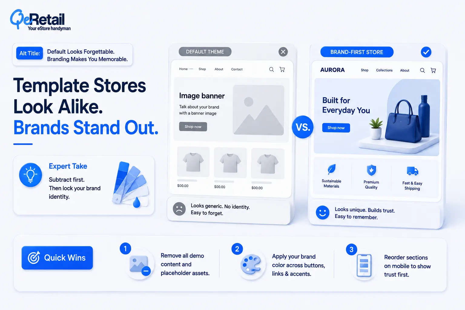
Buyers who shop online regularly recognize default theme layouts subconsciously. When your store looks like the template demo, your brand looks like a store that launched last Tuesday and hasn’t invested in staying. That perception hurts price integrity and brand recall.
What Customization Actually Means
This isn’t about custom code. It’s about brand imprint. Your color palette, your section spacing, your button shape, your empty state text – these micro-decisions compound into either “this brand has an identity” or “this is a template.” The fastest fix is not a redesign. It’s removing what doesn’t belong to you.
Expert Take:
Most stores over-customize in the wrong direction, adding widgets, countdown timers, and popups while leaving the underlying typography and color system at theme default. Strip the add-ons first. Lock in a real brand color and a real heading font. The subtractive pass does more for perceived quality than any feature addition.
Quick Wins:
- Remove all default/placeholder content from your theme – every demo image, stock photo, and filler text.
- Set your brand color in theme settings and ensure all button, accent, and link colors inherit from it.
- Audit your theme’s section order on mobile; rearrange so your strongest trust signal appears first.

Signal 4: Missing or Broken Trust Badges
Trust badges near the buy button are not optional UI elements. They are conversion infrastructure.
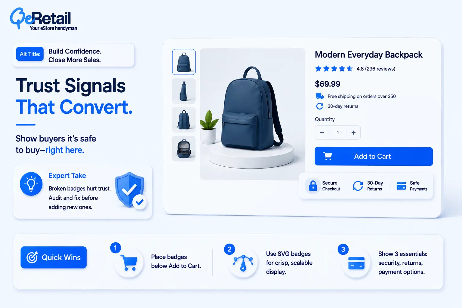
Research from the Baymard Institute shows that 17% of shoppers abandon checkout because they “don’t trust the site with their credit card information.” That’s not a product problem. That’s a design problem you can fix in an afternoon.
Where Badges Break Down
Most Shopify stores that have badges place them in the wrong location: the footer, or buried mid-page. Buyers don’t scroll to the footer before adding to cart. Your trust badges need to be within visual proximity of your Add to Cart button. Secure checkout, return policy, money-back guarantee these three, above or below the button, not below the fold.
Expert Take:
A broken badge image a placeholder icon, a 404 graphic, or a badge from a service you no longer use is worse than no badge at all. It signals neglect. Audit every badge in your store and confirm it renders correctly on mobile and desktop before you worry about adding new ones.
Quick Wins:
- Place trust badge row directly below your Add to Cart button on all product templates.
- Use SVG badges, not PNG; they render crisply at all screen sizes and never show as broken images.
- Include exactly three badges: secure checkout, return policy (with the number of days), and your payment options.
Signal 5: A Mobile Layout That Punishes Buyers
Sixty-seven percent of eCommerce traffic is mobile. Most Shopify themes look fine on desktop and quietly break on the device your buyers are actually using.

“Looks fine on mobile” is not the same as “converts on mobile.” This is the gap most $100K–$500K stores are living inside. Your images stack correctly. Your fonts resize. But your buy button is below three paragraphs of description, your trust badges are invisible, and your sticky header is eating 20% of the screen.
The Self-Completion Audit
Complete a purchase on your own store on a real phone. Not Shopify preview mode your actual phone, on your actual store. Time how long it takes from landing to order confirmation.
Note every friction point: pinch-to-zoom on product images, tapping the wrong CTA because buttons are too close, the quantity selector that doesn’t register. That audit is worth more than any heatmap tool. Once you’ve fixed mobile UX, pair it with checkout optimization to close the remaining conversion gap.
Expert Take:
The sticky Add to Cart button on mobile is the single highest-ROI design change most Shopify stores can make. It follows the buyer as they read, removes the scroll-back action, and cuts friction on the highest-intent moment. Most themes support it natively.
Quick Wins:
- Enable sticky Add to Cart in your theme settings; verify it renders above the fold on a 375px screen.
- Increase all tap targets to a minimum of 44x44px buttons, links, and quantity controls.
- Test product image zoom on mobile; if it requires pinching, switch to a swipe-enabled gallery format.

Stop Looking DIY. Start Converting Like a Brand.
Design trust isn’t a rebrand. It isn’t a $30,000 custom theme. It’s seven signals – most of them fixable in days, not months.
But if your store has all seven problems and you fix only the most visible one, you haven’t solved the trust gap. You’ve patched one crack in a wall. Buyers experience your store as a system. One professional-looking section next to a DIY section doesn’t average out – the weaker element sets the ceiling.
The stores compounding at 30% year-over-year growth at the $100K–$500K tier treated design as revenue architecture, not decoration. They measured trust signals the way they measured CAC. And they understood that reducing customer acquisition cost starts with making every click count after it lands – not just before.
If your store looks DIY, you didn’t fail at design. You haven’t invested in it yet. Book a free consultation, and we will walk through your store’s seven trust signals and give you a prioritized fix sequence your team can execute this week.
Frequently Asked Questions
How Do I Know If My Shopify Store Looks Diy To Buyers?
Which Of The 7 Design Signals Has The Biggest Impact On Conversion Rate?
Do I Need A Custom Shopify Theme To Fix These Trust Signals?
How Long Does It Take To Fix A Design Trust Gap On A Shopify Store?
Can Design Trust Problems Explain A High Click-Through Rate But Low Conversion Rate?
Table of Contents