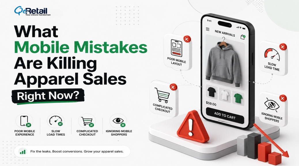
Mobile shoppers abandon 85.65% of their carts. Desktop shoppers abandon 69.75%. That gap has barely moved in five years, according to Baymard Institute.
Here’s what makes that number sting. Your apparel store likely pulls 72% or more of its traffic from phones, yet odds are your site was designed on a desktop monitor, previewed on mobile once, and shipped. Traffic isn’t your problem. Friction is. Slow pages, buried size guides, checkouts built for a mouse cursor instead of a thumb.
Below are the seven mobile mistakes that are draining apparel revenue right now, plus the fix for each.
Key Action Points:
- Get mobile load time under 3 seconds before touching anything else
- Put your size guide on the product page, not behind a link
- Swap text-heavy menus for visual category tiles
- Turn on Shop Pay, Apple Pay, and Google Pay
- Compress checkout into one screen with autofill
- Test your mobile funnel on a real phone every month

Why Do Apparel Brands Lose More Sales on Mobile?
Apparel brands lose more sales on mobile because clothing purchases run on visual confidence. Fit, fabric, color. A small screen amplifies every doubt a shopper already has, and slow pages and cramped checkouts push abandonment roughly 16 points above desktop levels.
And the cost doesn’t stop at the lost checkout. Online fashion return rates close to 29%, most of which are attributed to sizing guesses. So a leaky mobile funnel charges you twice: once when the shopper bails, again when the shopper who didn’t bail sends the order back.
The 7 Mobile Mistakes (And How to Fix Each One)
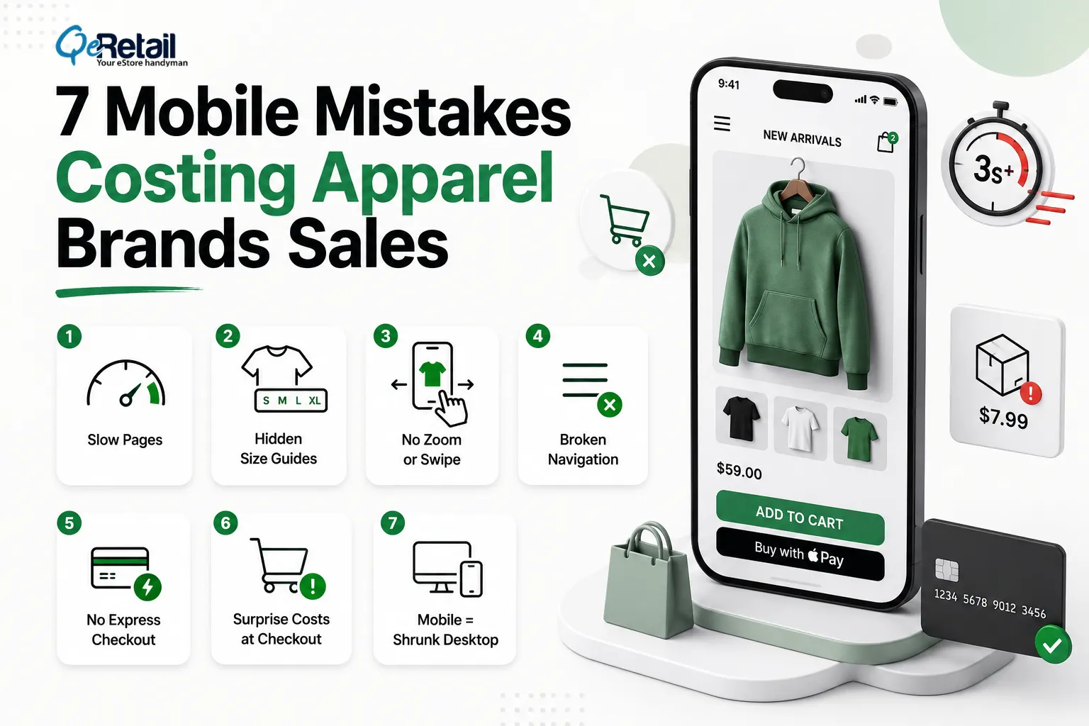
1. Pages That Load Slower Than 3 Seconds
53% of mobile visitors leave once a page passes the 3-second mark. The average Shopify store? It loads in 4.2 seconds on mobile. Apparel stores tend to be the worst offenders here, weighed down by oversized lookbook images, uncompressed video, and a pile of tracking scripts nobody remembers installing.
Expert Take: Stores keep buying speed apps to fix what is, in reality, an asset problem. Audit your five heaviest pages first. Converting hero images to WebP and lazy-loading everything below the fold usually improves speed more than any app can.
Quick Wins:
- Compress every product image to WebP under 150KB
- Lazy-load everything below the first screen
- Delete tracking scripts you haven’t checked in 90 days
2. Size Guides Hidden Behind Links
Sizing doubt kills more apparel conversions than anything else on the page. When your size guide opens a separate page or, worse, a PDF, mobile shoppers don’t follow it. They leave. Fit uncertainty is what drives fashion’s near-29% return rate, and hiding the chart only feeds it.
Expert Take: A size guide buried behind a link is a conversion killer in disguise. Shoppers on mobile won’t open a new tab to check measurements; they’ll open a competitor’s page instead. The closer the sizing information is to the “Add to Cart” button, the fewer the hesitations between intent and purchase.
Quick Wins:
- Embed the size chart as a tap-to-expand drawer on the product page
- Add model height and the size worn to every product photo
- Surface “true to size” review feedback next to the size selector
3. Product Photos You Can’t Zoom or Swipe
Fabric texture sells clothes. Can your shopper pinch into the weave of a knit? Swipe through six angles in five seconds? If not, the screen becomes a wall between them and the product, and no amount of clever copy climbs over it.
Expert Take: On mobile, photography is the fitting room. Shoppers who can’t feel the fabric need to see it, close, clearly, and from every angle. Stores that invest in gesture-friendly galleries consistently see lower bounce rates on PDPs because they’re replacing physical touch with visual confidence.
Quick Wins:
- Enable pinch-zoom on every product image
- Lead with on-body shots, then flat-lay detail
- Add one short video to each hero product
4. Desktop Navigation Crammed Into a Hamburger Menu
A seven-level dropdown squeezed into a hamburger icon forces mobile shoppers to dig for what they want. Most won’t bother. Visual category tiles (“New In,” “Dresses,” “Denim”) turn navigation into browsing, which is what apparel shoppers came to do anyway.
Expert Take: Your mobile menu is not a sitemap. It’s merchandising. The first categories a thumb can reach should match what sells, not how your catalog is organized internally.
Quick Wins:
- Replace text lists with tappable image tiles for top categories
- Cap mobile menu depth at two levels
- Put search at the top, since searchers convert better than browsers
5. No Express Payment Options
Typing a 16-digit card number on a phone keyboard is where carts go to die. Shop Pay, Apple Pay, and Google Pay collapse the whole thing into one tap, and they’re a big reason mobile and desktop conversion rates are finally converging toward parity at around 2.8%.
Expert Take: Every additional field in your checkout is a micro-decision that fatigues the buyer. Express wallets don’t just save time; they remove doubt. When a shopper sees Apple Pay or Shop Pay, they already trust the transaction before they tap.
Quick Wins:
- Turn on Shop Pay, Apple Pay, and Google Pay today
- Show express buttons on the cart page, not just at checkout
- Keep a guest checkout path with no account wall
6. Multi-Screen Checkouts With Surprise Costs
48% of US shoppers abandon when unexpected costs show up at checkout. That’s been the number one reason for six straight years. On a phone, every extra screen multiplies the damage, which is why Baymard’s testing pegs the upside of better checkout design at a 35% conversion lift.
Expert Take: Surprise shipping costs at checkout aren’t just an inconvenience; they’re a breach of trust. By the time a shopper reaches checkout, they’ve already committed mentally. Introducing new costs at that stage feels like a bait-and-switch, and that feeling sticks.
Quick Wins:
- Show shipping costs on the product page, not at checkout
- Compress checkout into a single scrollable screen
- Enable address autofill and numeric keyboards for card fields
7. Treating Mobile as a Smaller Desktop
This one is the root of the other six. Responsive design shrinks a desktop site. Mobile-first design starts from the thumb: CTAs in the thumb zone, swipe-native galleries, single-column flow. Apparel brands that rebuild this way fix all seven leaks at the architecture level instead of patching them one app at a time.
That’s the whole premise behind QeRetail’s mobile-first redesign for apparel brands: a storefront built for where 72% of your shoppers already are. Pair it with a tighter funnel (start with our checkout optimization guide and CAC reduction playbook), and mobile stops being your weakest channel.
Expert Take: Responsive design is damage control. Mobile-first design is a strategy. When you build from the smallest screen outward, every decision, layout, hierarchy, and interaction gets made with the most constrained, most common user in mind.
Quick Wins:
- Place all primary CTAs within thumb reach, the bottom two-thirds of the screen
- Switch to a single-column layout with no horizontal scrolling
- Design tap targets at a minimum of 48x48px to reduce misclicks
- Test your store on a real mobile device, not just a resized browser window
Quick Wins You Can Ship This Week
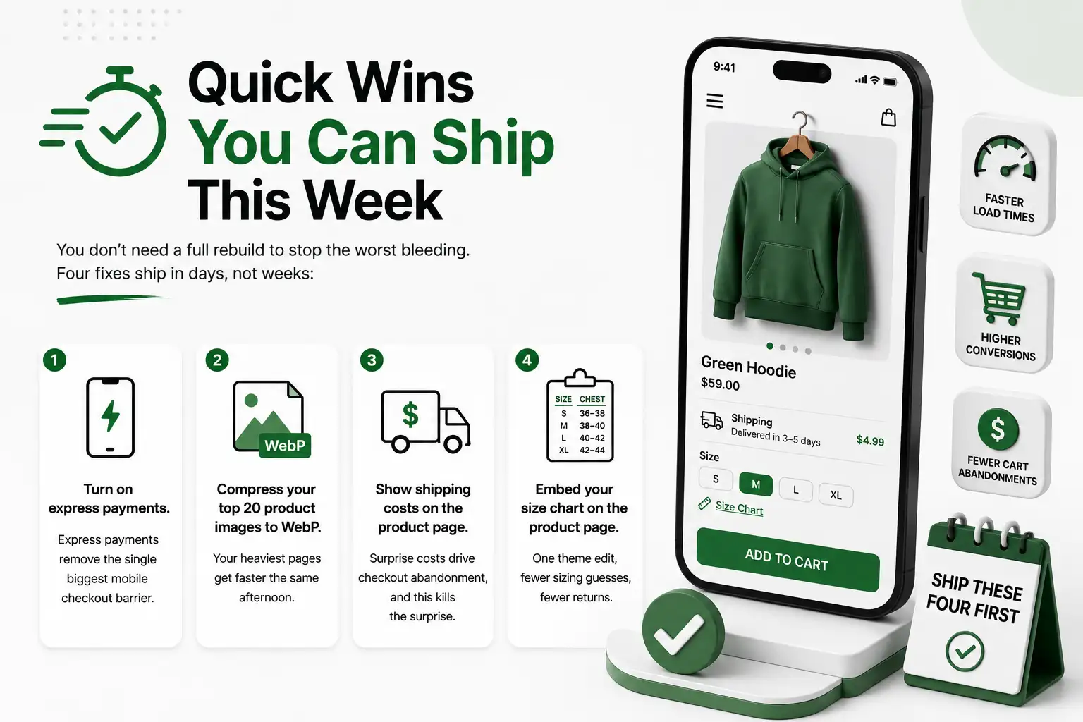
You don’t need a full rebuild to stop the worst bleeding. Four fixes ship in days, not weeks:
- Turn on express payments. Shop Pay, Apple Pay, and Google Pay take minutes to enable and remove the single biggest mobile checkout barrier.
- Compress your top 20 product images to WebP. Your heaviest pages get faster the same afternoon.
- Show shipping costs on the product page. Surprise costs drive checkout abandonment, and this kills the surprise.
- Embed your size chart on the product page. One theme edit, fewer sizing guesses, fewer returns.
Ship these four first. Then measure for two weeks before deciding what the full rebuild needs to cover.

Stop Patching Desktop Designs. Start Building Mobile-First.
Most apparel stores treat mobile as an afterthought, even though it quietly handles three-quarters of their traffic. Then the 85% abandonment rate gets blamed on ad costs, or seasonality, or anything except the storefront itself.
Fix the seven leaks above, and the math shifts fast. Faster pages, visible sizing, one-tap payment. Each fix compounds the others.
QeRetail rebuilds apparel storefronts mobile-first, from product page to payment. Get your free mobile audit, and we will show you exactly where your store is losing sales and how much each fix is worth.
Frequently Asked Questions
What Steps Can I Take to Identify If My Apparel Store Has a Mobile Problem?
Analyze conversion rates of your mobile vs. desktop. However, mobile conversions are only half as high or lower than desktop; it’s the storefront, not your traffic. Now test it with your own cell phone: surf, select the size, and checkout. The greater the friction, the more friction.
Why Is It That There Are More Desktops That Get Abandoned Than Mobile Carts?
Phone causes all checkout woes. Filling out information on multiple screens, looking up shipping rates, and entering information into a card. There is always another route out for the shopper for each step. With the exception of those that are paid for or checked out on one screen, the majority of these exits are closed with payment.
What Are the Initial Changes That Can Be Made in the Mobile App of Any Clothing Company?
The first one is the speed of the page, and the second is the size of the page. A slow page will lead the customer away from your product, and a hidden size guide will lead the customer away just before purchase. Both fixes are relatively cheap and do not necessitate a redesign of the graphic; however, as they do not impact the visual appearance, they are done prior to the redesign.
Do I Need a Mobile Site or a Mobile App?
No. It’s taken care of by a mobile-first storefront on your already existing Shopify theme. The revenue leak is in the browser experience, and that’s where growing app brands need to concentrate to develop a loyal repeat purchase base via apps.
Then, How Much Does It Take to Design a Website for Mobile Devices?
In general, it takes 4-8 weeks for the creation of a storefront for an apparel business, depending upon the theme and catalog size. The first week of shipping will focus on the easy things, and the full rebuild will happen at the same time.
Table of Contents


