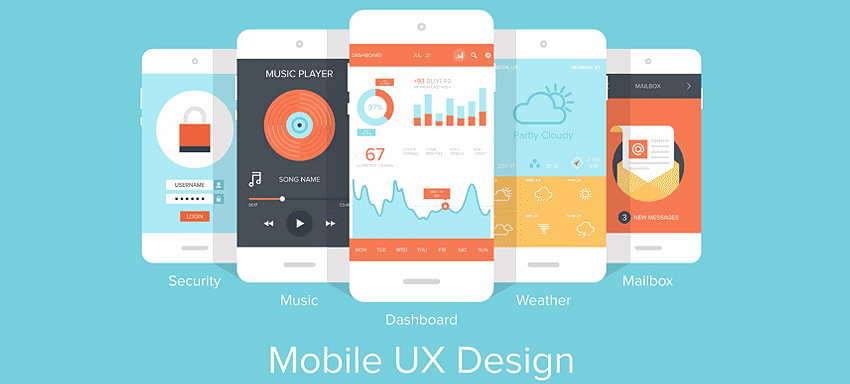
A great user experience UX always leads to conversions, no doubt about it. To mention on optimizations to the UX there isn’t any limit where currently mobile optimization is the biggest opportunity looked forward.
It’s quite common to see lower conversions in mobile traffic compared to the res, where Google Analytics says it’s just less than 20% of the mobile visitors go till the cart.
To talk about various reasons behind,
- One could the CTA (Call To Action) is not prominently seen on the screen.
- Next could be the big white space (unused ones) around the product image that gives an impression there’s not much to add around it or important details get pushed to the bottom part; Keep in mind this doesn’t mean flooding the screen beyond a pleasing look.
- Next could be the hidden information that’s important for one to decide to go ahead or not with the purchase, on a mobile screen; no one wants to scroll!
- Smaller text regarding the main product details isn’t any fun for readers. Mutually exclusive multiple discount offers on a single product can be quite confusing.
- Duplicate content gives the impression that the business just boasts being an empty vessel
Mobile optimization is required to show the main product details clearly and prominently, call to action quite dominating, discount offers to be right to the point straight, crisp and clear, in order to give a good conversion.
Optimization could be tough due to various reasons like harder text manipulation that makes cursor placement harder, complex autocorrect suggestions, weird errors due to autocorrect options, big context switch to tap the screen, tedious copy/paste which are to be handled at the end to give the journey simple and comfortable for the users to complete the actions on a mobile.
To talk on some tips on mobile optimization,
- The provision could be made to accommodate users loving recreational shopping and those doing the real act of buying as well. Recreational browsing well suited in the device leads to a smoother purchase.
- Rather than the flow upstream, going in sync with the mobile and using suitable elements based on the medium adds a value.
- When going for responsive web designs, the difference between a plain responsive website and a clear mobile site needs to be understood clearly. Any deviation from giving the required information to the user would cause him to just walk away.
Assumptions never work hence each and every small coding to you make for the mobile site needs to be tested thoroughly.
UX upgrades on product pages give more clarity and definitely contribute to conversions. To have these done at just the best, in view of a great mobile traffic, towards a high sales and an improved business growth or for any web development services as in magento, bigcommerce or so, just ask us if you want the best!


