People adding the items to the cart in an eStore proceed to checkout when they are taken through an excellent experience across the whole of the ecommerce platform and they find the entire journey to be user-friendly. Speed of the site, no forced registrations, form filling made easy and a few good practices in checkout highly influence the conversions in an eCommerce store.
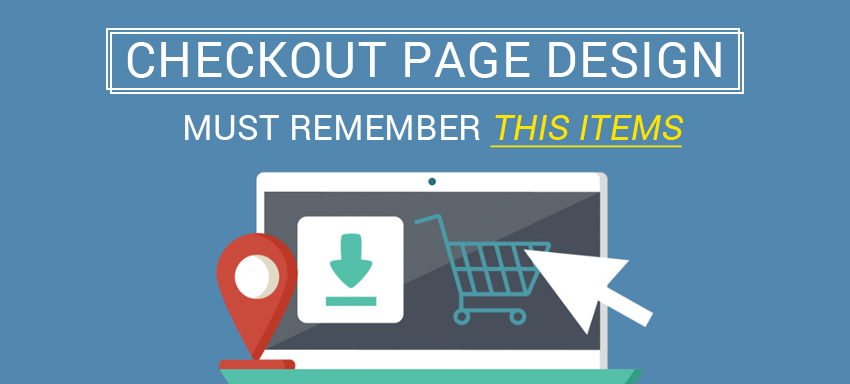
A satisfying estore journey is what can cause a visitor to become a customer; the overall design of the ecommerce platform is important and more important is the checkout part. Let’s see how we can do a checkout web design such that our users don’t stay a prey to a poor, unresponsive non-user friendly online purchase experience. Fundamentals of a checkout design encompassing cart graphics and so are jotted below, in intent to add insights to transforming your site into a profitable estore.
- Simple cart: Shopping cart, the prime visual indicator of the services provided by you, to the potential customers should be simple and suiting the website. Appropriate graphics for the standard trolley, basket and routine looking shopping bags can be made such that they are clearly accessible, that is located so the users can spot it within < 5 seconds. Size of the cart should be appropriate enough and placed visibly, like on the top right. Real time update of the added/removed/updated items, clear show and a simple message on successful addition to cart are some basic to have an eye upon.
- Clear cart display: Product details, videos, pictures, font size of the figures shown, discount details, offer descriptions, and all data should be easy and simple to understand/make-out. Images shown should be just to the product straight forward and all the possible views of the product should be included in the images. Relevant videos do add a great sense to the product page. Titles, product summary, colour, size, customization, price, tax, shipping options, total price and all should be extremely clear!
- Give options: People love seeing options to customize; they feel they have the control over what they are buying. Make it possible. Options like ‘save for later’, ‘additional choices of payment methods’, account creation or registration options, guest check out options can be given but then make sure not to force them to register with you because if you do so you give an impression you’re going to send them unwanted mails later.
- Create the trust: People are very much concerned about their information being safe, their payments going through a trusted gateway and getting the best out of their time, cash and effort. Lock symbols to show the site security, 3rd approvals if any and so gain their trust. Giving the options to provide feedbacks makes the customer feel good that you value them. Customer service details need to be clear.
- Linear process: Checkout process should be simple; cart, payment, review and confirm. Process indicators make more sense.
- Simple forms: make sure to use simple friendly forms you use in check out pages or for registration or for account creation or any. Logical flow, secure information at appropriate places, consistent details, right sequence of information say for shipping then billing or so, such a clarity is a must!
While these guidelines exist, it is not quite acceptable if we don’t wake up to the call of ecommerce if we target to win the customers and drive towards making more sales and businesses. Looking out for someone who can give you the best in checkout, and much more in ecommerce, just ask us.