Many may argue that the concept of the first fold is an ancient one. During that period, there were no other devices available except the desktop to browse the websites. In case of newspapers, yes the first fold is important. The readers judge the entire newspaper based on the content of the page above the fold.
But, in case of websites, is it still important to have an attractive first fold design? People scroll don’t they? Yes, they do scroll but only if they find the content of the first fold interesting, valuable and impressive.
Many online retailers have underestimated the power of first fold design. They commit mistakes in designing first fold of the home page which can be the reason of high bounce rate.
Here, we will discuss some first fold design mistakes which should never be ignored by you if you are really serious about improving sales of your online store.
Placing Too Much Content
Too much content above the fold can make the design cluttered and slow loading. You have only 8 seconds to capture your audiences’ attention towards your online store. If you display all the information above the fold, you don’t give any reason to your visitor to stay on your website. The content above the fold should create some curiosity among your visitors so that they scroll down and also visit other pages of your entire store.
Low-Quality Images
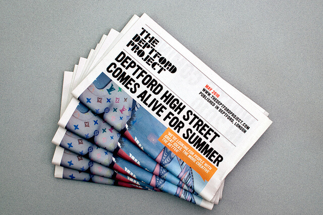
Ensure that the quality of the images you place above the fold is high in terms of resolution. Blurred or low-quality images can never appeal your audience and generate interest in them. The visuals of the first fold play an important role. This is proven by the newspapers which contain attractive visuals in first fold to attract people to buy it and read on.
Content Not Persuasive
Placing content which is not persuasive or adding any value to your customers is a big NO. This may create a situation wherein your audience loses the interest in your store and moves on to your competitors’. Keep the content crisp, fresh and to the point. Give your audience reasons to purchase from your store only. For example, if you are offering free shipping, say that in first fold itself. Just don’t wait for the page to end for showing the information which can convince your audience to buy from your store.
No Clear Call to Action
A call to action is something which asks the visitors to take some actions to buy the product, subscribe to a service, or something which adds value to the business. This call to action should be prominently placed above the fold. The reason behind that is if you don’t direct your visitors to what to do next, they may leave your website without scrolling down and looking for the call to action.
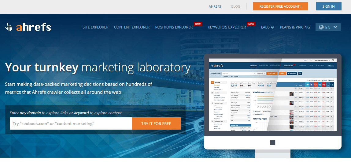
As you can see in the below first fold design, the call to action is clear and prominent enough to guide visitors to the destination.
Too Many Options in Main Navigation Menu
The navigation menu appearing in the first fold of the website is the most important element of your online store. It is from where your visitors choose to browse through your entire store. Placing too many categories in the navigation menu can confuse them and make them leave the website. It is always suggested to keep not more than 7 main categories in the navigation menu and rest of them can be shown as subcategories in the drop down menus.
Talking Too Much About Your Store
This is the most common mistake which online retailers do. Talking too much about your store doesn’t help your visitors’ purpose to visit your store. Instead of boasting about your products or services, show them the content which can solve their problems. First, focus on problem and then provide the solution. This would be the best way to impress your visitors and convert them into customers.
First Fold Design Mistakes: Basic Fundamentals in Common
All the above mentioned first fold design mistakes have basic fundamentals in common – Not conveying the clear message to the visitors and presenting that message in a cluttered or ambiguous manner. Just remember that your visitors are judging your entire store based on your first fold. Therefore, just make it happening while you are upgrading your eStore home page, so that your visitors find it interesting enough to go through other pages of your online store too.

Are you ready to give your eStore
a stunning makeover?
Get a $499 worth of custom homepage redesign mockup Free
Design My Mockup
![]()