CTA (call-to-action) can be in the form of buttons and text which encourage users to buy product, download an ebook or subscribe to any service. You may have found these CTAs on emails and website landing pages, product pages, popups, homepage, etc.
All your marketing content should have an attractive call-to-action which trigger clicks.
Basically, a perfect call-to-action has 2 main properties – attractive design and appealing content. You have really won half of the battle if you have both of things right.
So, how do you design a persuasive and convincing call to action?
We have gathered some call to action design tweaks which can encourage your reader to click and take benefit of your offer.
Selecting Color of the CTA
How do you choose the right color for your CTA button? The CTA should stand out different from other elements displayed on the same page right? To make that possible, you need to use highly contrasting colored CTA for your marketing content.
But, you need to ensure that the color of your CTA should be consistent with your brand identity and doesn’t look out of context.
The best option would be to do A/B testing with the colors and find out which color of CTA gets you more clicks.
As per the test done by Hubspot on Performable’s website, the red color button got 21% more clicks than the green color.
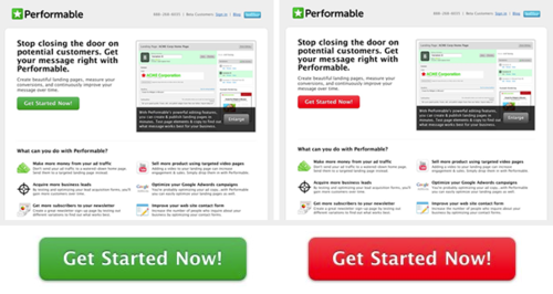
There may be several other factors which encouraged more clicks on the red button. We cannot change all our green buttons to red, but still it would be better to do a simple A/B testing while choosing the color for your CTA.
Placing CTA at the Right Position
Your visitors go through the page from left to right and top to the bottom. Is your CTA easily noticed by your visitors? If not, then it might not be placed at the right place.
Place your CTA immediately after you introduce your offer to the visitors. It should be prominently visible to your visitors.
Most probably, the CTA above the fold design works well. But many times the offer requires descriptive content and at that time placing CTA above the fold is not possible. Placing CTA without explaining what the offer is all about cannot prove to be effective.
The purpose of the call to action is to tell people what they should do. Without explaining to your visitors that why should they do obviously, we cannot tell them what should they do.
Thus, the positioning of the CTA matters a lot and should be chosen carefully.
Adding Curves to the Shape of CTA
Most of the time, the CTA button is in a rectangular shape, but adding curves to its corners have proven to grab the attention of the visitors. The humans tend to get attracted to smooth corners rather than sharp edges of an object.
As per Neuro-aesthetics researchers, people are likely to view the center of the button if its corners are rounded, whereas, in case of square edges, it is inverse.
Whichever shape you choose for your CTA, ensure you have maintained the consistency throughout the page, to help your audience recognize the CTA.

Appropriate Size of the CTA
The size of the CTA should be appropriate. Not too big or not too small. The size should be such that the content in it is readable. But then, it should not be so big that the other elements of the page go unnoticed.
The best way to design the CTA would be to ensure that it’s size gels well with the other elements of your page.
Give Enough White Space
There should be enough white space surrounding your CTA as that would help your visitors to notice it and click on it. Help the CTA to stand out different from the rest of the elements of the page by giving enough whitespace around your CTA.
Leverage Valuable Content
To make the CTA tempting enough to click, it is important to pay attention to the vocabulary too. Instead of writing just “Submit” you can write “Click to Download your Copy” can be beneficial.
The visitors after reading the content on CTA should get a clear idea of what benefit would they get if they click it. If the content on the CTA solves the purpose of their landing on the page, then only they can get tempted to click your CTA.
Call to Action Design: The Key Takeaways
Whether you are looking forward to designing a CTA for the landing page, product page or an email, just remember that you can be successful in generating the good amount of leads if the CTA has been clicked. This makes the CTA most important element of your marketing content.
There is no single rule when it comes to designing a perfect CTA. It is all about executing the above tips and testing different variables in order to achieve success in generating maximum conversions through CTA.

Are you ready to give your eStore
a stunning makeover?
Get a $499 worth of custom homepage redesign mockup Free
Design My Mockup
![]()