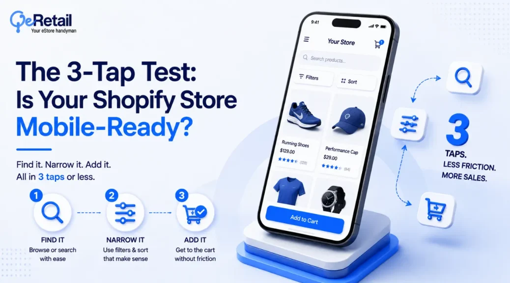
If a customer can buy the best-selling product in three taps, then you have already won the eCommerce war. However, most eCommerce store owners don’t have this 3-tap navigation approach.
And this is why 62% of mobile eCommerce sites are deemed “mediocre or worse” on user experience (UX). So, the channel carrying most of your revenue runs on the weakest experience your store has to offer.
The reason is simple: navigation gets built for desktop first, then compressed onto a phone screen as an afterthought. This is where a real 3-tap audit becomes crucial. With a five-minute test, you can exactly know where your best-seller sits buried.
In this piece, you’ll get all 5: why the 3-click rule is a myth, the 3-step tap audit to run on your own store, what a buried best-seller actually costs in discoverability and abandonment, two proven navigation fixes with named before-after numbers, and a decision framework for patch versus rebuild.
Key Action Points:
- Run the homepage-to-product tap count on your actual bestseller, on an actual phone
- Fix the hamburger menu first if it hides your main categories
- Add a bottom navigation bar once you’re scaling past $200K
- Build site search that returns your bestseller on the first query, not the fifth
- Track mobile cart abandonment separately from desktop, since the gap runs 10+ points wide
- Stop budgeting a redesign before you’ve run the 5-minute audit that tells you if you need one
Why the 3-Click Rule Is a Myth (and Taps Are the Real Unit)
Most UX teams still treat the three-click rule as gospel: bury nothing past three clicks or lose the shopper. However, a HubSpot analysis of more than 8,000 clicks by researcher Jared Porter found no correlation between click count and whether users found what they wanted, with some successful sessions running 25 pages deep.
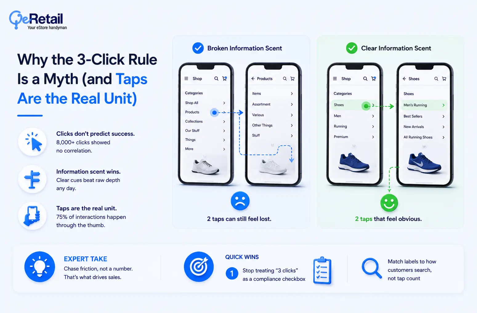
The reason behind such a scenario is simple- shoppers don’t count clicks. They follow information scent, the trail of cues that tells them they’re getting closer to what they want, and a broken scent kills a two-tap path just as easily as a five-tap one.
On mobile, the unit that actually matters is the tap, not the click. Smashing Magazine’s research on phone-holding behavior found 49% of people use their phone one-handed, and roughly 75% of touchscreen interactions run through the thumb. So, a tap sitting in your store’s hard-to-reach zone costs more than a tap in easy thumb range, no matter how many taps came before it.
The 3-click rule measured the wrong thing. On mobile, reach and information scent decide whether a shopper finds your bestseller, not a raw tap count.
Expert Take:
Store owners chase a three-click number because it’s easy to measure, not because it predicts sales. Chasing the count instead of the friction is how you end up redesigning a menu that was never the problem.
Quick Wins:
- Stop treating “3 clicks” as a compliance checkbox
- Test whether your category labels match how customers actually search, not just how many taps they take
Run the 3-Step Tap Audit on Your Own Store
Major ecommerce sites name mobile navigation, on-site search, and sitewide elements as the three weakest-scoring categories in mobile UX, out of 3,600-plus usability issues logged across 50-plus sites. Those three surfaces are exactly what a tap audit on your store should test.
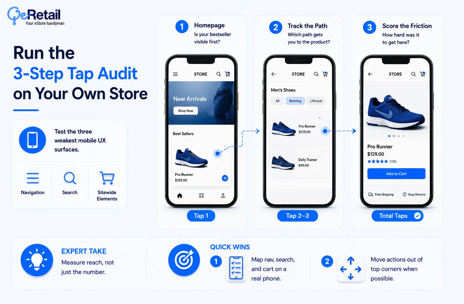
- Step 1 starts from your homepage. Open your store on an actual phone, not a resized browser window, and note tap one: is your bestseller visible, or does it require an interaction first?
- Step 2 tracks every tap to the product page. Log whether taps two and three go through a labeled category, a search box, or a homepage banner, since each path carries a different measured cost, covered next.
- Step 3 scores the friction. Note whether your main navigation sits behind a hidden menu, whether search returns the right product on the first try, and how many taps the full path took.
The reason behind such a scenario is simple- most navigation audits get run on a desktop screen, where the problems a real phone has stay invisible. This is where a five-minute test on your own bestseller beats any assumption about where shoppers get stuck.
Expert Take:
A four-tap path with every tap in thumb range beats a two-tap path that forces a stretch to the top-left hamburger icon. Measure reach, not just the number.
Quick Wins:
- Map where your main nav, search, and cart icons actually sit on a real phone screen.
- Move any frequently-used action out of the top corners if you can
What a Buried Best-Seller Actually Costs
Nielsen Norman Group ran a controlled study on hidden versus visible navigation and found hidden menus cut content discoverability by more than 20%. Mobile users were also 15% slower at completing tasks with hidden navigation, and rated the task 21% harder.
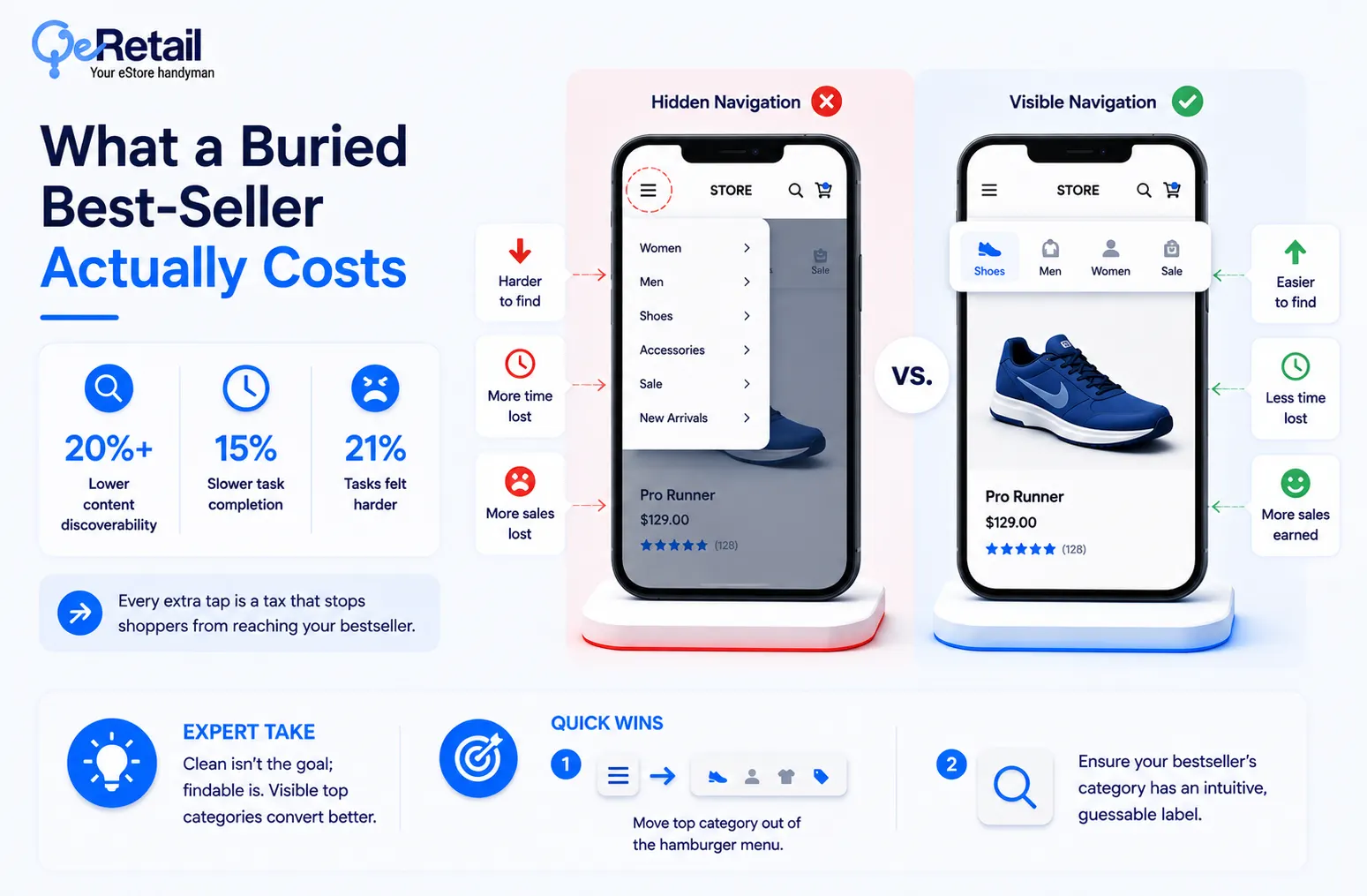
So, every extra tap or hunt through a hamburger menu is not a neutral inconvenience for your store. It is a measured tax on whether the shopper ever reaches the product page at all.
The issue at hand is not that mobile shoppers are impatient. It is that most stores ask them to work harder, on a smaller screen, with less patience, than desktop ever did. A buried bestseller does not just sit quietly losing sales. It actively pushes shoppers toward the exit.
Expert Take:
Most stores hide navigation to look “clean.” Clean isn’t the goal; findable is. A visible bar with your top 4 categories will look busier and convert better every time.
Quick Wins:
- Pull your top-selling category out from behind the hamburger menu and into a visible bar.
- Audit whether your bestseller’s category has an intuitive, guessable label

Two Fixes With Named Before-and-After Numbers
Redbooth tested this directly. The project management company replaced its hamburger menu with a bottom tab bar in its iPhone app, and daily active users (DAU) rose 65%, while average session duration rose 70%. Facebook made a similar move in 2013, shifting from a top-left hamburger menu to a bottom tab bar, and reported gains in engagement, revenue, and perceived speed.
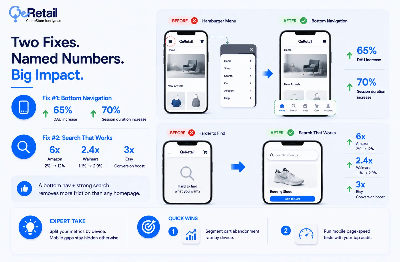
The reason behind such a scenario is simple- bottom navigation keeps the most-used destinations, home, search, and cart, in the thumb’s easy-reach zone at all times, instead of hiding them behind one extra tap.
Search is the second fix, and it is frequently the fastest path to your bestseller. 69% of retail shoppers use on-site search as their primary way to find a product. When they do, Amazon’s conversion rate rises roughly 6x, from 2% to 12%, Walmart’s rises 2.4x, from 1.1% to 2.9%, and Etsy sees a 3x conversion boost.
So, between the two fixes, the verdict is direct: a visible bottom nav plus a search bar that actually works removes more friction than any homepage redesign will.
Expert Take:
If you’re only tracking overall abandonment, you’re missing a 10-point mobile gap a desktop-only audit will never surface. Split the metric before you diagnose the cause.
Quick Wins:
- Segment cart abandonment rate by device in your analytics, not just in aggregate
- Run a mobile page-speed test alongside your tap audit, since the two compound.
Decision Framework: Patch It or Rebuild It?
Not every store needs a full information-architecture rebuild, and the audit data from the sections above already contains the decision framework.
There are two signal groups. The patch signals: your bestseller sits 2 to 3 taps away, but under a generic category label, and search works when used. The rebuild signals: the product sits 4 or more taps away, the main navigation is hidden behind a hamburger menu, and search returns weak or irrelevant results.
If your audit turned up one flag, add a merchandising shortcut or fix the category label this week. If it turned up all three, the fix is not cosmetic. It is the navigation itself.

Conclusion
Mobile carries 73% of retail traffic, and most stores still send that traffic through navigation that Baymard rates mediocre or worse. The tap count itself was never the real rule. Discoverability, reach, and search quality are. Run the 3-step audit on your own bestseller this week, score it against the patch-or-rebuild signals above, and fix the smaller problem first. A shopper who reaches your bestseller in three taps buys. One who gives up at five never does.
Frequently Asked Questions
How Many Taps Should It Take To Reach A Bestselling Product On Mobile?
Is The 3-Click Rule Still Valid For Ecommerce?
Does A Hamburger Menu Hurt Mobile Conversions?
Bottom Navigation Bar Vs. Hamburger Menu, Which Converts Better?
How Much Does Site Search Improve Mobile Conversion?
Table of Contents