Converting the web traffic or mobile traffic into targeted sales or leads purely is driven by the landing pages. LPO (Landing Page Optimization) is the term given for the process of grooming/optimizing them so they effectively sell your products giving you the appropriate conversions towards the business growth.
Visual appeal, easy navigation and being error-free are the 3 main aspects of optimizing the landing pages.
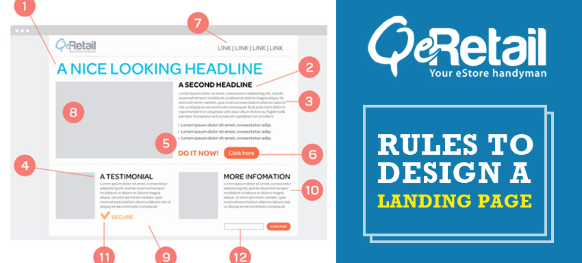
What does a landing page fulfil?
- Tells the user what are the products/services you provide them
- Shows how professional, trustworthy and with good attitude you are
- Appropriately placed links reveal the other contents of your website
- Content/verbiage in the landing pages convey the user how clear you are on the details of your own products
What to include in a landing page?
- Media: Have a media section in the landing pages, a video or a picture because the users love to see rather than to hear on what you have to sell. The unfinished appearance rendered by a dense text is cleared off by the supporting images. Again, if you look at what kind of pictures you include, make sure to include relevant ones and not for the sake of. Videos could be hosted in Youtube but when hosted by your own business, it reduces the influence of media bits coming from Youtube from a marketing view. High quality media should be ensured so you don’t want to mess up with the trendy current day customers? Have them tested in various systems/devices/browsers
- No clutter! Endless stories, complex or irrelevant links about the product in landing pages annoy the users. Don’t include a sentence having more than 15 words. Column width should be reduced if the word width is 20 words in the page. Links in the main area is to be avoided to stop user distraction moving to multiple other pages. Design elements make the pages appealing but use them wisely as a highlight. Using designs as a framework to fill in the content is a good practice; use smarter designs.
- Right language/grammar/spelling: Making spelling mistakes in the website landing pages isn’t any funny unlike when done by a kid in its homework book! Right words, right tone, powerful mood out of the language apt for the type of product you sell, is very important! Don’t miss out on such silly things!
- Effective links: The links included should read what they mean and should lead to the right page; users should be clear on what they are for. Don’t create an ambiguity here. A concise link text, short names keeping the sidebar width low are quite appealing. Keeping links on the side bars or on the top is wiser than including them in the main body where they might get messed up. Remember the states mentioned in an alphabetical order in a railway site? Make sure to have such logics. Last and the most important thing to note on links: Make them look like links not as a plain text!
- Wise colours: Blue creates trust, use them in logos. Red is thrilling, use them for warnings. Black is modern/stylish or for evil, use appropriately. Yellows/oranges are bold, utilize them show sub headings or so. Green is calm and used in context of wealth, note it!
While you know the nuances of creating the best landing pages, powerful responsive websites/ responsive web designs, implementation of ecommerce software and all around ecommerce web design, if you are looking for an expert help here, ask us.