
81% of Shopify purchases happen on a phone. Yet most stores are still built to look good on a laptop first.
That gap is costing you sales every single day.
Mobile shoppers on Shopify convert at roughly 1.4%–2.0%. Desktop shoppers convert at 3.2%–4.1%. Same products. Same prices. Half the result on the device that most of your buyers use.
The reason isn’t your traffic. It’s that your “responsive” theme shrinks a desktop site down to fit a phone, instead of being built for the phone from the start. Those are two very different things, and the difference shows up in your revenue.
Key Action Points:
- Check what share of your sales already come from mobile before deciding anything
- Stop judging your store on a laptop and start judging it on a phone
- Fix the slowest mobile pages first since speed moves both rankings and sales
- Rebuild your navigation and checkout for thumbs, not a mouse
- Match the size of your redesign to your current revenue and margins
Quick Wins:
- Open Shopify Analytics right now and check what percentage of your orders came from mobile this month.
- Put your laptop down, open your store on your phone, and try to buy something. Every frustration you feel is a lost sale.
- Open Google Search Console, filter by mobile, and find your slowest page; that’s where your rankings are bleeding.
- Count how many taps it takes to reach a product from your homepage on your phone. If it’s more than two, fix that first.
- Find your revenue tier in the section above and do only what that stage calls for, nothing more.

What Is Responsive Design?
Responsive design means your store changes shape to fit the screen it lands on. One layout, many sizes. The desktop version is the starting point, and the phone version is what’s left after everything gets squeezed down.
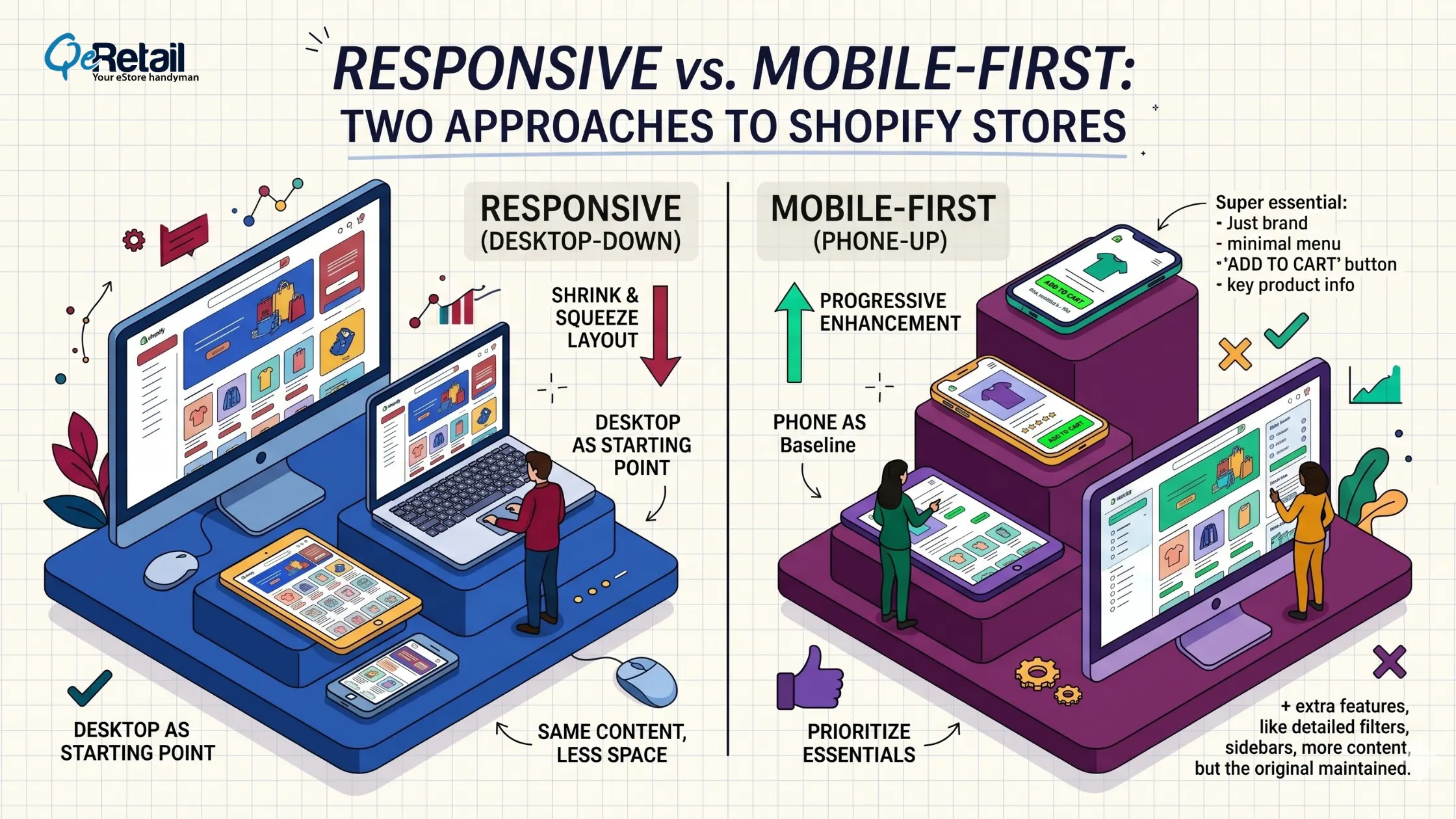
Most Shopify themes are responsive out of the box. Flexible grids and CSS media queries make columns stack, images scale, and text reflow when the screen narrows. Nothing gets removed; it all just gets smaller and rearranged.
This is called graceful degradation. Build the full desktop experience, then let it scale down. It works, and it’s cheap, which is why almost every theme ships this way.
But “works” is not the same as “sells.”
What Is a Mobile-First Redesign?
Mobile-first flips the order. You design the phone version first, with the smallest screen as baseline, then add for tablets and desktops. The phone is no longer an afterthought. It’s the main event.
Starting with the phone forces a decision: what actually matters? Limited space means you lead with the product, the price, and the buy button. Clutter gets cut because there’s no room for it. This is progressive enhancement, building up from a lean base rather than trimming a heavy one.
For Shopify stores, this means a lighter theme, fewer apps dragging down load time, and navigation built for one thumb. It also means fixing the small stuff that quietly kills sales: body text at 16px minimum so nobody zooms, buttons at least 48x48px so thumbs don’t mis-tap, and the add-to-cart button sitting in the natural thumb zone.
Why Shopify Owners Confuse the Two
Every mobile-first site is responsive. Not every responsive site is mobile-first.
Responsive answers: How does my site fit different screens? Mobile-first answers: What does my site lead with?
A responsive theme can still be designed desktop-first, then squeezed onto a phone. A mobile-first theme is also responsive, but it was planned around the phone from day one.
Think of packing. Responsive is cramming your full suitcase into a carry-on. Mobile-first is choosing only what you need for the trip, then adding extras if there’s room.
Quick Win: 60-second phone test.Open your store on mobile data (not WiFi). How long until it’s usable? Try adding a product to the cart with one hand. If anything feels slow or fiddly, you have a mobile-first problem, not just a responsive one.
How Google Judges Your Store Now
This isn’t only about how your store feels. It’s about whether buyers find you at all.
Google has fully switched to mobile-first indexing. It uses the mobile version of your site to set your rankings. Your desktop site no longer gets a vote. If your phone version loads slowly, hides content, or breaks layout, that’s what Google ranks.
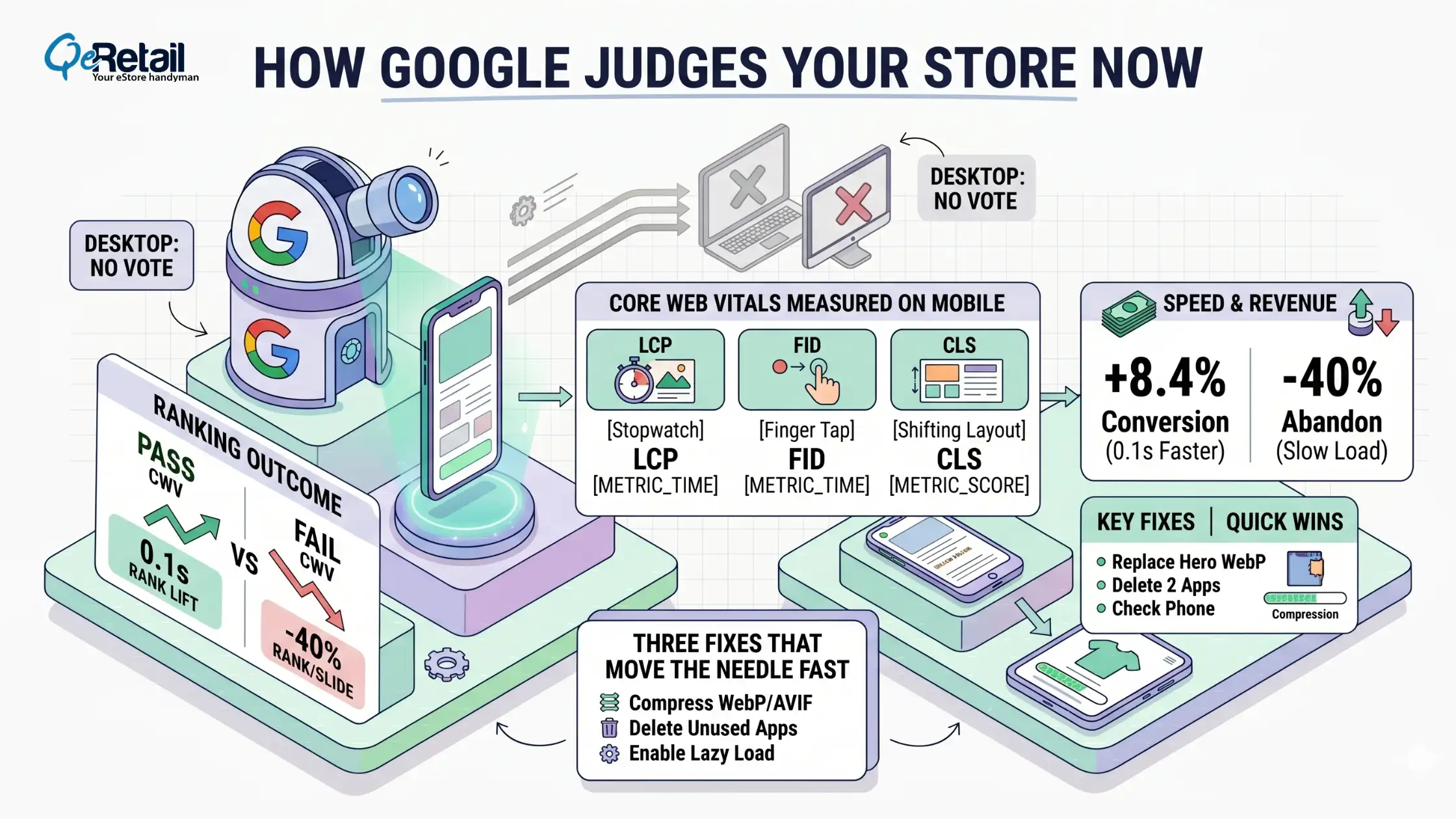
Google also measures Core Web Vitals: how fast main content loads, how quickly the page responds to taps, and whether things jump around while loading. Fail these on mobile, and you slide down the results.
Speed is where mobile design and revenue connect most directly. A 0.1-second improvement in load time lifts retail conversions by 8.4%. Plus, 40% of users abandon a page that takes more than 3 seconds to load.
Three fixes that move the needle fast:
- Compress product images to WebP or AVIF
- Delete apps you haven’t used in 60 days; they still load scripts on every page
- Enable lazy loading so below-the-fold images don’t block the render
Quick Win: 20 minutes.Replace your hero image with a WebP file under 200KB. Delete two unused apps. Reload on your phone. You’ll feel the difference immediately.

Which One Does Your Store Need?
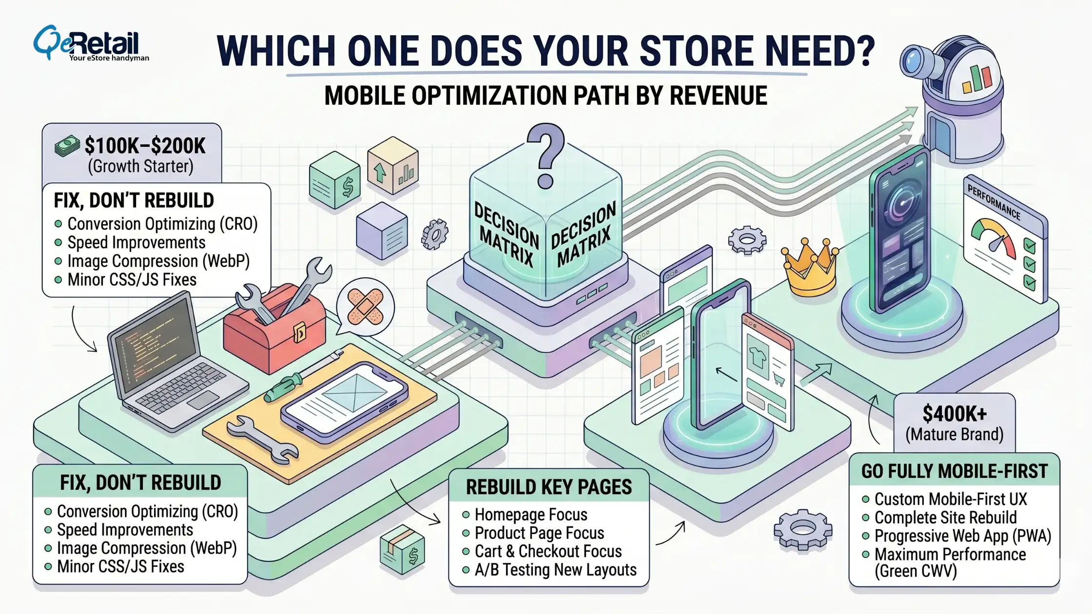
$100K–$200K (Growth Starter): Fix, don’t rebuild.
Your responsive theme is a fine base. Remove the friction sitting on top of it. Compress images, cut dead apps, enlarge buttons, raise text to 16px, and simplify navigation to two taps max. This is a mobile clean-up, not a redesign.
$200K–$400K (Scaling Operator): Rebuild key pages.
Mobile is now your main channel, and small fixes are hitting their limit. Rebuild your homepage, product page, and cart with a mobile-first mindset, phone first, then enhance for desktop.
Roll out one page at a time so you can measure how each change affects conversion. These three pages drive most of your revenue; you don’t need to rebuild the whole store at once.
$400K+ (Mature Brand): Go fully mobile-first.
Every fraction of a percent in mobile conversion is real money at this scale. A complete mobile-first theme rebuild pays for itself. Set a performance budget, with strict limits on page weight and app count, and track mobile conversion, Core Web Vitals, and checkout drop-off as ongoing metrics, not a one-time project.
A faster, leaner store also lowers your cost per sale, which directly reduces your Shopify customer acquisition cost.
Stop Shrinking Your Desktop Site. Start Designing for Thumbs.
Most Shopify stores aren’t losing mobile sales because of their products. They’re losing them because a desktop site got squeezed onto a phone and called “responsive.”
Responsive design keeps your store from breaking on small screens. Mobile-first makes your store actually sell on them. One stops a problem. The other builds an advantage that compounds as more buyers shop from phones and as Google keeps ranking the mobile version first.
You don’t have to rebuild everything tomorrow. You do need to stop judging your store on a laptop and start fixing the experience your real buyers see. Book a free consultation, and our experts will show you exactly where your mobile experience is leaking sales and what to fix first.
Frequently Asked Questions
Is a Responsive Shopify Theme Enough for Mobile?
It’s a starting point, not a finish line. Responsive stops your store from breaking on a phone, but it’s usually a desktop design scaled down. With 81% of Shopify purchases on mobile, the experience needs to be designed for the phone, not just resized to fit it.
What’s the Real Difference Between Responsive and Mobile-First?
Responsive adapts one layout to many screen sizes, starting from desktop. Mobile-first starts with the phone and builds up. Every mobile-first site is responsive, but not every responsive site is mobile-first. The difference is which screen you design for first.
Does Mobile-First Help My Google Ranking?
Yes. Google uses mobile-first indexing, so it ranks your store based on the phone version. A faster, cleaner mobile experience improves Core Web Vitals scores, and a 0.1-second speed improvement has been shown to lift retail conversions by 8.4%.
Table of Contents


