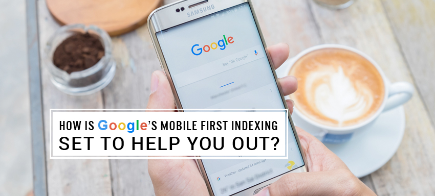
Google’s mobile first index, as the name suggests, is its algorithm modified to index the ECommerce store mobile sites in first place compared to the desktop sites, in bringing up the SERPs. It is focusing on giving the ultimate privilege of showing the ‘best results to the users on their ‘most used devices, that is smart phones and tablets. Google algorithm is all set to pick up the mobile sites while giving the rank.
As of now, this is an ‘experiment’ as Google calls it; while the search index will remain the same for estore websites and online store apps, it will go on to the mobile sites to check upon their structure of the content and show them on SERP snippets. You are not going to see mobile-friendly adjustments anymore and this effectively means your desktop users would be impacted if you aren’t mobile friendly. This means you will need to take mobile SEO into a serious consideration from now on.
Google puts forth the below recommendations to be absorbed within us, so we put them in on designing, if in the near short future this venture is seen successful and expanded,
- Sites on responsive web design or dynamic sites showing the same structure and content across mobiles and desktops needn’t have to worry anything at this juncture.
- For those estores where the site configuration is different in primary content and markup across desktops and smart devices, the below checklist gets applied,
- To make sure the markup is same across desktops and mobile sites, verify the structured markup using data comparison tool here and check the results
- Structured data on mobile sites is recommended not to contain lots of markup that are irrelevant to the site.
- Check the google bot accessibility on your site mobile version, using the robot text here.
- Mobile sites are also to be verified on Search Console, along with the desktop ones.
- If you have canonical links on your site, then don’t worry on the change; google will check on the links to get you the relevant ranking.
- Those estores having just the desktop version would be indexed as usual. If you are trying to build a mobile site, keep in mind the functional desktop versions are much better than incomplete mobile sites so wait till you build a complete mobile site before you launch.
- If you don’t own a mobile site yet, then this ranking preference for mobile sites isn’t going to help you.
- Google answers your further queries here
We are sure this is a great news for responsive or mobile sites.
Are you worried your site is not mobile ready yet? No worries, the tips below may help you to check the readiness,
- Once you have the mobile site built, check it on the test here for its mobile friendliness
- Google’s mobile guide here may help you in site optimisation
- Third party hosting sites may check here for help
We are sure you realise the need for mobile responsive sites for further high rankings from google. While you have a good idea on the googles indexing changes, if you think you still require details or for non responsive to responsive site conversion, ask us now


