


This article was originally published on 25th June 2018 and has been updated to reflect updated information.
Managing an online store doesn’t end with setting up the storefront and having the eCommerce store live on an eCommerce platform. You need to monitor the website traffic, study the online interactions & behavior of your customers, manage the backend inventory, send periodic promotions on different marketing channels to ensure the customer engagement, and handle many such responsibilities.
For your business to sustain, it is important to ensure consistent website traffic. While other marketing channels contribute to bringing new visitors to your eCommerce store, SEO brings in the most inbound leads. With the rise in using handheld devices since past decade, different search engines have started ranking pages based on their mobile SEO scores. In 2019, 52% of all worldwide online traffic comes from mobile, 45% from the desktop (Source). So you may have the best products and offers but if your store doesn’t rank well when searched on a mobile device, it is as good as non-existent.
In this article, we are going to guide you about how to audit your eCommerce site for mobile SEO.
Table of Contents
Understand Your Mobile Traffic
Before you move ahead in improving the mobile traffic on your store, it is important to create a baseline of the existing traffic. So, you first need to divide your existing traffic into desktop users and mobile users. You can further dive deeper into the device type. Google Analytics can be your savior here as it can not only show you the different devices used but also the region-wise breakdown of your website traffic.
Make a list of your top-performing pages ad study the existing traffic by logging into your Google Analytics account and heading towards Audience –> Mobile. The overview section, as shown below, will split the overall traffic into three categories:
- Mobile
- Desktop
- Tablet
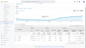
Dwell deeper by clicking the devices to specifically see the different devices used.
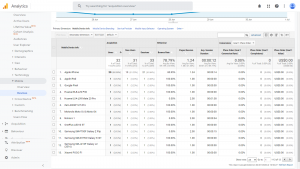 Once you have the list of top-performing pages cross-referenced with the devices used to visit the pages, you can move ahead to correctly optimizing the pages for responsiveness and build out your mobile keyword strategy.
Mobile Site Configuration
Basically, there are three ways in which you can configure your eCommerce mobile site –
Separate Website for Mobile Devices
With this type of setup, you have 2 websites – a desktop version and a mobile version. When a visitor lands to your website homepage, the site detects the device your visitor is using and directs them to the URL designed for that device.
Separate mobile sites are a huge pain to manage as far as SEO is concerned. There are lot many complications relating to duplicate and canonical URLs when it comes to having a separate website for mobile devices.
Dynamic Serving
In case of dynamic serving, you have the same website URL for desktop and mobile users but the HTML/CSS code is shown depending on the device your website visitors are using.
But, in this case, you need to constantly develop a new set of code for different devices coming up every day. If you have failed to create an HTML/CSS code for the latest mobile device just introduced in the market, then the desktop version would be shown to the user of that particular mobile device.
Responsive Design
The best option is having a responsive design for your eCommerce store if you want it to be SEO friendly and user-friendly both. No separate code or URL for different devices is required. Just simple changes in the CSS of your website code can make your eCommerce website get displayed in multiple devices in a perfect manner.
Even Google recommends Responsive design layout for an eCommerce store to get ranked on top in SERPs.
So, now you know different ways of representing your eCommerce store to mobile users. Let’s now look at some mobile SEO tactics which can make your online store achieve high ranking in search engines and maximize the traffic.
Mobile SEO Tactics
Keyword Research
Do you know which search queries your audience is using to look for the products or services you are selling? Proper keyword research can only drive relevant traffic to your website who actually buys from your store. Otherwise, you may just increase the bounce rate of your eCommerce store.
Apply Meta Title and Description
Similar to desktop sites, mobile sites also need to apply search engine friendly meta titles and descriptions. This is the basic element through which the search engine algorithm can understand your business.
As mobile sites are supposed to be friendly on smaller screens, just ensure that you assign short and crisp meta titles and descriptions to your website. Mangools SERP Simulator allows you to test your meta titles and description for both viewports.
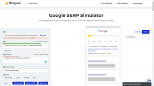
(Source: Mangools)
Use “ALT” Tags for Images
As you know search engines cannot read the images, you need to implement alternative text to images. Especially, for an eCommerce website, it becomes necessary to apply the alternative text to your product images so that they get listed whenever searched for.
Implement AMP
AMP refers to Accelerated Mobile Pages which is a Google Backend Project which can load your web pages quicker on mobile devices. Though, implementing AMP cannot be a direct ranking factor but plays a major role in boosting the user experience on mobiles which can lead to high search engine ranking.
Use Structured Data Markup
The search results with rich snippets are likely to get enhanced on the small size of mobile screens and can improve your website CTR. It is always recommended to use Schema.org tags so that the search engines represent your content in a manner helping you stand out different from your competitors.
Optimizing Mobile Site for Excellent User Experience
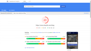
Loading Speed Optimization
Quick loading speed plays an important role in providing a better experience for your mobile visitors. Some of the factors to check for are:
-
- Multiple page redirects
- Render-blocking resources
- Encoded images
- Static assets served with an efficient cache
- Text visibility while the Webfont is load
- JavaScript execution time
- Minify CSS
- Serve images in next-gen formats
Use Google’s Page Speed Insights Tool to check whether your online store loads quickly on mobile devices or not.
Large Button Size
The buttons on your eCommerce store should be large enough to easily viewed on small screens of mobile devices. Sometimes, the buttons are so small in size that the users are not able to tap them and that may become quite frustrating for your online store visitors.
Use Clear Typography
The typography you use on your eCommerce store designed for mobile users should be extremely clear. Don’t force your visitors to pinch and expand to be able to read the content of your website, as that may increase your bounce rate. Use readable typography to give your users comfortable browsing experience.
Ensure Enough Whitespace
Having enough whitespace on mobile sites is more important than websites. What might be the reason? The mobile screen being small, the clutter in text and images become irritating for users and they just abandon the store immediately. To make sure your mobile visitors have a comfortable shopping experience, ensure to have an uncluttered design of your mobile site.
Use Small Header Images
The mobile screens being small, it is always suggested to use small header images on the Homepage of your eCommerce site. Unnecessarily placing large images can refrain your mobile visitors from viewing the important content on your online store. In the example below by Sur La Table, has the image being resized to accommodate the mobile view.

Add Social Sharing Buttons
It is always recommended to add social sharing buttons in the sidebar. This would improve the social shares of your eCommerce store significantly. But, you also need to ensure that these social sharing buttons are placed properly without disturbing or distracting your mobile visitors.
Live Chat Integration
Live chat is the quickest way through which your visitors can interact with you and so it is highly used in case they have any query. This quick way of interacting help them in purchase decision also on an eCommerce store.
Especially, when your visitors are browsing your store using their mobile device, they are on their go and want to make quick decisions and for that, they need the fastest way to communicate with you. No other option can be better than live chat integration for this.
Simplify Checkout Process
It is obvious that your eCommerce store should have a simplified checkout process to ease the job of your customer. But, if they are buying from your store using mobile devices, then an easy checkout process becomes extremely important. Asking your customers to fill up long forms using their mobile devices while the checkout is not at all acceptable and can just increase your bounce rate. By showing the number of steps remaining to check out is a great way to achieve that.

eCommerce Mobile SEO: The Final Summary
Improving CTR of a mobile site is extremely important for high ranking. If Google finds that the users are not clicking to your mobile site URL listed in search engines, your ranking may go down.
Moreover, the user-friendliness of a mobile site is also important for achieving a high ranking in search engines. If the users don’t find your mobile site friendly enough, they may bounce back to the SERPs and that can also downrank your mobile site.
Thus, if you want to maximize ranking, traffic, and conversions of your store, you need to focus on keeping your store user-friendly and search engine friendly both.
Related Pages