If you want to increase your eCommerce sales, you need to start using high-converting landing pages.
Visitors that land on your eCommerce website, blog, or dropshipping store might not be excited to buy from you. Why? Your product descriptions may be boring, to say the least. Perhaps, your landing page design isn’t attractive or responsive to mobile visitors?
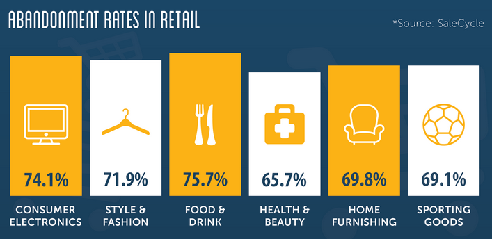
In this case, most of your visitors will leave. According to Deloitte, about 54% of all online shoppers abandon their shopping carts before making a purchase.
In retail, the average abandonment rate is capped at 68.70%, based on Baymard’s study.
Marketo’s study also revealed that 96% of visitors to your eCommerce website are not ready to buy yet.
It may seem like the odds are stacked against you, but there’s a better way to boost your eCommerce conversions using landing pages.
Here are 11 eCommerce landing pages you could emulate to increase conversions: sales, and repeat purchases:
Table of Contents
1. GILI Sports
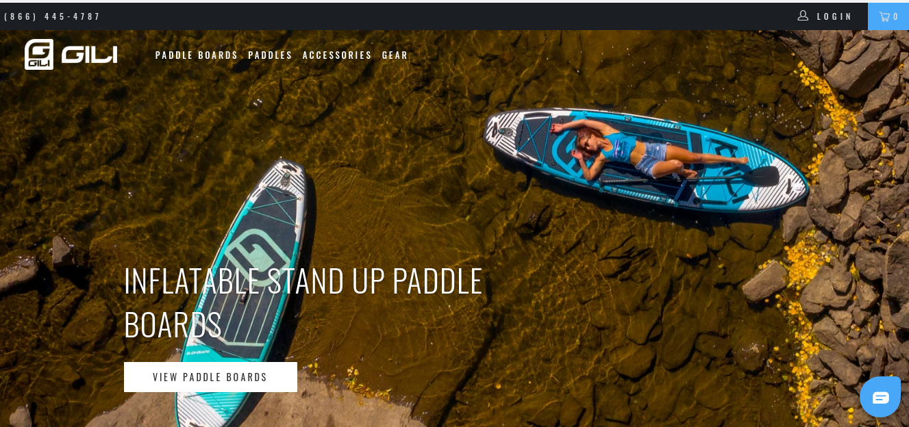
GILI Sports uses an inspiring eCommerce landing page to drive conversions. This brand sells Paddleboards and accessories, and they used different copywriting strategies to drive engagement on their page.
First, the featured image is relevant to the main product. The image’s white space background tells exactly where the Paddleboard should be used — water.
This instills trust in the visitor and builds confidence in them right away. The CTA button tells the visitor exactly what they’ll get “View Paddle Boards.”
Although GILI Sports may not be the perfect eCommerce landing page, it does many things well.
If you can test and improve some elements on your eCommerce landing page, you’ll see a boost in conversions.
2. Winc
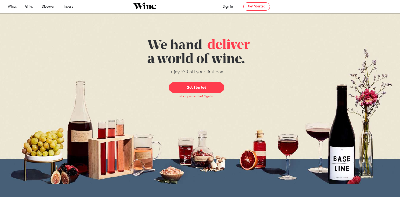
Winc is a Wine Subscription eCommerce store.
Customers get a personalized box of their favorites wines in a box. They pay monthly for this service. So, what makes the “Winc” and amazing eCommerce landing page?
Winc displays photos of the available wines in a variety of boxes.
It shows several social proofs, such as “12 million glasses of wine enjoyed, 10 countries collaborated with to make wine, 40 locations serving the wine.” All of these are proof that Winc wine can be trusted.
The benefits of Winc wine are well shown using icons. This hones the benefits of drinking Winc wines and shows the subtle culture behind the company.
The featured image displays the actual product that the customer will receive when they subscribe. Also, the logos of well-known stores, where Winc’s wines are mentioned and featured, instills credibility to the offer. The CTA button is clear, bold, and persuasive.
Keep these best practices in mind when creating a new eCommerce landing page or improving an existing one.
3. Zoma
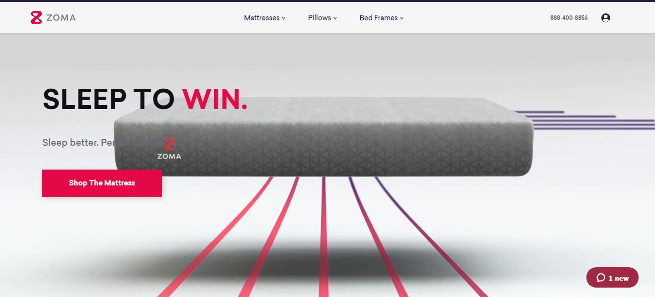
Zoma manufactures and sells Mattresses, Pillows, and Bed frames. It’s a well-known brand in the sleep aids market.
Zoma’s landing page tells the brand’s story. The page stands tall above others with its Unique Value Proposition, “Sleep To Win.” The company even listed some of its mattresses that give optimal good night’s rest.
When you first land on the page, you’ll feel welcome with eye-catchy color themes and professional imagery. The subheadline “Sleep better. Perform better” draws the visitor’s attention.
Zoma’s call-to-action button is clear and tells the visitor exactly what to do “Shop The Mattress.”
4. Larq
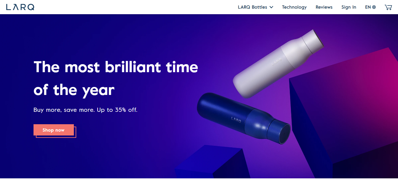
Larq is an amazing eCommerce brand that sells self-cleaning water bottles. A simple idea, but it’s so exciting to see what the company is doing with its landing page.
The Larq landing page blends in creativity and visuals.
There’s a message between the main offer, value proposition, and call-to-action (CTA). These are well represented, beautifully displayed, and the page is easy to navigate.
Larq uses a clean design with a closely-relevant headline. The featured image uses high-quality imagery, and the CTA button is clear, bright, and related to the main offer.
5. Burrow
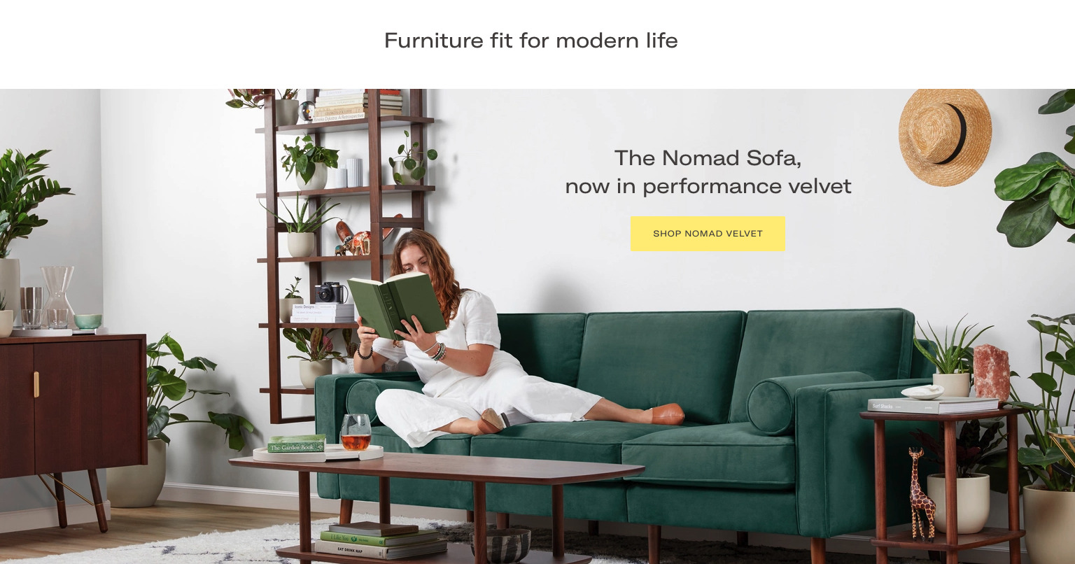
Burrow is another unique eCommerce store that sells Custom furniture and Sectional Sofas. Let’s see what they’re getting right with the landing page.
Burrow’s landing page uses some of the best imagery to showcase a new product launch. The landing page uses a contemporary tone that matches the products on the page, which will inevitably catch the customer’s attention.
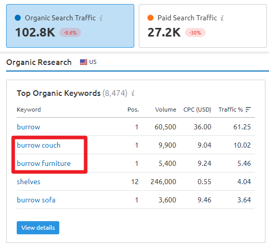
Burrow’s landing pages are also capitalizing on several branded keywords like Burrow couch, Burrow furniture, and currently rank for 8,000+ keywords. It also drives 100,000+ organic traffic.
Burrow’s furniture is fit for modern life. Therefore, the use of modern fonts and color choices that aligns with branding is important.
The landing page uses a dose of image’s white space in a perfect way. There’s social proof at the bottom of the page — this highlights the most popular products in the collection.
6. Skullcandy
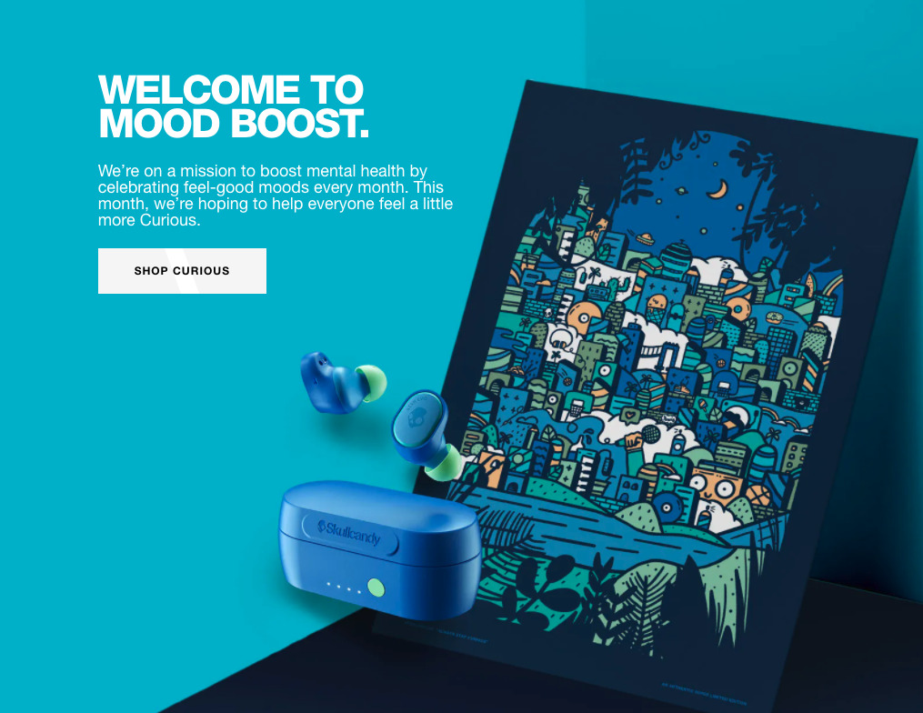
Skullcandy is respected for its Headphones, Wireless Earbuds, Speakers, and more. The landing page has been creatively designed to project the already widely known products to the spotlight.
The goal is to provide a new perspective to customers.
Rather than dwelling on the technical specifications for the headphones, the content is welcoming — and focuses on the brand’s mission of boosting mental health by celebrating “feel-good moods” each month.
Skullcandy’s landing page uses a customer-focused Value Proposition. The message on the landing page is relevant and timely concerning mental health.
The copywriter is smart enough to use contrasting tones between fonts, images, and backgrounds to create an irresistible loop in the customers’ minds.
7. Gillette

Gillette has become the gentleman’s best friend. For me, I use it all the time to keep a clean shave. I also enjoy the grooming resources on their blog — such as podcasts, videos, infographics, and one of the best online learning platforms for men.
Gillette is already a trusted men’s grooming brand. Regardless, it doesn’t leave its marketing to fate. The landing page uses a clean and minimalist design to highlight their product. It doesn’t use too many words but fewer and captivating words.
The brand can tell better stories, convey what lies behind the offer, and customers who land on this page can clearly see the value propositions, such as free shipping and cancellation.
The icons draw the buyer’s attention and illustrate the copy better. Gillette also uses the word “Free” to send a strong message of what lies ahead when you buy a Razor or Beard Trimmer.
8. Solo Stove
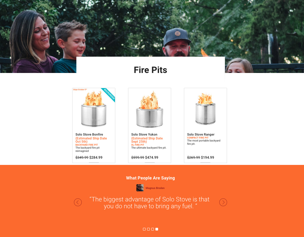
At first glance, you’ll see the product descriptions, with a price drop aimed at motivating visitors to respond to the discounted offer. The landing page also leverages unique social proof tools such as direct quotes from existing customers.
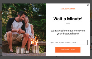
The landing page copy is good enough, but it goes beyond that. It uses a pop-up to offer a discount code when visitors sign up with an email address.
Although the discount isn’t stated, I bet it’s gated — only to be revealed when the visitor fills out the form successfully. Solo Stove is hard on email marketing, a sustainable way to generate more money and grow eCommerce sales.
9. Spinning
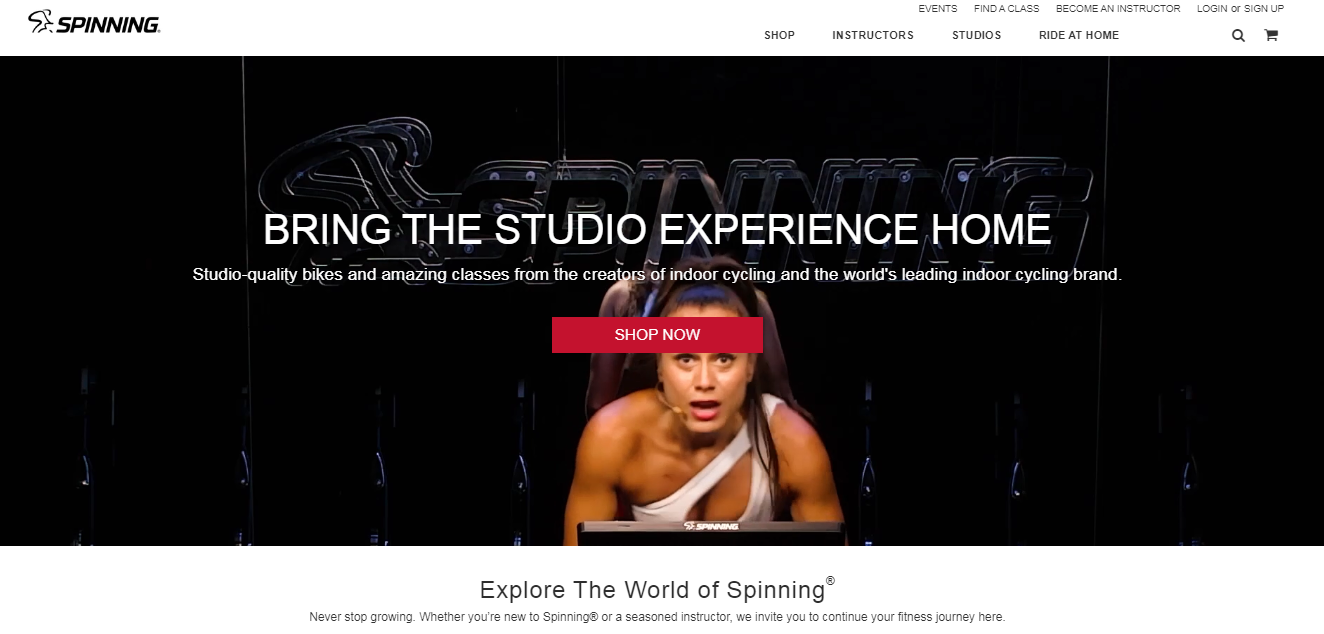
Spinning brings Spinner bikes and Spinning education to the spotlight with its unique approach.
Using different strategies such as email marketing, predictive dialing, and Instagram influencer marketing are effective ways to attract buyers to their Spinner bikes.
However, this eCommerce fitness brand lets you bring the studio experience home. The landing page features the main spinner bike in action using a background video.
Using videos in your eCommerce pages and campaigns can dramatically increase your sales. After all, 95% of viewers absorb the videos they watch more than written text.
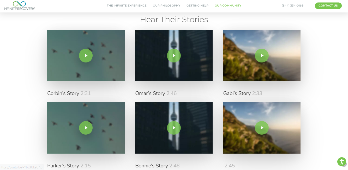
Using video testimonials is also a great way to improve the stickiness of your landing page. My favorite example is Infinite Recovery, a Texas rehab center that uses video to share clients’ success stories.
A closer look at Spinning’s landing page shows that the CTA button stands out on the page with its attention-grabbing color.
The headline “Bring the Studio Experience Home” is relevant to customers who need a home gym without missing out on real experiences.
As you navigate this eCommerce website, you’ll discover that the brand not only cares about Spinning bikes but also healthy lifestyle habits like simple meal plans, workout apparel, and joining a community.
10. Revelry
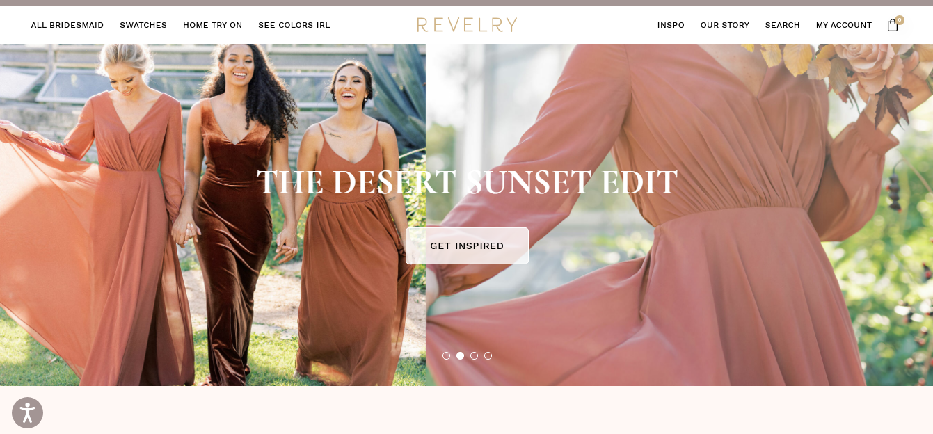
It’s time to applaud Bridesmaid with lovely dresses. That’s what Revelry does best.
The brand recognizes that it’s no longer enough to have the best wedding dresses, but how you market and showcase them on the website matters greatly.
Revelry uses a matching landing page that the audience would fall in love with.
The color choices are on point, exactly how ladies want it. The headline is irresistible, and the CTA is catchy enough to draw the customer in. Ladies not only love Revelry for its amazing dresses but the website speed as well.
11. Trunk Club
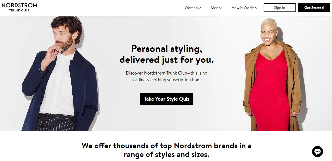
Trunk Club (by Nordstrom) redefines personal styling for men and women.
The eCommerce company uses a different approach to converting visitors into buyers by encouraging them to take a quiz. Aside from using marketing software to manage their email campaigns, quiz makers are also important to Trunk Club.
Aside from using high-quality imagery of a gentleman and lady on its landing page, The Trunk Club also targets the right keywords. You’ll need a keyword tool to find the primary keywords your audience is searching for.
The Trunk Club’s landing page is an example of an eCommerce page that offers a single choice (a quiz) and nothing else.
Conclusion
There you have it, some of the best eCommerce landing page examples you could model to create yours.
Remember that your visitors are already distracted by shiny objects on the web. As a result, your landing pages and product pages should be designed with persuasion and relevance elements.
Use your eCommerce landing page as a virtual elevator pitch: craft pages that are sticky, engaging, and highly relevant to your target audience.
Don’t forget to use high-quality visuals to tell your product’s story. This approach will significantly boost your eCommerce sales and revenue — and you’ll no longer waste your traffic and ad spend.
Contributor Bio:

|
Burkhard Berger is the founder of awesomex™. You can follow him on his journey from 0 to 100,000 monthly visitors on www.awesomex.com. His articles include some of the best growth hacking strategies and digital scaling tactics that he has learned from his own successes and failures. |