Checkout page designs: a critical factor for e-commerce conversions. Unlike physical stores wherein the annoyance of people waiting in the checkout lanes is a telltale sign of inconvenience, online retail checkout lacks that instantaneous identification of points of friction of the buyer’s journey.
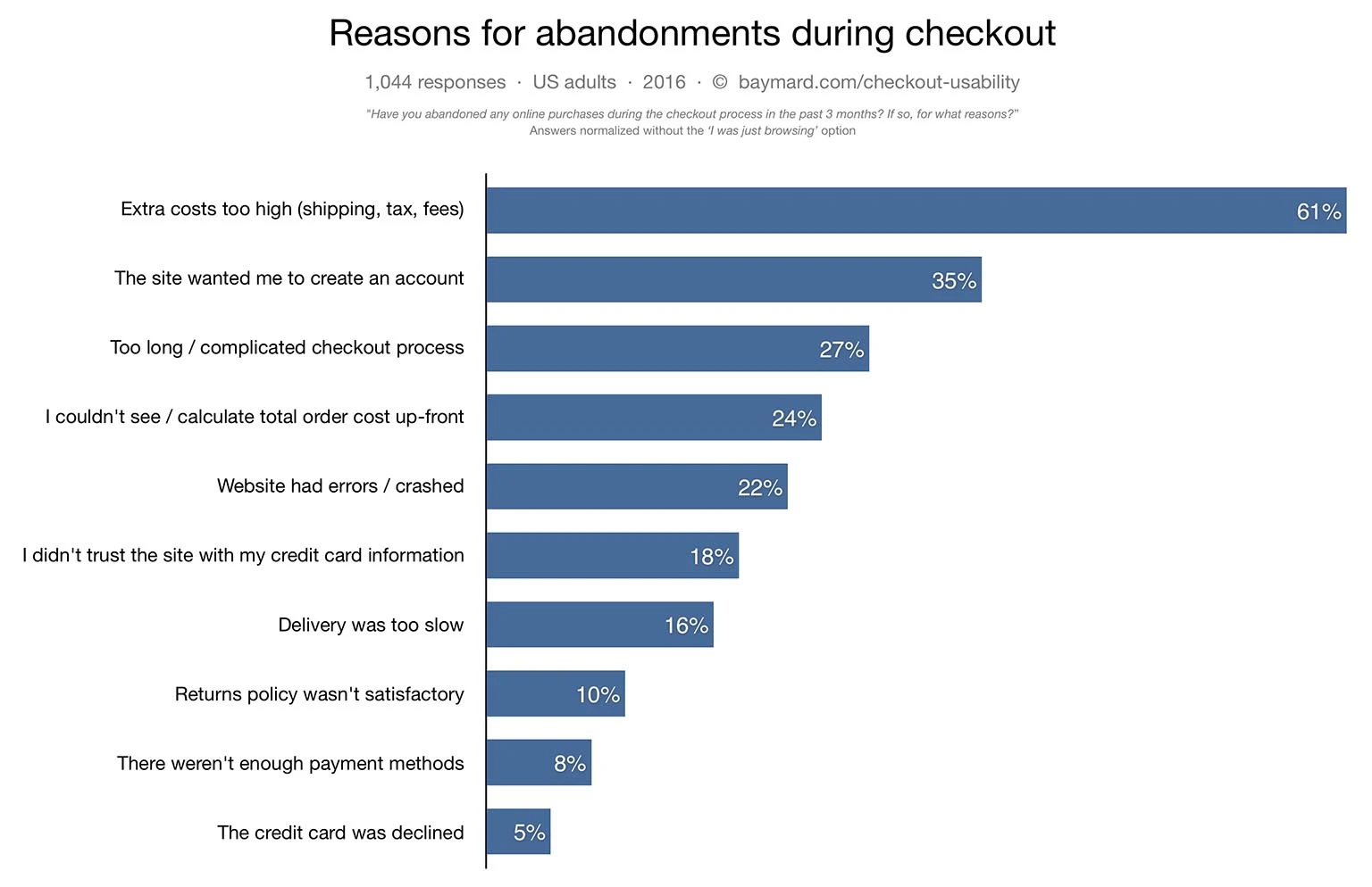
A choppy checkout experience can result in an increase rate of cart abandonments as reported in this research by the Baymard Institute.
69.23% of all e-commerce visitors abandon their shopping carts. Why?
Your e-commerce store is probably leaking money too.
Baymard’s checkout usability test documents that the average site can increase its conversion rate by 35.26% mainly by optimizing the checkout flow and design. And these figures are based on checkout user experience of e-commerce sites, such as Walmart, Amazon, Wayfair, Crate & Barrel, ASOS, etc.
Keeping user experience as the top priority can fix many of the outlined issues solely through design changes.
Here are 5 best checkout page designs or examples from the top retailers which will give you fresh insights into a seamless e-commerce checkout flow and design.
You will find concise checkout UX guidelines which have proved successful in improving customer experience and thereby increasing their sales/revenue.
1. Kylie cosmetics
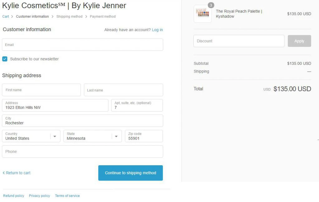
Kylie Cosmetics checkout user experience is cakewalk with only 3 steps. It also overcomes the barrier of account creation by allowing guest checkout and smartly points you at the end to make a choice of ‘Save my information for faster checkout”. Shipping cost is clearly displayed leaving no space for surprises in the final step. Refund and privacy policy details are placed just below the checkout forms making it accessible.
2. Nordstrom
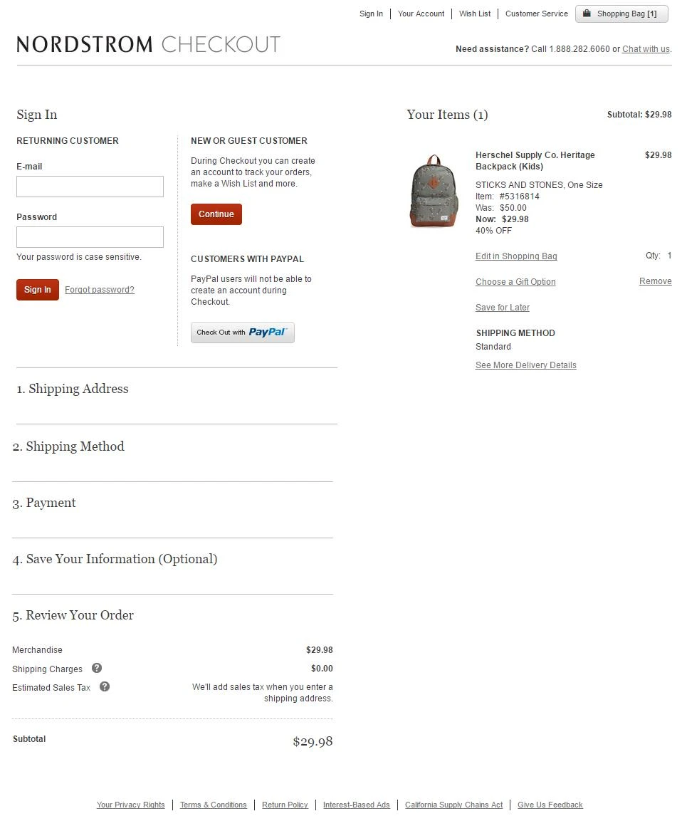
Nordstorm follows the ideal checkout page design with visual checkout process, guest checkouts, final order review and much more.
The complete checkout design is well-placed in a single page with an accordion design. One page checkout seems quicker to you even though it is more or less the same amount of form filling.
Well-placed cart contents, refund and privacy policy throughout the checkout flow ensures easy access and visibility. The message emphasizing security of your payment information make you feel at home.
Recommended: 10 Signs Your eCommerce Website Design Needs An Upgrade
3. Nike
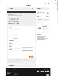
Nike’s checkout flow is 3 steps long which keeps the checkout process short and the user is not overwhelmed. Clear navigation with a seamless layout makes checkout UX a breeze. It follows the ideal checkout flow rule of ‘Guest checkout’. Clear display of messages enables the users to know the reason to request a particular information.
Well highlighted trust badges and primary CTAs imbibes a sense of security.
Final order review button gives you the freedom to make a final call before placing the order.
4. Fab
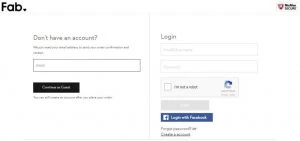
Fab is a real winner with a clear and clean layout and 3 steps long checkout process. It also presents you with a smart option of ‘login with Facebook’ together with guest checkout. Saving client’s time been a criterion, it gives you the option of copying shipping address to the billing address. The Trust badges in the checkout UX make the customer feel secure and builds trust.
Recommended: A Definitive Guide to Website Redesign
5. ASOS
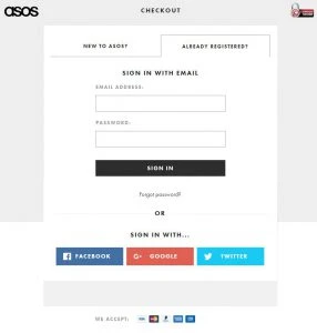
ASOS brought 50% more new customers by just removing the account creation process for new users. It allows you to sign with your Facebook, Google or Twitter account or guest checkout. Laying all the steps on a single page gives a smooth checkout flow. You will love the way it lists addresses when you start typing your address. Security symbol from the very beginning enhances trust.
Your e-commerce store checkout user experience should help the customer is making a confident and informed decision. By doing that you have removed the barrier in your checkout conversion rate and increased sales. Moreover, as your customers keep evolving in their online experience and so you need to keep adapting.
Feeling already inspired by these great checkout page designs? Start optimizing your checkout page now!
Sources: Baymard Institute, Econsultancy, ClickZ, e-commerce platforms.