If you’ve been an Ecommerce business owner since some time now, or are just starting out with an online venture – you certainly know that Shopify is the place to be.
Not only has the platform grown and evolved itself into being as accessible a place for its users, but it has also successfully provided them the tools to personalize their selling experience.
Coming to the point, good design is more about good thinking than anything else. A lot of store owners are quick to hop on the Shopify bandwagon to give their businesses as much visibility and reach as possible.
However, what they usually forget is that simply opening up an E-store is never enough, and a lot depends on how well-designed and user friendly your store looks and feels.
The audiences are no more moving under the blanket of lack of information, and are more than equipped to find and pick alternatives that suit them best.
Which is exactly why, a lot of emphasis is being shifted to good design experiences and taking the UI/UX design game up a notch.
So, what does good website design comprise of?
And how does one do what it takes to build a front that encompasses all the qualities of a well designed E-store?
Well, we’ve done the homework for you.
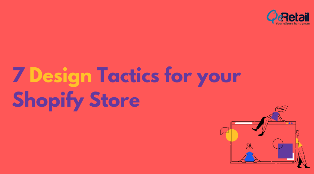
In this article, we’ve listed 7 key design tactics that would definitely come in handy if you’re looking to give your Shopify store that much needed revamp, or are simply in the process of designing a website for the first time.
What you will learn in this article-
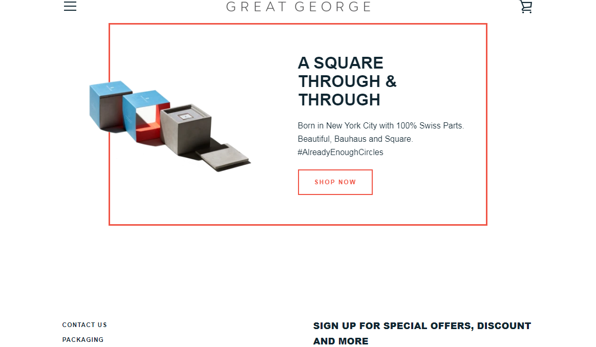
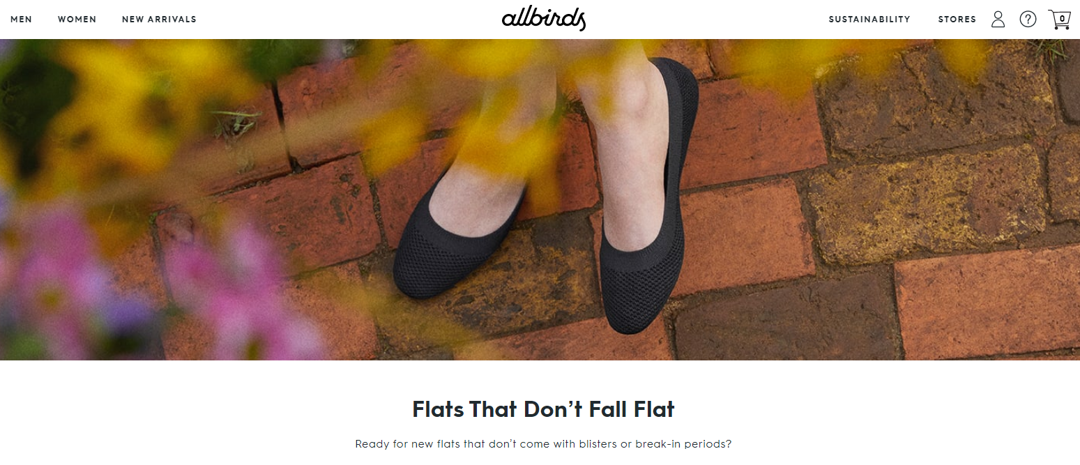
1. You do you: Be original
Originality goes a long way.
When you’re authentic and know exactly where you’re coming from, it reflects in your design experience. Store owners and creators in today’s time aren’t holding back from exploring the fun sides to building a store on Shopify – whether it’s with picking a bolder theme than usual, or highlighting their offerings using off-beat colour-font schemes.
Originality speaks for itself.
Contemporary brands and their creators are no longer shying away from taking the risk to do something different, and do it their own way. Even though swaying away from the norm can definitely be a bit of a pole-walk, it pays off. Novelty is refreshing, and if you’re planning to give your website that much needed revamp, you shouldn’t shy away from it.
The avenues across E-commerce offer a plethora of opportunities, but given you have the right kind of website design that can make it’s mark.
To list a few examples of brands bringing their A game in the sphere of originality –
-
-
The Critical Slide Society
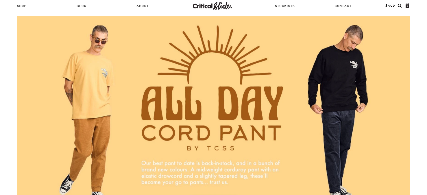
The Critical Slide Society This Australia based apparel brand manages to stand out with core theme focused on simplicity with a dash of spunk. With a plain white background for it’s layout, and a wonderfully contrasting display of products – Critical Slide nails their design game.
-
-
-
Pop Chart Lab
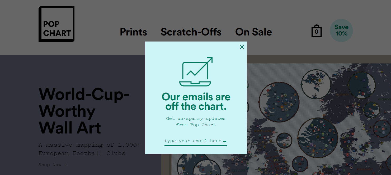
Pop Chart Lab Pop Chart Lab steers away brilliantly from the feel and look of a typical E-commerce site. Not shying away from bringing the ‘pop’ to their graphics as well as the content throughout, this collective makes their case for what it means to be hip, happening and here for business.
-
-
-
Hiut Denim Co.
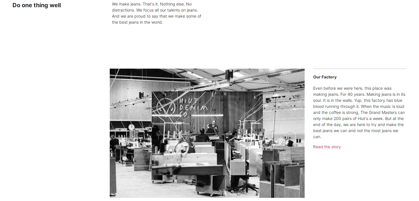
Hiut Denim If there was ever a petition to be signed for bringing back editorials into web design, Hiut Denim would be on the front. The collective uses an almost newspaper-like layout and content rich frames to it’s space. Minimalistic, yet fun!
-
-
-
Happiness Absicssa
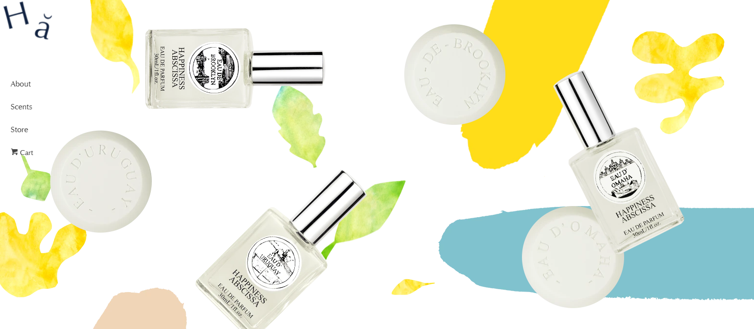
Happiness Abscissa Happiness Abscissa acts as a breather from the mundane, with a delightful design layout comprising of perfectly bright graphics and a balanced image-content ratio. Another great aspect to this brand’s website is how they’ve tucked their main navigation panel on the left, to bring focus to their story-line and product background.
-
-
Factory 43

Factory 43 Perhaps the most fun pick on the list, Factory 43 stands out with a generous use of animations and bold graphics throughout their web front. The core concept behind this store’s design is to merge the ‘factory-like’ feel from their name with a vivid highlight thrown on their products, and they manage to ace the blend remarkably.
It’s a 10/10 from us!
2. Do your homework : List down your needs before picking a theme
Shopify has hundreds of themes to offer for it’s E-stores.
Before picking the theme that you feel works best for you, you need to sit with yourself and understand your needs and their scope. It’s easy to lose your way when going through the options, since there’s so many of them. But it’s also just as important to explore.
Another aspect to take note of before you finalise the theme of your choice is that these themes don’t do everything for you. They come with limitations as well, and you need to make sure you can work around their capabilities.
The Shopify template builder allows you to surf through themes and pick the one you like best, then use drag-and-drop options to customise, add content, layer sections etc. Even then, you can only finish about 80% of the process in one go, and for the second part of the build – it would be better to hire a designer.
When you find yourself at the inceptive stage of designing your E-store, you need to keep your tabs open and not shy away from doing your research. But yes, do try to stick within the realms of the Shopify Theme Store.
This, because these themes are ticked off by Shopify on the basis of not just their quality, but also their functionality before they’re listed.
So, picking a theme from the platform’s theme store makes sure that you’re not only getting good quality, but also sticking to the rules and regulations that Shopify needs it’s users and developers to comply with.
Before you pick a theme, ask yourself these :
– What am I trying to showcase through my site?
– How do I differentiate my store from others?
– Who is it that I’m catering to?
– What are the core values that my brand stands for?
– If my website was a person, what would it be like?
3. De-clutter : Avoid information overload
When setting up a website, it’s very crucial to understand the difference between ‘can-haves’ and ‘must-haves’.
A lot of store-fronts clutter their web spaces with information that isn’t just unnecessary for the space it’s taking up, but also hampers the user-experience. Good design in the contemporary age is more about good visibility, and a better understanding of what belongs where than anything else.
When you’re building an E-store on Shopify, an essential tip to keep in mind would be that your site doesn’t need to consist of everything that you have to offer, but only the pointers that actually speak for your brand and it’s core utilities.
This also ensures that the right kind of content get’s visibility on your storefront.
Some pointers to keep in mind –
– It’s a website, not an encyclopedia.
– Visual thinking is a lot about being able to tell essential information from non-essential.
– A visitor’s attention span isn’t as consistent as you think it is.
– Stick to the point.
– Less is more.
4. Choose wisely : Hire a good designer
Teamwork is key to creating anything good.
When setting out to build your E-store, do your research on good designers around, and especially ones who’re sure to align with your expectations and end-goals. It’s only right to take your time with the process, since it’s not always an instantly rewarding take-up either.
When it comes to design, professional help always goes a long way. Not only would an expert understand the technicalities better, their work would also reflect the same on execution. It’s always useful to seek professional help where required. Creating a user-friendly storefront that actually works the way your buyers want it to isn’t an amateur’s cup of tea and it’s only wise to use a professional’s help in doing so. This not only gives your site that expert edge, but also makes sure that you have the kind of visibility you aspire for.
What’s just as important is to partner with a professional who can match your visual and creative contours, to bring the best out of your e-store.
It can be helpful to ask yourself these questions before
starting out –
1. Which web design services are included?
2. What is the scope of the design package?
3. What is the cost, and what’s my budget?
4. What is their web design process?
5. What does their previous work experience say about them?
5. Think like your customer
The whole purpose of building an E-store or website is to get your customer to make a purchase from you.
For that to happen, the customer needs to connect with you first.
It’s of utmost importance to put yourself in your customer’s shoes to understand what they’re looking for. Most customers are looking for certain common factors, like – a site that’s well-designed, easily navigable and comes with a seamless checkout experience. Sounds pretty basic, right?
It’s really not.
It holds a lot of value to be empathetic to your audiences, because that’s pretty much the only way you can actually listen to them. Empathy enables brand owners to veritably create personalized design experiences from the customer’s perspective.
Try to ask yourself these questions when trying to create a more user-friendly web front –
– What kind of layout can I make to simplify my user’s navigation?
– How do I simplify my checkout process?
– Is there a way through which I can organise my product range better?
– Does my site contain all the useful information that a customer would require?

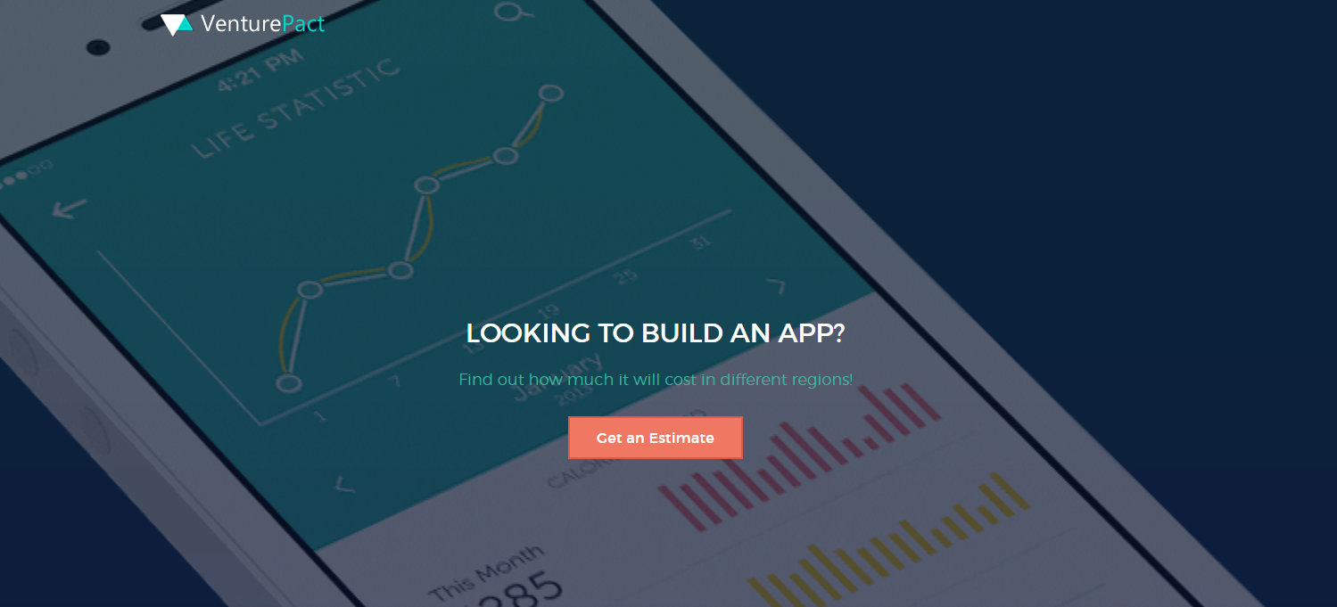
6. Create an Interactive Shopping Experience
One of the drawbacks of online shopping is the lack of touch and feel you get when buying from a physical store. Out of those interviewed by Adweek, 25% of people prefer brick and mortar store experience “relaxing and enjoyable” after comparing both forms of shopping methods.
You can interpret this as 75% of people may be adjusting to online shopping. In fact, due to recent events, people are resorting to online shopping. So, store owners need to innovate the online shopping experience to cater to their customers and make it unique, especially during the holiday season.
A lot of your user’s website experience depends on not just the look factor of your site, but also the ‘feel-good’ factor to it. How great web design differs from one that’s plain good is by capitalizing on this very element of designing an E-store.
A great example of a brand using this tactic would be VenturePact, who partnered with Outgrow to create a calculator that helped their users calculate the cost of building an app. This also happened to be one of their target audience’s primary concerns.
Within just 2 weeks of launching, the calculator boosted traffic by 15% and increased conversion rate by 28%, coming off as one of the collective’s most successful lead-generating projects.
7. How a Progressive Web App helps businesses –
Online shoppers can be divided into two core groups :
- Those who plan and research before making an online purchase.
- Last minute shoppers who tend to be more impulsive.
In either case, more preference is given to shopping via mobile apps. Not only is it quick, responsive, but the content is also arranged adequately for the small screen.
Roughly four out of five Americans are now online shoppers, with more than half having made purchases using a mobile device (Source: Pixel Union).
However, developing a mobile application is not every small business owners’ cup of tea. There are multiple hoops to jump through, but one of the most common reasons for most people avoiding mobile app development is the cost.
The different tiers of app development costs (approx):
- Simple app development price tag – $40,000 – $60,000
- Medium complexity app development price tag – $61,000 – $120,000
- Complex app development price tag – $120,000+
- Cost of hiring a US app developer ~$90,000 / year
- Royalties to OS-specific stores such as Apple App Store and Google Play Store – $25 one time (Play store) or $99/ year (App Store)
However, the benefits from a dedicated app listed below justify the costs in the long run:
- Efficient
- Offers high scalability
- App Data Security
- Ease of use
What if you could have a dedicated app at a fraction of the cost?
This is where PWA comes into the picture.
Progressive Web App (PWA) is a technology that turns your webstore into a shortcut on your user’s device. The shortcut behaves like a dedicated app and provides a user interface similar to using a mobile app. Any changes on the webstore are automatically reflected in the contents of the shortcut. The shortcut occupies very little space and can be installed with a single click.
In terms of security, the shortcut is as secure as the actual web-front.
So, in a nutshell, many brands are jumping on board for implementing PWA as it is a win-win.
The benefits for online shoppers:
– No need to remember the store address.
– Low on resources and storage space.
– Responsive design, adaptable for every screen size.
– As secure as a web store.
– Easier navigation.
Wrapping up,
We hope these design hacks come in handy when you’re in the process of setting up your freshly built store on Shopify. Keep in mind though, that design is all about what you make of it. So don’t shy away from bringing your own unique quips and quirks to your store-front this season!
Happy marketing!