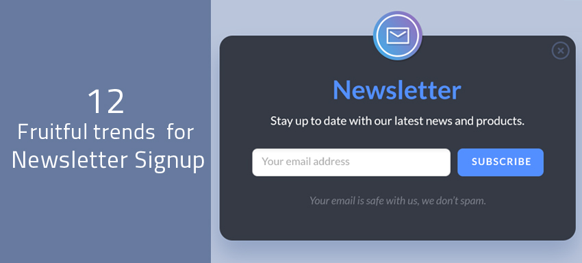
A well-designed eStore is not just the one termed as a user-friendly eStore or a mobile-friendly eStore but also the one that gives the newsletter sign up form and other user interaction spaces in a prominent place/manner. Email newsletters are one of the most powerful tools in direct communication with the users and a newsletter signup popup design should be in such a way it allures your customers to sign up right there. How do you design such a powerful eCommerce platform design with a thoughtful approach in order to the highest numbers in subscriptions?
- The signup form should be crisp. Ask just for the user’s email address to start with, even if you have a near-future plan of retrieving other information from them.
- Respect the user action/time of having signed up to you; give them an offer in return. Every single person asks “What is in it for me?” do you hear?
- Tell the user how many users have signed up earlier and what they have got in return. Tell this in a style such that the user feels great to be a part of it; a project they are a part of an exclusive small group or a part of a well-known big group or whatever; just make it smart!
- A good design of color in the background, font color, good verbiage, no typo errors, a direct and clear message is all necessary to grab the user’s attention in minutes!
- Single column formats are the best recommended because they are the easiest, the simplest to perceive/interpret for the users. Responsive eStores stand on such column designs
Recommended: How perfectly are your email newsletters formatted?
- Well-designed buttons with the right font color, right background shade and the right, meaningful, text on them, with a few animation aspects if suitable, are the best ones engaging the users or reminding the users to hit ‘complete’ once they are done with filling the form!
- Mobile-friendly design is a must. The signup form has to look clear and neat irrespective of the size of the device screen.
- Pop-ups are gaining popularity now. Centre page pop-ups with a transparent shade, not hiding the website behind it is recommended. Corner pop-ups built using CSS to hide/show the pop up every few minutes/seconds are a great idea too!
- High color big image designs are as well on the higher side of gaining popularity, while the simple ones gain the sight. Any videos/media specific to the customer group or to the intended region/audience implemented at the best, of course, add a lot of sense!
- The most important is directing the users to the site once done with the form filling.
- Use designs with appropriate optimized images and graphics in a simple way with the logo as a focal point, or even a simpler one with a sharp text!
- Appealing overlays clearly conveying what you offer, clean design with no bends anywhere, are all highly recommended.
While the rules sound simple, there requires sound expertise to do them at the best at the best possible cost and effort. Should you require such support or anything in eCommerce, ask us at QeRetail now!