Over 70% of ecommerce traffic comes from smartphones. We design your store mobile-first so it looks beautiful and converts better on mobile devices.
Get a FREE mobile homepage mockup of your store.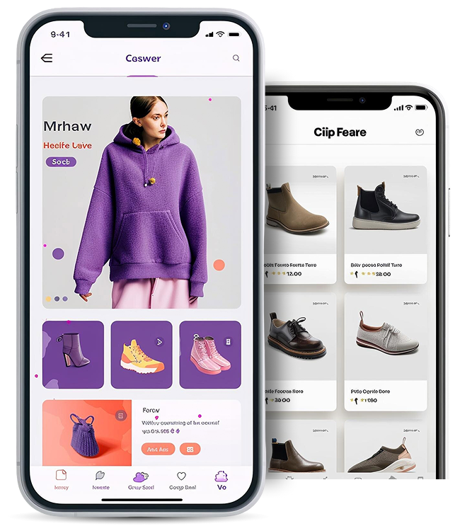
Many ecommerce stores were designed for desktop screens first and then adapted for mobile. This often leads to cluttered layouts, poor navigation, and lower mobile conversions. Mobile-first design starts with the smartphone experience and builds upward, creating a smoother shopping experience for today's mobile shoppers.

Designed from the ground up for smartphones, ensuring a seamless and intuitive shopping journey.

Lightweight, mobile-first layouts improve speed, keeping users engaged and reducing bounce rates.

Focused design removes distractions and guides users smoothly from browsing to checkout.
Your homepage should guide mobile
visitors quickly to your products.
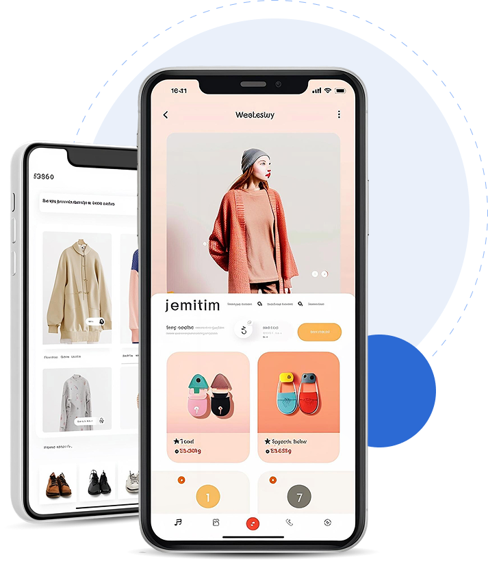
Turn product pages into high converting
mobile experiences.
Get all three designs together for the best
mobile shopping experience.


Submit your
store URL.

We create a free mobile
-first homepage mockup.

You review
the design.

If approved, we implement
it into your store.
 Better mobile shopping experience
 Higher mobile conversion rates
 Cleaner modern layout
 Faster product browsing
 Improved customer engagement
Many ecommerce stores were designed for desktop screens first and then adapted for mobile. This often leads to cluttered layouts, poor navigation, and lower mobile conversions. Mobile-first design starts with the smartphone experience and builds upward, creating a smoother shopping experience for today's mobile shoppers.


