CTA’s are the most important part of any website; Well placed CTA’s influences the customers to get to the buying action and helps increase conversion rates. In contrast, poorly placed CTA’s reduce customers’ interest and reduce the sales & conversions. Thus it’s important for every website owner to bring in a ‘call to action’ strategy and be creative to ensure that CTA’s helps in achieving necessary objectives for your estore.
The four most important factors to examine your CTA’s primarily is to evaluate clarity of text, placement of CTA’s on webpage, size of the CTA buttons on various devices (e.g., desktop, mobile, tablets) and colour of the CTA buttons. The user data collected on the above factors will help you to identify how CTA’s are performing and which landing pages on your eCommerce store needs attention.
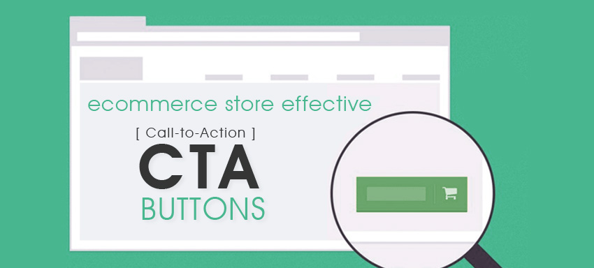
Here are a few effective ways to improve your CTA’s performance:
- Continuously assess and test: You need to continuously assess CTA performance and their conversion rates. Collect analytics related to the current landing page performance, traffic sources and other available accessible data to assess what’s working/what’s not. Analysing the collected data will further help in finding and fixing the CTA’s that need further improvement.
- Find the perfect CTA location: Placement of CTA’s on landing page is very important. Placement of the buttons is dependent on the complexity of offer and the right decision here helps to increase conversions.
- Use action oriented text: Importance of CTA buttons increases with those influencing words specified on the CTA buttons. Simpler and action oriented words resonate with the audience better and increases click through rates. Also, the more action-oriented your CTA verbs are, the more immediate reactions you’ll provoke. H&M and oDesk provide a good example of using action words.
- Use the right colours and sizes: Colours on CTA’s directly have an impact on users actions. Your colours must be selected in such a way that it gives the users signal on where to click but the size of the button must be relevant to the background design; it must not be too big as it distracts the other contents on your page. The colour and size of CTA’s must be selected depending on the site design and need to stand out from rest of the page
- Make CTA’s relevant: Use relevant text on CTA buttons so that they describe why a user should click on a button. Great CTA buttons increase conversion e.g., buttons with captions “click here” and “submit” can be replaced by ‘Get your free coupon! Which ‘looks more relevant than “Submit” caption on a button.
- Make them stand out: Make your CTA’s stand out; if it’s hidden in the text and is lost in the background, it will be really difficult for users to see them. Few options are to reduce the number of elements and bright colours within your web design and leave enough white spaces around the CTA so that users get the attention on them straight away.
Assessing current performance of your CTA’s and modifying them as per the above recommendation will help to increase the sales & conversions and increase the click through rates on your websites. To start off with assessing your current webpages and facelifting your website, reach out to us here. Glance through the customer CTA development services we provide to stand out from competition.